Airbnb · ★ 27K · ⟳ 2026-10 · Apache-2.0
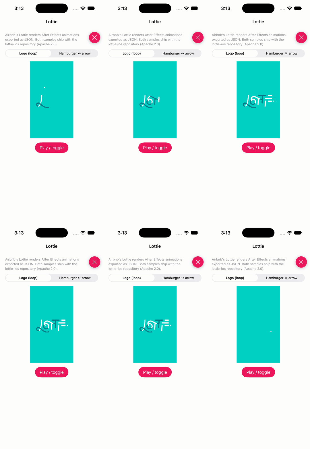
Render After Effects animations natively and keep product motion consistent across screens.
▶ Live demo in the app SPM vector after effects json animation bodymovin keyframes
.package(url: "https://github.com/airbnb/lottie-ios", from: "4.6.1")Usage
LottieAnimationView plays an exported JSON animation; set loop mode or play a progress range.
private let animationView = LottieAnimationView()

animationView.animation = LottieAnimation.named("LottieLogo1", bundle: .module)
animationView.loopMode = .loop
animationView.play()

animationView.play(fromProgress: toggled ? 0 : 0.5, toProgress: toggled ? 0.5 : 1, loopMode: .playOnce)
lkzhao · ★ 22K · ⟳ 2025-01 · MIT
Hero is a library for building iOS view controller transitions. It provides a layer on top of the UIKit's cumbersome transition APIs. Making custom transitions an easy task for developers.
▶ Live demo in the app SPM CocoaPods Carthage transition navigation interactive shared element material design view controller
.package(url: "https://github.com/HeroTransitions/Hero", from: "1.6.4")Usage
Give matching views the same heroID, add heroModifiers, and replace or push view controllers with Hero enabled.
cell.heroModifiers = [.fade, .translate(x:-100)]
cell.imageView!.heroID = "image_\(indexPath.item)"
cell.imageView!.heroModifiers = [.arc]

hero_replaceViewController(with: next)

func heroWillStartAnimatingTo(viewController: UIViewController) {
  if let _ = viewController as? GridCollectionViewController {
    tableView.heroModifiers = [.ignoreSubviewModifiers]
  } else if viewController is ImageViewController {
  } else {
    tableView.heroModifiers = [.cascade]
  }
}
no preview
Facebook · ★ 20K · ⟳ 2020-01 · BSD-3-Clause
Classic extensible animation primitives for spring and decay motion in UIKit apps.
CocoaPods Archived spring decay classic physics animation engine objective-c facebook
MengTo · ★ 14K · ⟳ 2023-07 · MIT
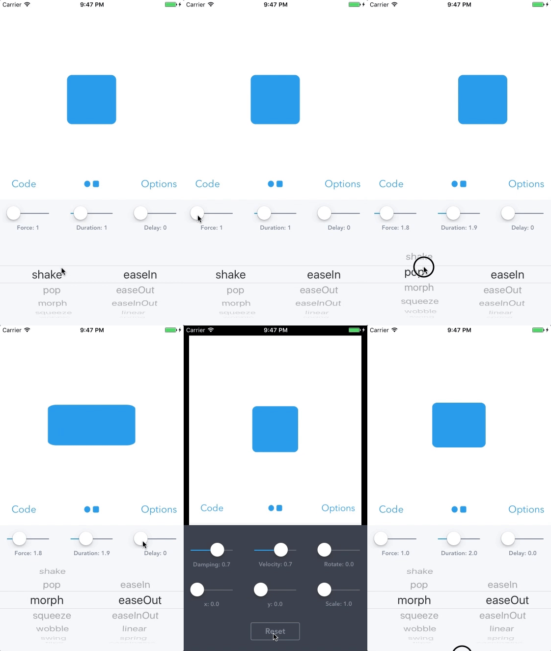
A library to simplify iOS animations in Swift.
▶ Live demo in the app CocoaPods prototype easing spring animation uiview interface builder
Usage
SpringView (from the storyboard) animates with the animation, curve, force, duration and delay you set.
ballView.animate()

ballView.force = selectedForce
ballView.duration = selectedDuration
ballView.delay = selectedDelay

ballView.animation = animations[selectedRow].rawValue
ballView.curve = animationCurves[selectedEasing].rawValue
Juanpe · ★ 13K · ⟳ 2026-06 · MIT
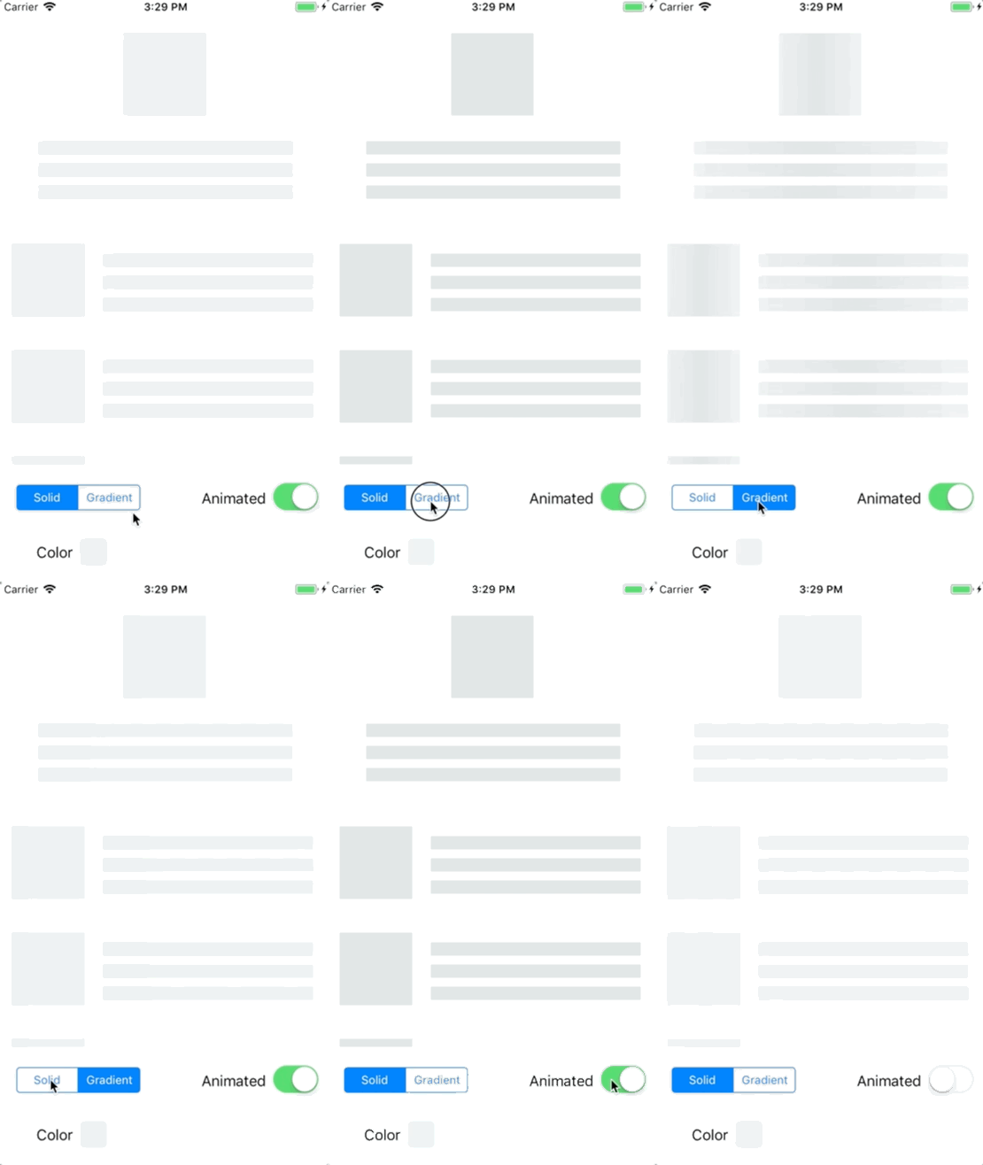
Today almost all apps have async processes, such as Api requests, long running processes, etc. And while the processes are working, usually developers place a loading view to show users that something is going on.SkeletonView has been conceived to address this need, an elegant way to show users that something is happening and also prepare them to which contents he is waiting.
▶ Live demo in the app SPM CocoaPods Carthage skeleton loading placeholder shimmer redacted table view collection view
.package(url: "https://github.com/Juanpe/SkeletonView", from: "1.31.0")Usage
Mark views skeletonable, show an animated gradient skeleton while loading, then hide it with a transition.
stack.isSkeletonable = true

stack.showAnimatedGradientSkeleton(usingGradient: SkeletonGradient(baseColor: DemoSupport.hairline), transition: .crossDissolve(0.25))
DispatchQueue.main.asyncAfter(deadline: .now() + 4) { [weak self] in
    self?.stack.hideSkeleton(transition: .crossDissolve(0.4))
}

title.isSkeletonable = true
title.linesCornerRadius = 6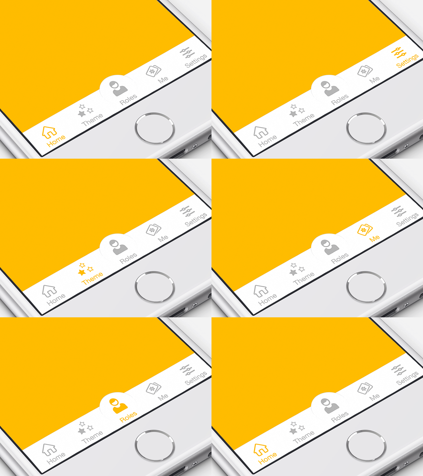
Ramotion · ★ 11K · ⟳ 2022-01 · MIT
RAMAnimatedTabBarController is a Swift module for adding animation to tabbar items.
▶ Live demo in the app SPM CocoaPods Carthage tab bar animation menu material design uikit
.package(url: "https://github.com/Ramotion/animated-tab-bar", from: "5.1.0")Usage
Set up RAMAnimatedTabBarController in the storyboard with RAMAnimatedTabBarItem items; badges work as usual.
@IBAction func showBadgeHandelr(_ sender: AnyObject) {
    index += 1
    self.tabBarItem.badgeValue = "\(index)"
}

@IBAction func hideBadgeHandler(_ sender: AnyObject) {
    self.tabBarItem.badgeValue = nil
}
ninjaprox · ★ 11K · ⟳ 2026-03 · MIT
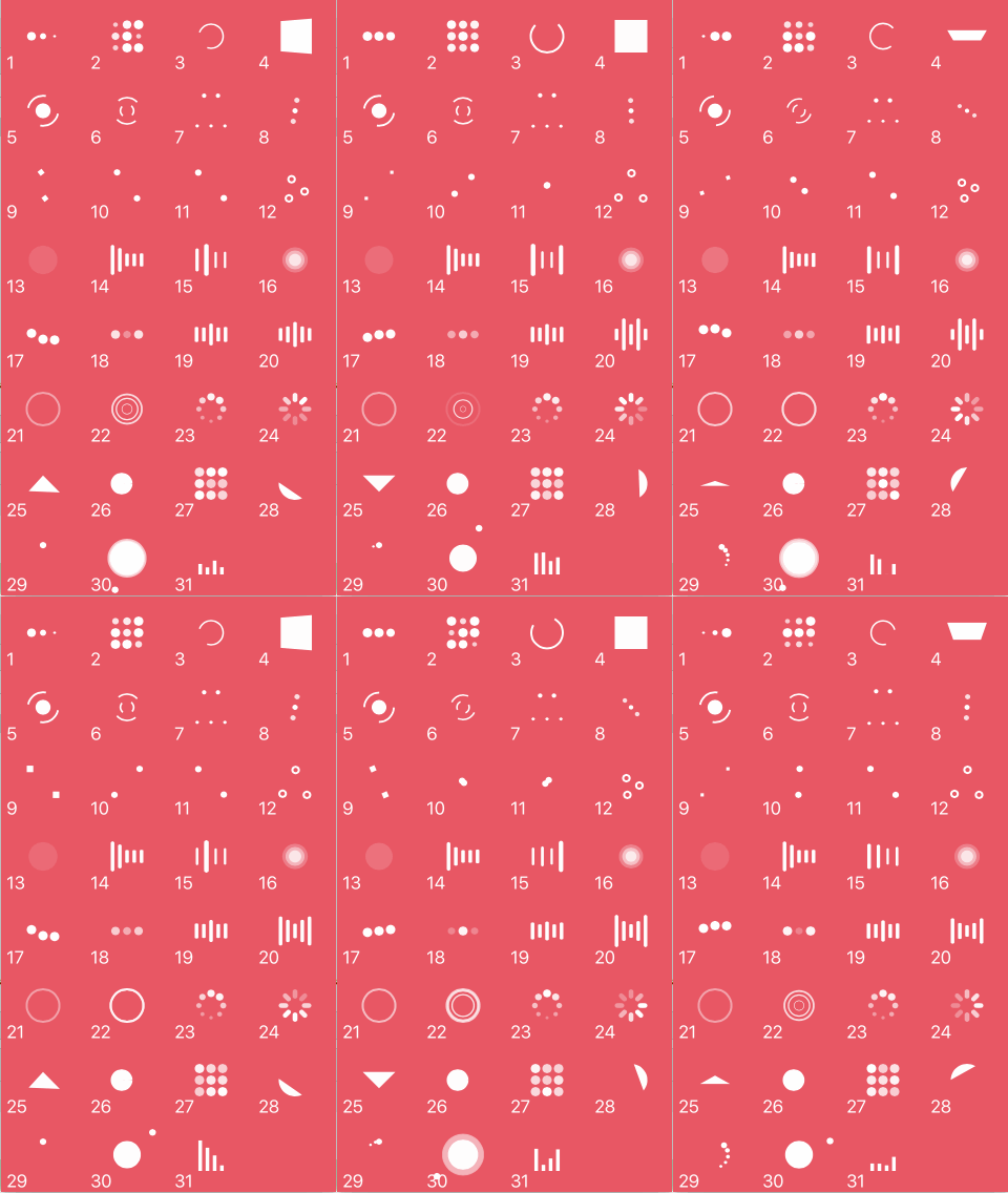
NVActivityIndicatorView is a collection of awesome loading animations.
▶ Live demo in the app SPM CocoaPods Carthage loading indicator feedback spinner activity indicator
.package(url: "https://github.com/ninjaprox/NVActivityIndicatorView", from: "5.2.0")Usage
Create an indicator with a frame and type and start it; startAnimating shows a full-screen HUD.
let activityIndicatorView = NVActivityIndicatorView(frame: frame,
                                                    type: types[$0])

activityIndicatorView.padding = 20

activityIndicatorView.startAnimating()

let types = NVActivityIndicatorType.allCases.filter { $0 != .blank }
startAnimating(size, message: "Loading...", type: types[sender.tag])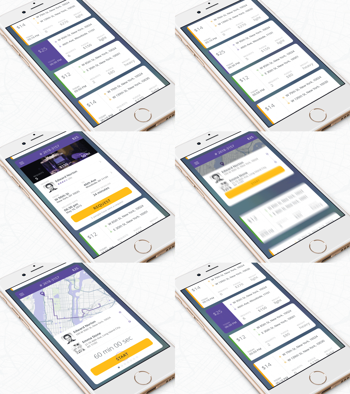
Ramotion · ★ 10K · ⟳ 2024-04 · MIT
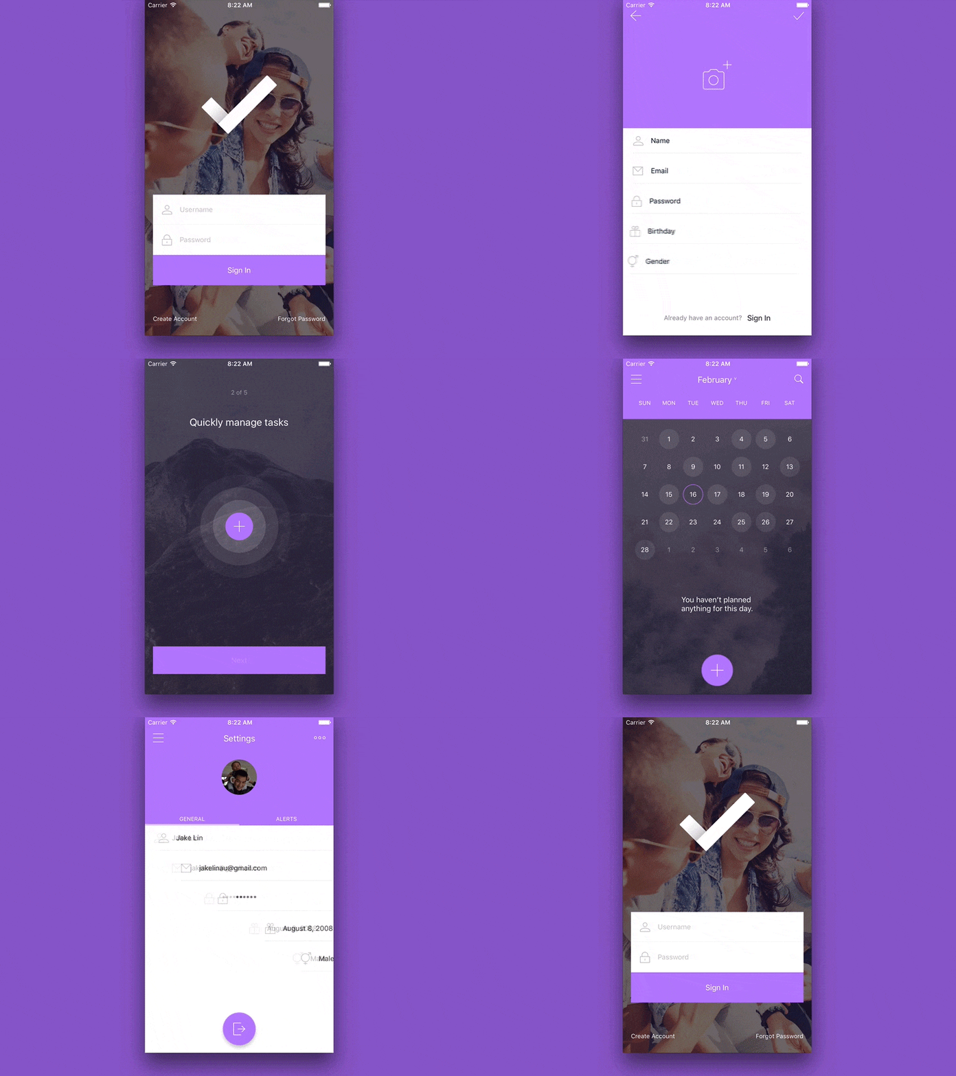
FoldingCell is an expanding content cell inspired by folding paper material
▶ Live demo in the app SPM CocoaPods Carthage table card interaction table view expand folding material design
.package(url: "https://github.com/Ramotion/folding-cell", from: "5.0.2")Usage
FoldingCell subclasses unfold with unfold(_:animated:completion:); keep the open/closed heights per row.
if cellHeights[(indexPath as NSIndexPath).row] == kCloseCellHeight {
  cell.unfold(false, animated: false, completion:nil)
} else {
  cell.unfold(true, animated: false, completion: nil)
}

let cell = tableView.cellForRow(at: indexPath) as! FoldingCell

if cellHeights[(indexPath as NSIndexPath).row] == kCloseCellHeight { // open cell
    cellHeights[(indexPath as NSIndexPath).row] = kOpenCellHeight
    cell.unfold(true, animated: true, completion: nil)
    duration = 0.5
} else {// close cell
    cellHeights[(indexPath as NSIndexPath).row] = kCloseCellHeight
    cell.unfold(false, animated: true, completion: nil)
    duration = 0.8
}
IBAnimatable · ★ 8.6K · ⟳ 2023-02 · MIT
Design and prototype customized UI, interaction, navigation, transition and animation for App Store ready Apps in Interface Builder with IBAnimatable.
▶ Live demo in the app SPM CocoaPods Carthage interface builder prototype design storyboard transition animation
.package(url: "https://github.com/IBAnimatable/IBAnimatable", from: "6.1.0")Usage
Animatable views and labels chain animations with .animate(...).then(...).
private let box = AnimatableView()
private let label = AnimatableLabel()

private func runChain() {
    box.animate(.squeezeFade(way: .in, direction: .down))
        .then(.pop(repeatCount: 1))
        .then(.shake(repeatCount: 1))
        .then(.flip(along: .x))
    label.animate(.slideFade(way: .in, direction: .left)).then(.swing(repeatCount: 1))
}
lexrus · ★ 8.1K · ⟳ 2026-11 · MIT
A morphing UILabel subclass written in Swift. The .Scale effect mimicked Apple's QuickType animation of iOS 8 in WWDC 2014. New morphing effects are available as Swift extensions.
▶ Live demo in the app SPM CocoaPods Carthage text label morph text animation uilabel
.package(url: "https://github.com/lexrus/LTMorphingLabel", from: "0.9.3")Usage
Set morphingEffect and duration, then assign new text and the label morphs from the old one.
private let label = LTMorphingLabel()

label.morphingDuration = 0.9
label.morphingEffect = .sparkle
label.text = words[0]

label.text = words[index]
Flipboard · ★ 7.9K · ⟳ 2024-03 · MIT
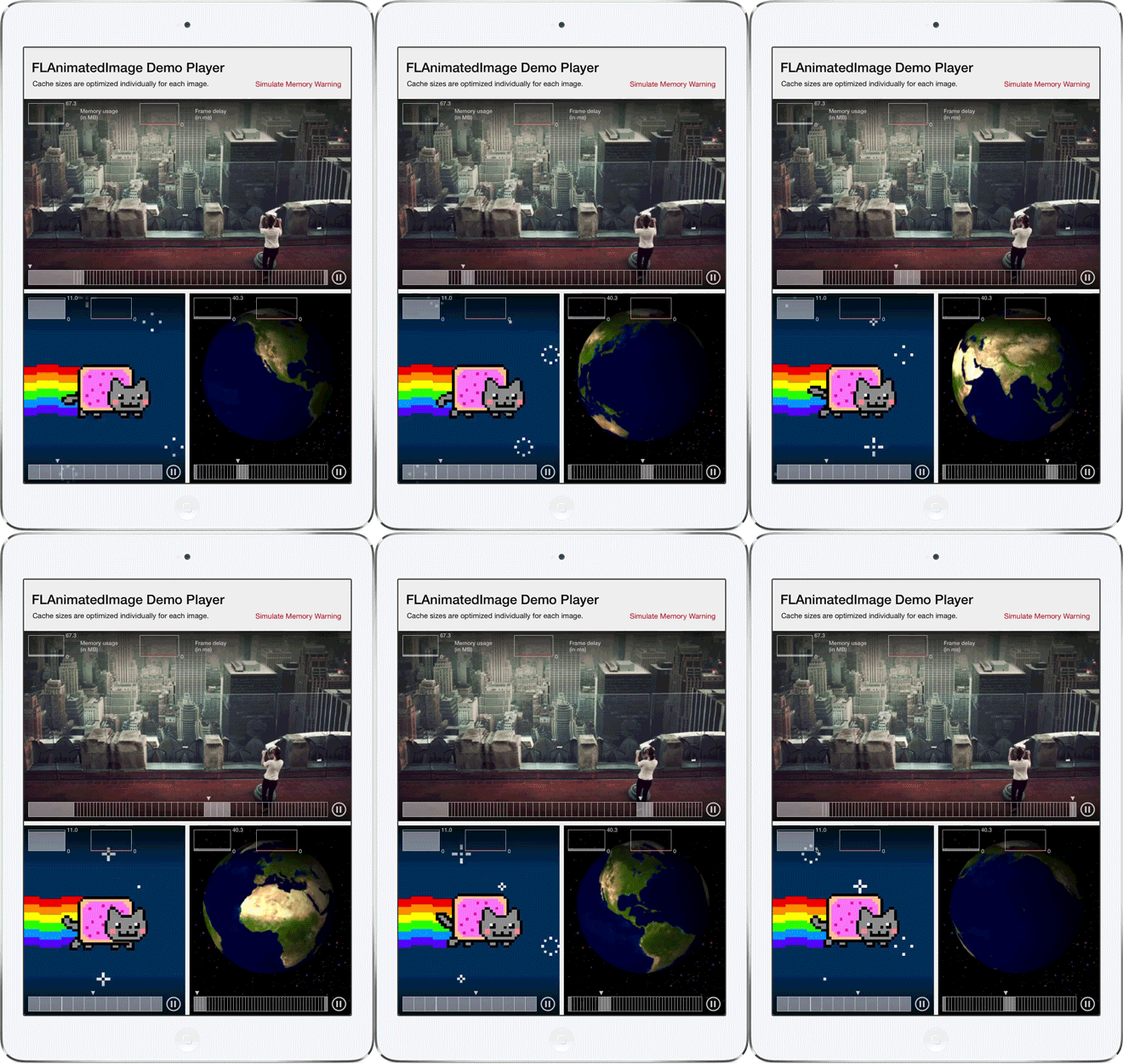
FLAnimatedImage is a performant animated GIF engine for iOS: 1. Plays multiple GIFs simultaneously with a playback speed comparable to desktop browsers 2. Honors variable frame delays 3. Behaves gracefully under memory pressure 4. Eliminates delays or blocking during the first playback loop 5. Interprets the frame delays of fast GIFs the same way modern browsers do
▶ Live demo in the app SPM CocoaPods gif image animated image performance objective-c flipboard
.package(url: "https://github.com/Flipboard/FLAnimatedImage", from: "1.0.17")Usage
FLAnimatedImage decodes GIF data; FLAnimatedImageView plays it frame by frame with flat memory use.
private let imageView = FLAnimatedImageView()

let image = FLAnimatedImage(animatedGIFData: data)

imageView.animatedImage = image
Marcos Griselli · ★ 7.3K · ⟳ 2024-03 · MIT
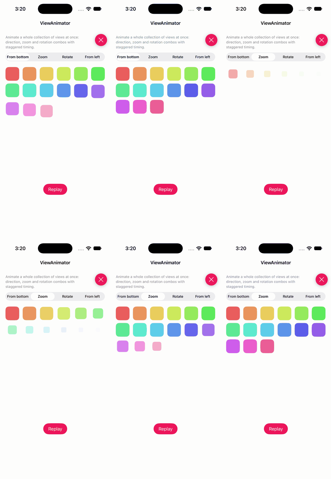
Animate collection and table view content with concise, reusable item animations.
▶ Live demo in the app SPM list collection stagger table view collection view animation
.package(url: "https://github.com/marcosgriselli/ViewAnimator", from: "3.1.0")Usage
Animate a list of views at once with direction, zoom and rotation animations and staggered timing.
let animations: [Animation]
switch picker.selectedSegmentIndex {
case 1: animations = [AnimationType.zoom(scale: 0.3)]
case 2: animations = [AnimationType.rotate(angle: .pi / 4), AnimationType.zoom(scale: 0.6)]
case 3: animations = [AnimationType.from(direction: .left, offset: 60)]
default: animations = [AnimationType.from(direction: .bottom, offset: 40), AnimationType.zoom(scale: 0.8)]
}
let cells = collectionView.visibleCells.sorted { lhs, rhs in
    (collectionView.indexPath(for: lhs) ?? IndexPath(item: 0, section: 0)) < (collectionView.indexPath(for: rhs) ?? IndexPath(item: 0, section: 0))
}
UIView.animate(views: cells, animations: animations, duration: 0.6)
no preview
ChenYilong · ★ 7.1K · ⟳ 2026-11 · MIT
Customisable tab bar controller with a raised centre button, badges and animated tab items.
SPM tabbar uikit badge tab bar center button objective-c
.package(url: "https://github.com/ChenYilong/CYLTabBarController", from: "1.99.67")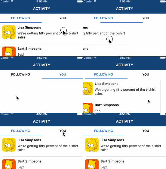
xmartlabs · ★ 7.0K · ⟳ 2023-11 · MIT
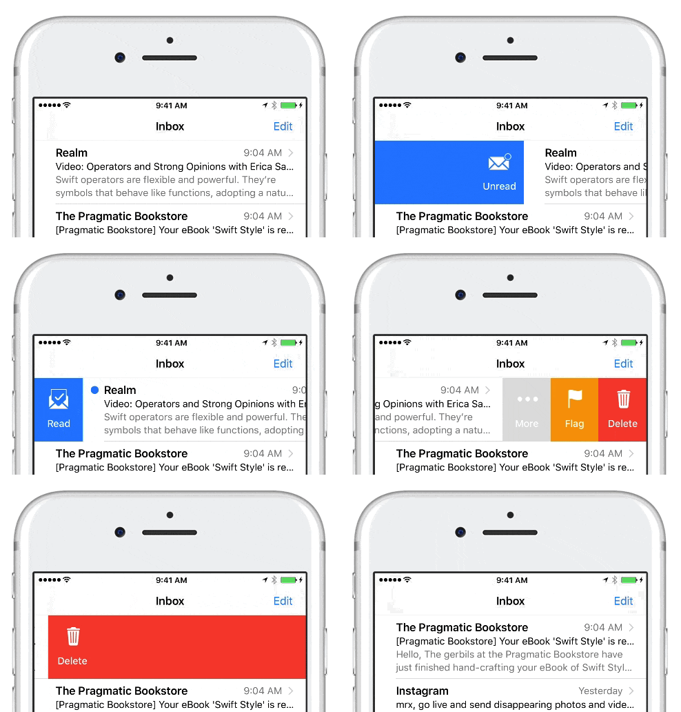
XLPagerTabStrip is a Container View Controller that allows us to switch easily among a collection of view controllers. Pan gesture can be used to move on to next or previous view controller. It shows a interactive indicator of the current, previous, next child view controllers.
▶ Live demo in the app SPM CocoaPods Carthage pager tabs paging segmented container swipe
.package(url: "https://github.com/xmartlabs/XLPagerTabStrip", from: "9.1.0")Usage
Subclass ButtonBarPagerTabStripViewController, style the button bar, return child controllers that provide IndicatorInfo.
settings.style.buttonBarBackgroundColor = .systemBackground
settings.style.buttonBarItemBackgroundColor = .systemBackground
settings.style.selectedBarBackgroundColor = DemoSupport.accent
settings.style.selectedBarHeight = 3
settings.style.buttonBarItemFont = .systemFont(ofSize: 15, weight: .semibold)
settings.style.buttonBarItemTitleColor = DemoSupport.title
settings.style.buttonBarItemsShouldFillAvailableWidth = true
settings.style.buttonBarMinimumLineSpacing = 0
settings.style.buttonBarLeftContentInset = 0
settings.style.buttonBarRightContentInset = 0

override func viewControllers(for pagerTabStripController: PagerTabStripViewController) -> [UIViewController] {
    [
        PagerChildViewController(title: "Transitions", symbol: "arrow.left.arrow.right", color: DemoSupport.accent),
        PagerChildViewController(title: "Menus", symbol: "line.3.horizontal", color: .systemIndigo),
        PagerChildViewController(title: "Loaders", symbol: "circle.dotted", color: .systemTeal),
    ]
}

func indicatorInfo(for pagerTabStripController: PagerTabStripViewController) -> IndicatorInfo {
    IndicatorInfo(title: tabTitle)
}
jerkoch · ★ 6.3K · ⟳ 2024-05 · MIT
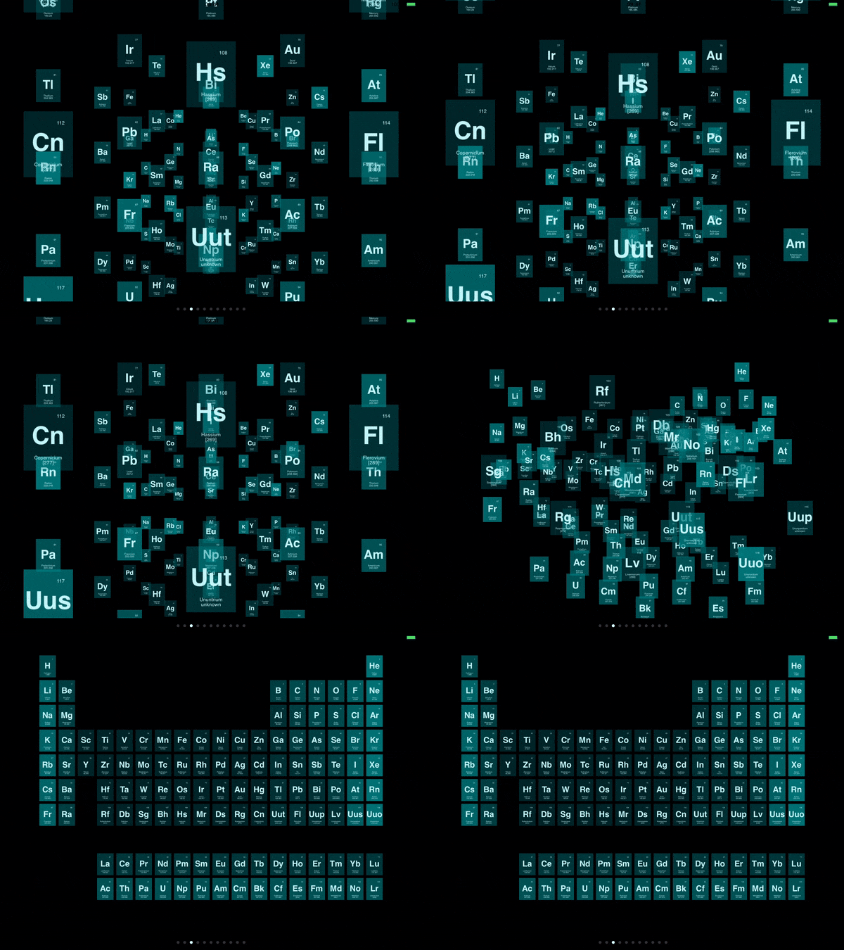
Swipeable UITableViewCell based on the stock Mail.app, implemented in Swift.
▶ Live demo in the app SPM CocoaPods Carthage swipe table view cell actions mail app drag
.package(url: "https://github.com/SwipeCellKit/SwipeCellKit", from: "2.7.1")Usage
Register SwipeTableViewCell, set its delegate, and return SwipeActions and SwipeOptions per orientation.
tableView.register(SwipeTableViewCell.self, forCellReuseIdentifier: "cell")

cell.delegate = self

func tableView(_ tableView: UITableView, editActionsForRowAt indexPath: IndexPath, for orientation: SwipeActionsOrientation) -> [SwipeAction]? {
    if orientation == .right {
        let delete = SwipeAction(style: .destructive, title: "Delete") { [weak self] _, indexPath in
            self?.items.remove(at: indexPath.row)
        }
        delete.image = UIImage(systemName: "trash")
        let flag = SwipeAction(style: .default, title: "Flag") { _, _ in }
        flag.image = UIImage(systemName: "flag")
        flag.backgroundColor = .systemOrange
        return [delete, flag]
    }
    let read = SwipeAction(style: .default, title: "Read") { _, _ in }
    read.image = UIImage(systemName: "envelope.open")
    read.backgroundColor = DemoSupport.accent
    return [read]
}

func tableView(_ tableView: UITableView, editActionsOptionsForRowAt indexPath: IndexPath, for orientation: SwipeActionsOrientation) -> SwipeOptions {
    var options = SwipeOptions()
    options.expansionStyle = orientation == .left ? .selection : .destructive
    options.transitionStyle = .border
    return options
}
exyte · ★ 6.0K · ⟳ 2024-02 · MIT
Powerful and easy-to-use vector graphics Swift library with SVG support
▶ Live demo in the app SPM CocoaPods Carthage vector svg drawing graphics animation
.package(url: "https://github.com/exyte/Macaw", from: "0.9.10")Usage
Build a scene graph of shapes, animate their placeVar, opacityVar and fillVar, and play the animations.
macawView = MacawView(node: makeScene(side: side), frame: CGRect(x: 0, y: 0, width: side, height: side))

animations.forEach { $0.play() }

let center = side / 2
let accent = Color(val: 0xEE165B)
let ring = Shape(form: Circle(cx: center, cy: center, r: 110), fill: nil, stroke: Stroke(fill: Color(val: 0xE1E4E8), width: 10))
let square = Shape(form: Rect(x: center - 44, y: center - 44, w: 88, h: 88), fill: Color(val: 0x5C6774))
let ball = Shape(form: Circle(cx: center + 110, cy: center, r: 22), fill: accent)
let dot = Shape(form: Circle(cx: center, cy: center - 110, r: 12), fill: Color(val: 0x4ECDC4))
animations = [
    ball.placeVar.animation(angle: .pi * 2, x: center, y: center, during: 3).cycle(),
    dot.placeVar.animation(angle: -.pi * 2, x: center, y: center, during: 5).cycle(),
    square.placeVar.animation(to: Transform.identity.rotate(angle: .pi / 2, x: center, y: center), during: 2).autoreversed().cycle(),
    square.opacityVar.animation(to: 0.35, during: 1.5).autoreversed().cycle(),
    ball.fillVar.animation(to: Color(val: 0x8E44AD), during: 1.5).autoreversed().cycle(),
]
return Group(contents: [ring, square, ball, dot])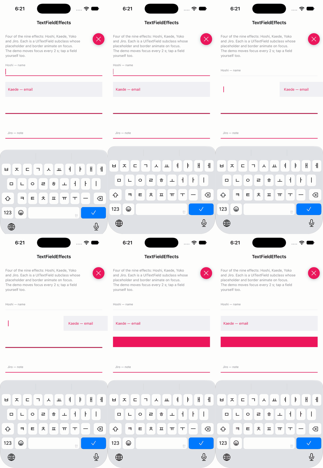
raulriera · ★ 6.0K · ⟳ 2024-01 · MIT
Text field subclasses with the Codrops entrance effects: floating labels, underlines and borders that animate on focus.
▶ Live demo in the app SPM textfield input focus text field floating label form
.package(url: "https://github.com/raulriera/TextFieldEffects", from: "1.7.0")Usage
Drop-in UITextField subclasses; set placeholder and the effect's colours, the animation plays on focus.
let hoshi = HoshiTextField()                    // underline grows, placeholder floats up
hoshi.placeholder = "Hoshi — name"
hoshi.borderInactiveColor = DemoSupport.hairline
hoshi.borderActiveColor = DemoSupport.accent
hoshi.placeholderColor = .secondaryLabel

let kaede = KaedeTextField()                    // placeholder slides right, field slides in
kaede.placeholder = "Kaede — email"
kaede.placeholderColor = DemoSupport.accent
kaede.foregroundColor = .secondarySystemBackground

let yoko = YokoTextField()                      // 3D flip reveals the field
yoko.placeholder = "Yoko — city"
yoko.placeholderColor = .white
yoko.foregroundColor = DemoSupport.accent

let jiro = JiroTextField()                      // the border fills from the bottom
jiro.placeholder = "Jiro — note"
jiro.borderColor = DemoSupport.accent
jiro.placeholderColor = .secondaryLabel
jonkykong · ★ 5.8K · ⟳ 2023-02 · MIT
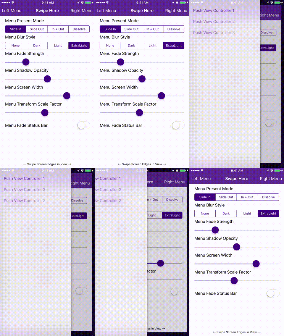
Simple side menu control for iOS in Swift inspired by Facebook. Right and Left sides. No coding required. iOS 8+.
▶ Live demo in the app SPM CocoaPods Carthage side menu drawer navigation hamburger menu storyboard
.package(url: "https://github.com/jonkykong/SideMenu", from: "6.5.0")Usage
Configure SideMenuManager with the menu navigation controllers, gestures and presentation mode.
SideMenuManager.default.menuEnableSwipeGestures = true
// Define the menus
SideMenuManager.default.menuLeftNavigationController = storyboard!.instantiateViewController(withIdentifier: "LeftMenuNavigationController") as? UISideMenuNavigationController
SideMenuManager.default.menuRightNavigationController = storyboard!.instantiateViewController(withIdentifier: "RightMenuNavigationController") as? UISideMenuNavigationController

// Enable gestures. The left and/or right menus must be set up above for these to work.
// Note that these continue to work on the Navigation Controller independent of the View Controller it displays!
SideMenuManager.default.menuAddPanGestureToPresent(toView: self.navigationController!.navigationBar)
SideMenuManager.default.menuAddScreenEdgePanGesturesToPresent(toView: self.navigationController!.view)

SideMenuManager.default.menuPresentMode = .viewSlideOut

let modes:[SideMenuManager.MenuPresentMode] = [.menuSlideIn, .viewSlideOut, .viewSlideInOut, .menuDissolveIn]
SideMenuManager.default.menuPresentMode = modes[segmentControl.selectedSegmentIndex]
Ramotion · ★ 5.5K · ⟳ 2020-04 · MIT
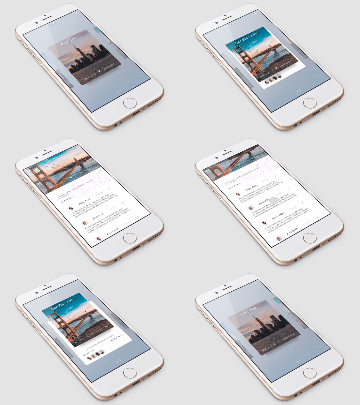
ExpandingCollection is an animated material design UI card peek/pop controller.
▶ Live demo in the app SPM CocoaPods Carthage Inactive since 2020 card collection view expand stack material design preview
.package(url: "https://github.com/Ramotion/expanding-collection", from: "3.1.0")Usage
Subclass ExpandingViewController, set itemSize, and push the detail with pushToViewController.
itemSize = CGSize(width: 256, height: 335)

// double swipe Up transition
if cell.isOpened == true && sender.direction == .up {
    pushToViewController(getViewController())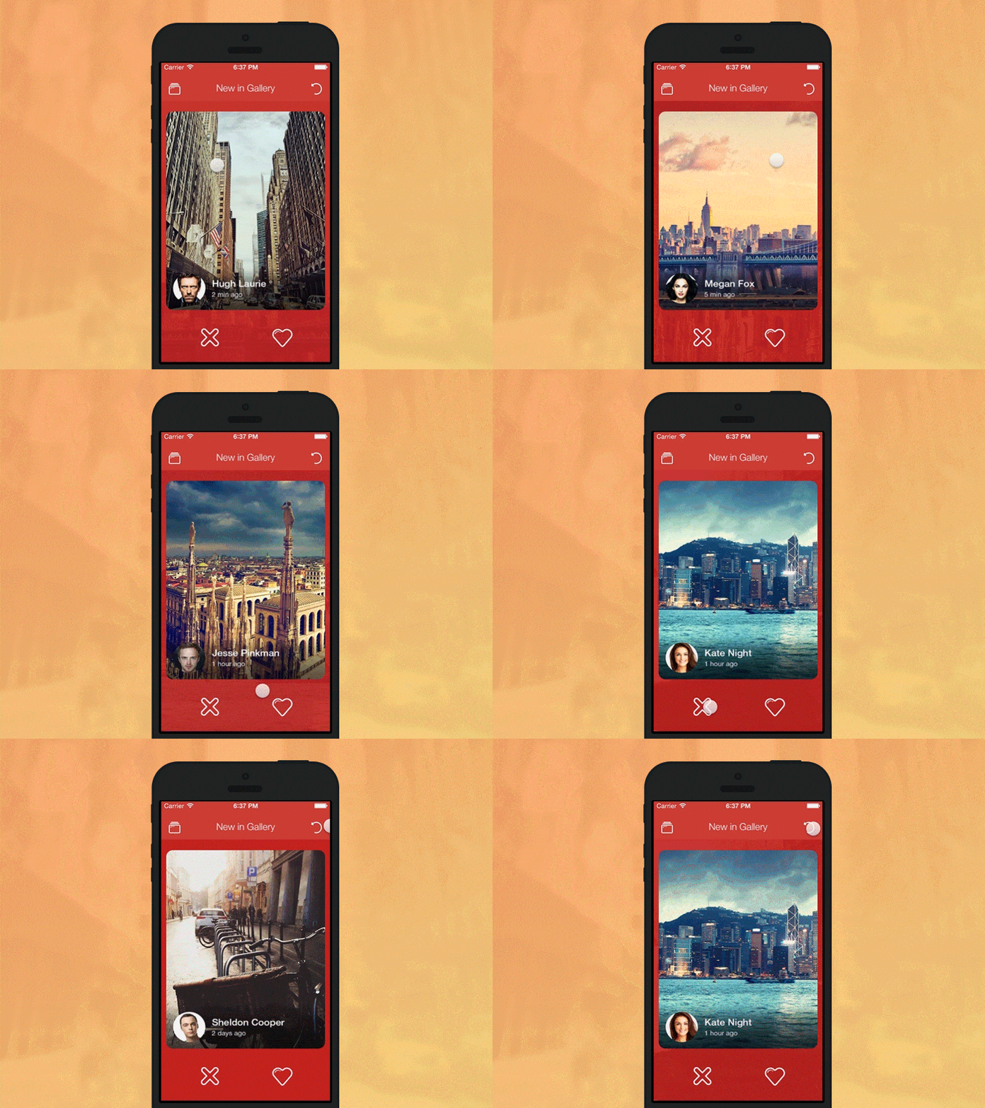
Yalantis · ★ 5.4K · ⟳ 2024-05 · MIT
KolodaView is a class designed to simplify the implementation of Tinder like cards on iOS.
▶ Live demo in the app CocoaPods Carthage card swipe tinder stack collection view gesture
Usage
KolodaView takes a data source and delegate for cards; swipe programmatically or revert the last action.
kolodaView.dataSource = self
kolodaView.delegate = self

@IBAction func leftButtonTapped() {
    kolodaView?.swipe(.left)
}

@IBAction func rightButtonTapped() {
    kolodaView?.swipe(.right)
}

func kolodaNumberOfCards(_ koloda: KolodaView) -> Int {
    return dataSource.count
}

func kolodaSpeedThatCardShouldDrag(_ koloda: KolodaView) -> DragSpeed {
    return .default
}

func koloda(_ koloda: KolodaView, viewForCardAt index: Int) -> UIView {
    return UIImageView(image: dataSource[Int(index)])
}
philackm · ★ 5.3K · ⟳ 2020-12 · MIT
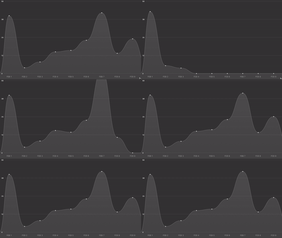
An adaptive scrollable graph view for iOS to visualise simple discrete datasets. Written in Swift.
CocoaPods Carthage Inactive since 2020 chart graph line chart data visualization scroll
no preview
eggswift · ★ 5.2K · ⟳ 2023-05 · MIT
Tab bar controller with customisable item animations, badges and a highlighted centre item.
SPM tabbar badge uikit tab bar center button objective-c
.package(url: "https://github.com/eggswift/ESTabBarController", from: "2.9.0-spm")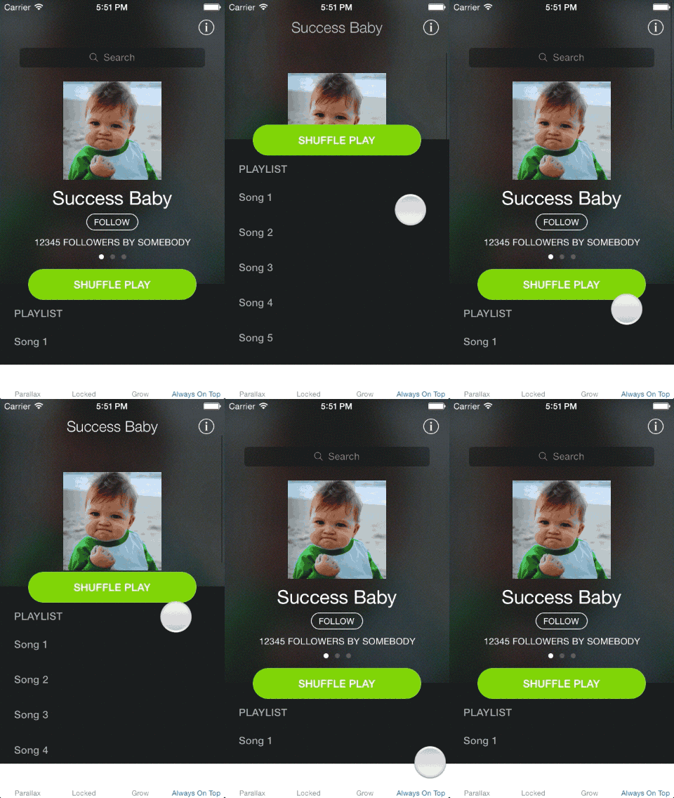
CSStickyHeaderFlowLayout · ★ 5.0K · ⟳ 2021-07 · MIT
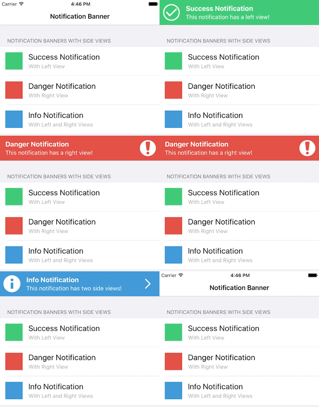
UICollectionView replacement of UITableView. Do even more like Parallax Header, Sticky Section Header. Made for iOS 7.
CocoaPods Carthage parallax sticky header collection view layout header
Daltron · ★ 4.9K · ⟳ 2024-07 · MIT
NotificationBanner is an extremely customizable and lightweight library that makes the task of displaying in app notification banners and drop down alerts an absolute breeze in iOS.
▶ Live demo in the app SPM CocoaPods Carthage banner notification toast in app status bar alert
.package(url: "https://github.com/Daltron/NotificationBanner", from: "3.2.0")Usage
Create a NotificationBanner or StatusBarNotificationBanner with a style and show it, optionally at a queue position.
let banner = NotificationBanner(title: "Basic Success Notification",
                                subtitle: "Extremely Customizable!",
                                style: .success)

banner.show(queuePosition: selectedQueuePosition())

let banner = StatusBarNotificationBanner(title: "Success Status Bar Notification", style: .success)
banner.show(queuePosition: selectedQueuePosition())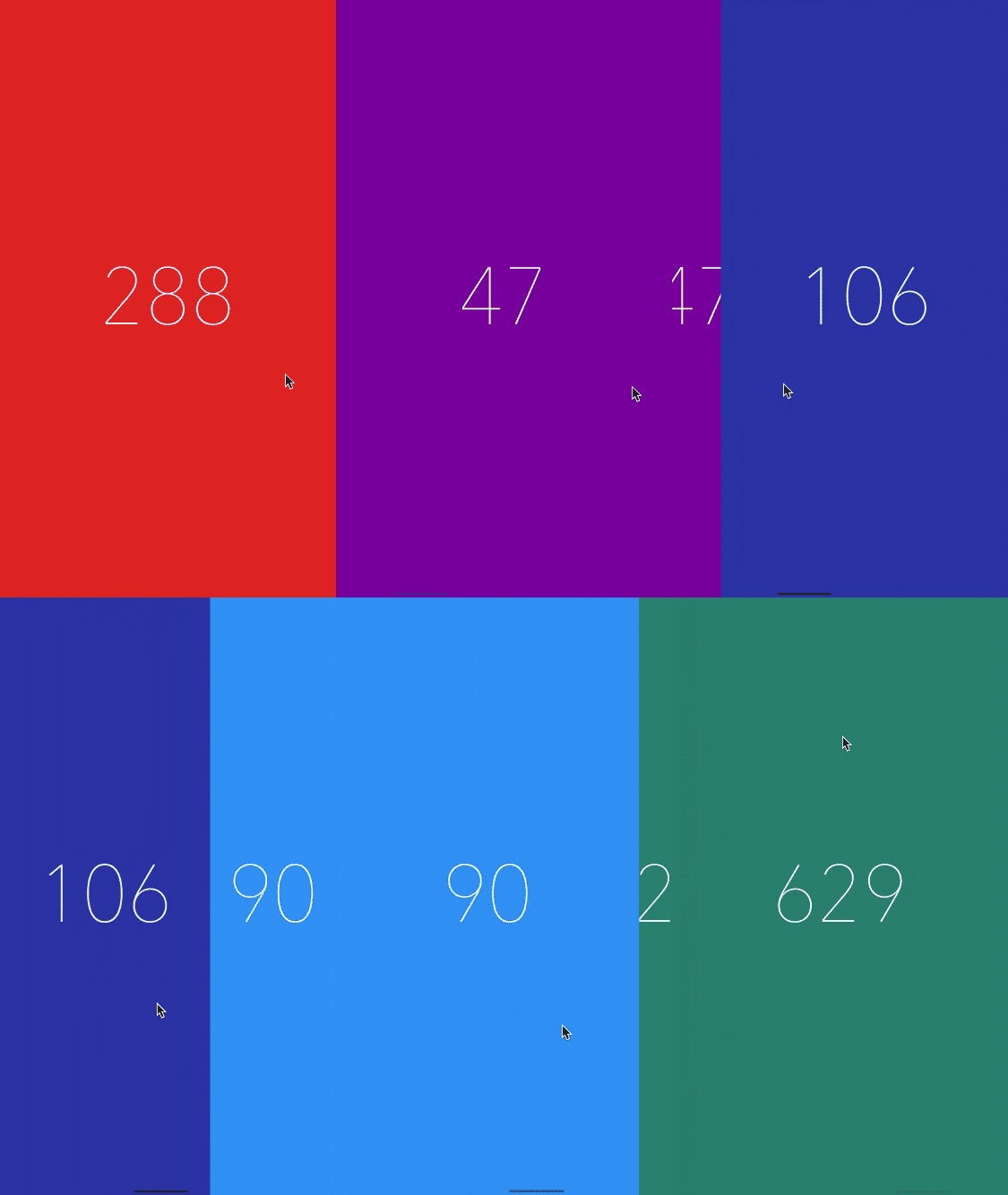
KelvinJin · ★ 4.9K · ⟳ 2020-09 · MIT
A UICollectionViewLayout subclass that adds custom transitions/animations to the UICollectionView without effecting your existing code.
▶ Live demo in the app SPM CocoaPods Inactive since 2020 collection layout paging carousel transition collection view
.package(url: "https://github.com/KelvinJin/AnimatedCollectionViewLayout", from: "1.1.0")Usage
Set the layout's animator and scrollDirection; items animate as they scroll into view.
if let layout = collectionView?.collectionViewLayout as? AnimatedCollectionViewLayout {
    layout.scrollDirection = direction
    layout.animator = animator?.0
}
no preview
Storehouse · ★ 4.5K · ⟳ 2022-05 · BSD-2-Clause
A physics-based animation framework for direct manipulation, gestures, and playful interface motion.
SPM Archived physics gesture simulation spring interactive animation engine
.package(url: "https://github.com/timdonnelly/Advance", from: "3.1.0")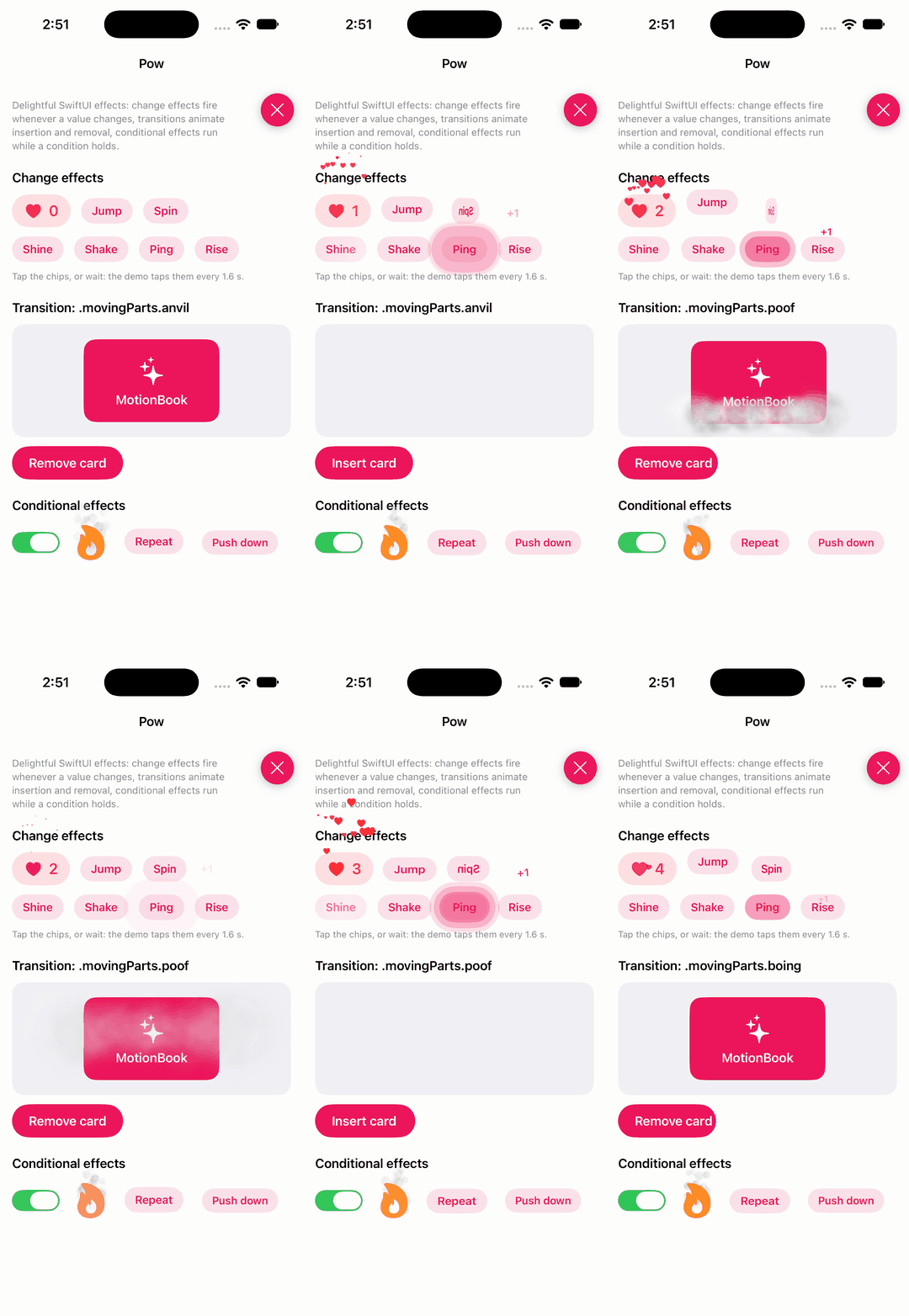
EmergeTools · ★ 4.4K · ⟳ 2026-04 · MIT
Delightful SwiftUI effects for your app
▶ Live demo in the app SwiftUI SPM swiftui effects transitions particles change effect animation
.package(url: "https://github.com/EmergeTools/Pow", from: "1.0.5")Usage
Change effects fire when a value changes, transitions animate insertion and removal, conditional effects run while a condition holds.
.changeEffect(.spray(origin: .center) { Image(systemName: "heart.fill").foregroundColor(.red) }, value: likes, isEnabled: isLiked)

.changeEffect(.jump(height: 24), value: taps)

.changeEffect(.spin, value: taps)

    .conditionalEffect(.smoke, condition: isSmoking)
Text("Repeat").demoChip()

    .conditionalEffect(.repeat(.jump(height: 12), every: 1.2), condition: true)
Text("Push down").demoChip()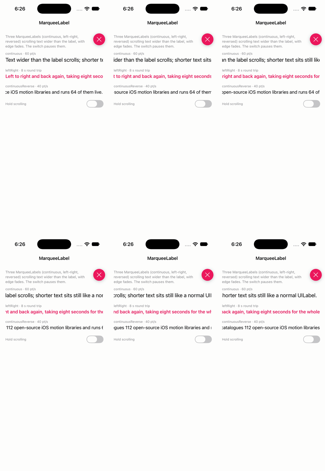
cbpowell · ★ 4.3K · ⟳ 2025-09 · MIT
UILabel replacement that scrolls text that does not fit, with configurable speed, fade and direction.
▶ Live demo in the app SPM label text scroll marquee ticker uilabel
.package(url: "https://github.com/cbpowell/MarqueeLabel", from: "4.5.3")Usage
MarqueeLabel(frame:rate:fadeLength:) scrolls text that does not fit; type, delay and buffers tune the marquee.
let marquee = MarqueeLabel(frame: .zero, rate: 60, fadeLength: 12)   // 60 points per second, 12 pt fade at both edges
marquee.type = .continuous           // .leftRight, .rightLeft, .continuousReverse
marquee.animationDelay = 1           // seconds before each pass
marquee.trailingBuffer = 24          // gap between repeats
marquee.text = "Text wider than the label scrolls; shorter text sits still like a normal UILabel."
PaoloCuscela · ★ 4.2K · ⟳ 2023-04 · MIT
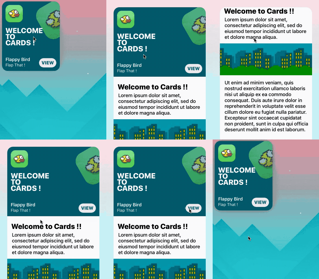
Awesome iOS 11 appstore cards in swift 4.
CocoaPods card app store uikit storyboard today ibdesignable
cruffenach · ★ 4.1K · ⟳ 2026-10 · MIT
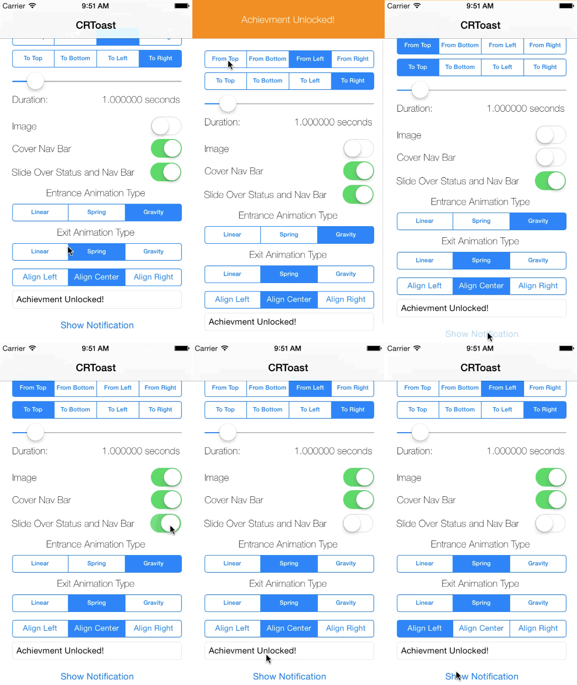
CRToast is a library that allows you to easily create notifications that appear on top of or by pushing out the status bar or navigation bar.
▶ Live demo in the app SPM CocoaPods Carthage toast notification status bar banner objective-c
.package(url: "https://github.com/cruffenach/CRToast", from: "0.0.9")Usage
Build an options dictionary with the kCRToast keys and show it through CRToastManager.
    [CRToastManager showNotificationWithOptions:[self options]
                                 apperanceBlock:^(void) {
//                                     NSLog(@"Appeared");
                                 }
                                completionBlock:^(void) {
//                                    NSLog(@"Completed");
                                }];

[CRToastManager dismissNotification:YES];

NSMutableDictionary *options = [@{kCRToastNotificationTypeKey               : self.coverNavBarSwitch.on ? @(CRToastTypeNavigationBar) : @(CRToastTypeStatusBar),
                                  kCRToastNotificationPresentationTypeKey   : self.slideOverSwitch.on ? @(CRToastPresentationTypeCover) : @(CRToastPresentationTypePush),
                                  kCRToastUnderStatusBarKey                 : @(self.slideUnderSwitch.on),
                                  kCRToastTextKey                           : self.txtNotificationMessage.text,
                                  kCRToastTextAlignmentKey                  : @(self.textAlignment),
                                  kCRToastTimeIntervalKey                   : @(self.sliderDuration.value),
                                  kCRToastAnimationInTypeKey                : @(CRToastAnimationTypeFromSegmentedControl(_inAnimationTypeSegmentedControl)),
                                  kCRToastAnimationOutTypeKey               : @(CRToastAnimationTypeFromSegmentedControl(_outAnimationTypeSegmentedControl)),
                                  kCRToastAnimationInDirectionKey           : @(self.segFromDirection.selectedSegmentIndex),
                                  kCRToastAnimationOutDirectionKey          : @(self.segToDirection.selectedSegmentIndex),
                                  kCRToastNotificationPreferredPaddingKey   : @(self.sliderPadding.value)} mutableCopy];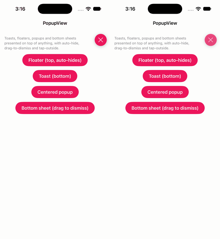
exyte · ★ 4.1K · ⟳ 2026-11 · MIT
Toasts and popups library written with SwiftUI
▶ Live demo in the app SwiftUI SPM swiftui toast popup banner notification
.package(url: "https://github.com/exyte/PopupView", from: "5.0.9")Usage
Attach .popup to any view; the customize closure picks type, position, animation, auto-hide and display mode.
.popup(isPresented: $showFloater) {
    PopupCard(icon: "bell.fill", title: "Floater", message: "Slides in from the top and hides after 5 s.")
} customize: {
    $0.type(.floater()).position(.top).animation(.spring()).autohideIn(5).displayMode(.overlay)
}

} customize: {
    $0.type(.toast).position(.bottom).dragToDismiss(true).closeOnTapOutside(true).backgroundColor(.black.opacity(0.4)).displayMode(.overlay)
}
Orderella · ★ 4.0K · ⟳ 2024-02 · MIT
A simple, customizable popup dialog for iOS written in Swift. Replaces UIAlertController alert style.
▶ Live demo in the app SPM CocoaPods Carthage popup dialog alert modal overlay
.package(url: "https://github.com/Orderella/PopupDialog", from: "1.1.1")Usage
PopupDialog with title, message and image; add CancelButton/DefaultButton actions and present it.
let popup = PopupDialog(title: title, message: message, image: image)

// Create first button
let buttonOne = CancelButton(title: "CANCEL") {
    self.label.text = "You canceled the car dialog."
}

// Create second button
let buttonTwo = DefaultButton(title: "ADMIRE CAR") {
    self.label.text = "What a beauty!"
}

// Create third button
let buttonThree = DefaultButton(title: "BUY CAR") {
    self.label.text = "Ah, maybe next time :)"
}

// Add buttons to dialog
popup.addButtons([buttonOne, buttonTwo, buttonThree])

// Present dialog
self.present(popup, animated: animated, completion: nil)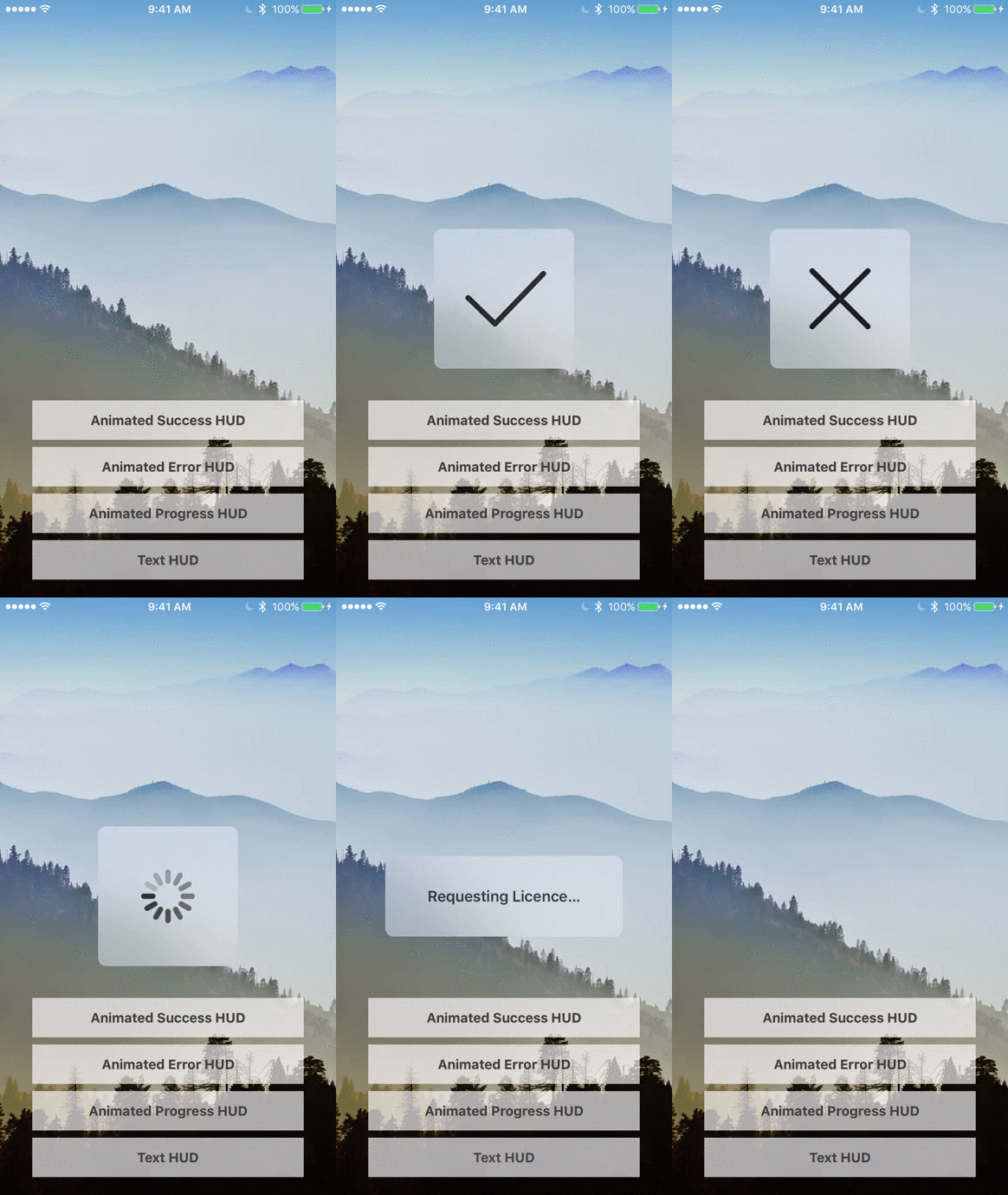
pkluz · ★ 3.8K · ⟳ 2023-02 · MIT
A Swift based reimplementation of the Apple HUD (Volume, Ringer, Rotation,…) for iOS 8.
▶ Live demo in the app SPM CocoaPods Carthage hud loading progress apple overlay
.package(url: "https://github.com/pkluz/PKHUD", from: "5.4.0")Usage
HUD.show / HUD.flash with built-in content types; onView keeps it inside a view instead of the whole window.
PKHUD.sharedHUD.dimsBackground = true

makeButton("Success") { HUD.flash(.success, delay: 1.0) },
makeButton("Error") { HUD.flash(.error, delay: 1.0) },

HUD.show(.labeledProgress(title: "Loading", subtitle: "fetching stars"))
DispatchQueue.main.asyncAfter(deadline: .now() + 1.5) { HUD.flash(.labeledSuccess(title: "Done", subtitle: "103 libraries"), delay: 1.0) }

HUD.show(.labeledProgress(title: "Loading", subtitle: "PKHUD"), onView: view)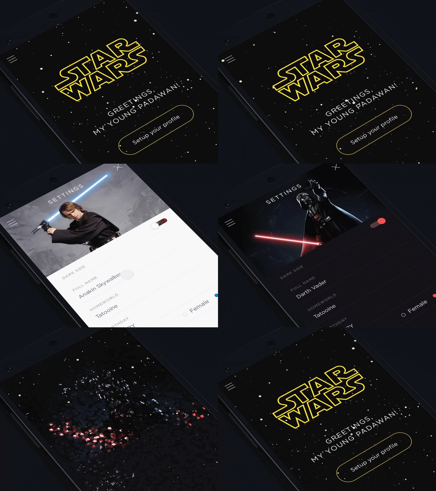
Yalantis · ★ 3.8K · ⟳ 2022-10 · MIT
This component implements transition animation to crumble view-controller into tiny pieces.
CocoaPods transition crumble particles uidynamics effect
cruisediary · ★ 3.5K · ⟳ 2026-03 · MIT
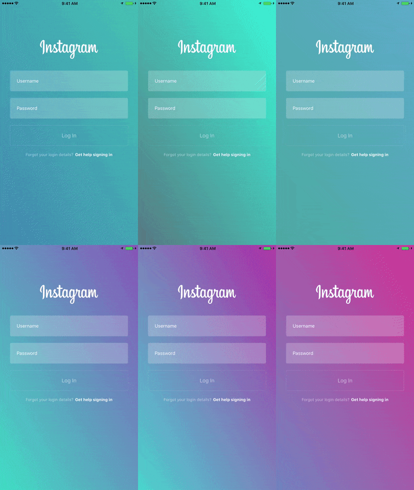
🎨Gradient animation effect like Instagram
▶ Live demo in the app SPM CocoaPods Carthage gradient background branding instagram animation
.package(url: "https://github.com/cruisediary/Pastel", from: "1.0.0")Usage
PastelView animates a gradient between the given colours; insert it behind your content and start.
let pastelView = PastelView(frame: view.bounds)
pastelView.animationDuration = 3.0

pastelView.setColors([UIColor(red: 156/255, green: 39/255, blue: 176/255, alpha: 1.0),
                      UIColor(red: 255/255, green: 64/255, blue: 129/255, alpha: 1.0),
                      UIColor(red: 123/255, green: 31/255, blue: 162/255, alpha: 1.0),
                      UIColor(red: 32/255, green: 76/255, blue: 255/255, alpha: 1.0),
                      UIColor(red: 32/255, green: 158/255, blue: 255/255, alpha: 1.0),
                      UIColor(red: 90/255, green: 120/255, blue: 127/255, alpha: 1.0),
                      UIColor(red: 58/255, green: 255/255, blue: 217/255, alpha: 1.0)])

pastelView.startAnimation()
view.insertSubview(pastelView, at: 0)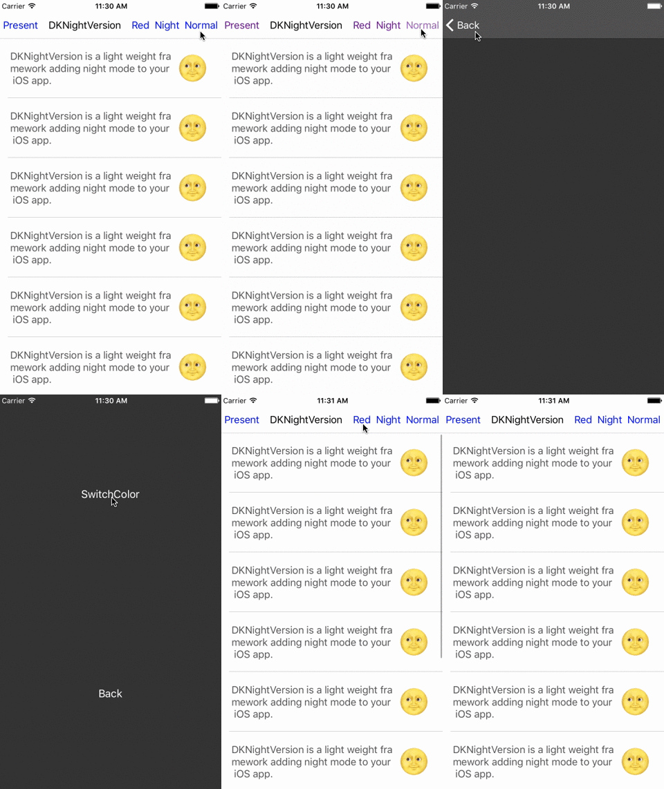
Draveness · ★ 3.5K · ⟳ 2019-09 · MIT
Manage Colors, Integrate Night/Multiple Themes
CocoaPods Carthage Archived theme night mode dark mode colors objective-c
Ramotion · ★ 3.4K · ⟳ 2022-07 · MIT
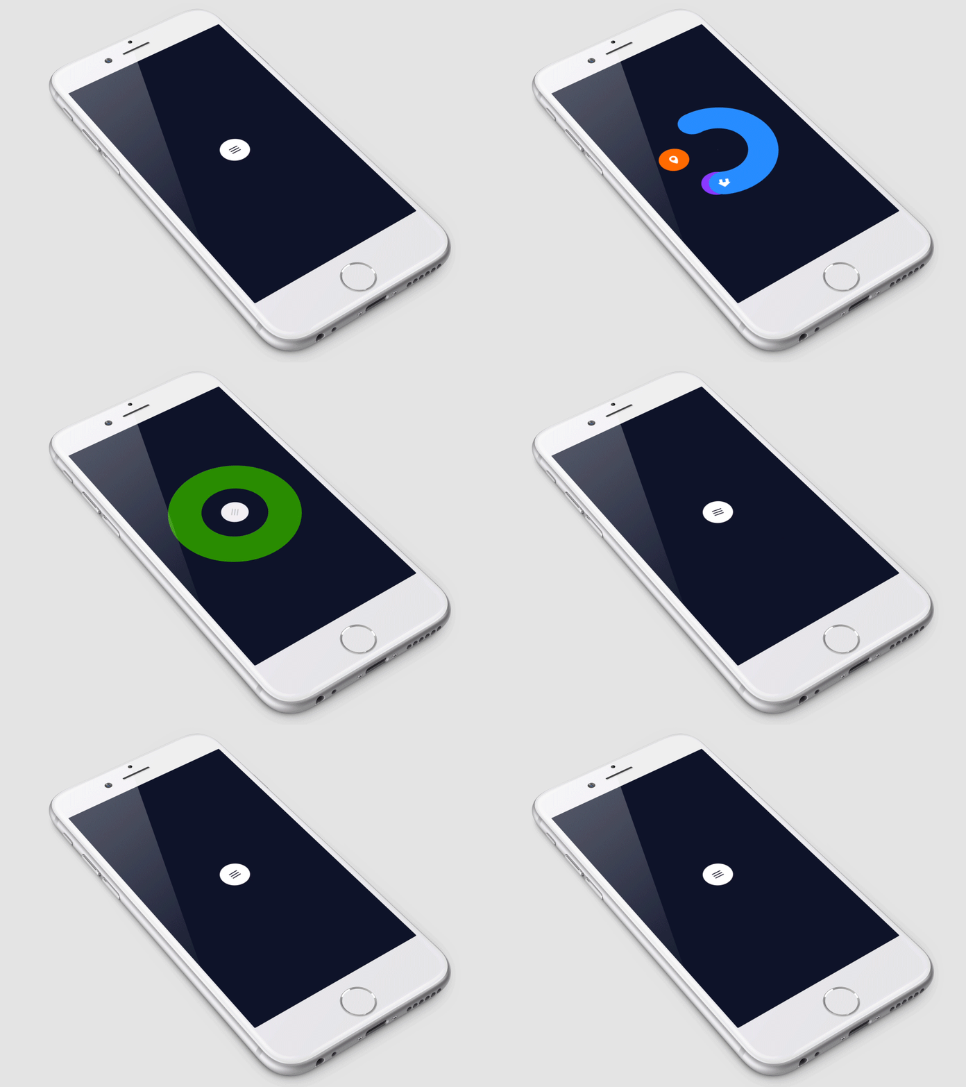
CircleMenu is a simple, elegant UI menu with a circular layout and material design animations.
▶ Live demo in the app SPM CocoaPods Carthage menu circular radial buttons animation material design
.package(url: "https://github.com/Ramotion/circle-menu", from: "4.1.0")Usage
CircleMenu is a UIButton subclass; the delegate configures each item as it is displayed.
button.delegate = self

func circleMenu(_ circleMenu: CircleMenu, willDisplay button: UIButton, atIndex: Int) {
    button.backgroundColor = items[atIndex].color

    button.setImage(UIImage(named: items[atIndex].icon, in: .module, compatibleWith: nil), for: .normal)

    let highlightedImage  = UIImage(named: items[atIndex].icon, in: .module, compatibleWith: nil)?.withRenderingMode(.alwaysTemplate)
    button.setImage(highlightedImage, for: .highlighted)
    button.tintColor = UIColor(red: 0, green: 0, blue: 0, alpha: 0.3)
}
dekatotoro · ★ 3.4K · ⟳ 2023-09 · MIT
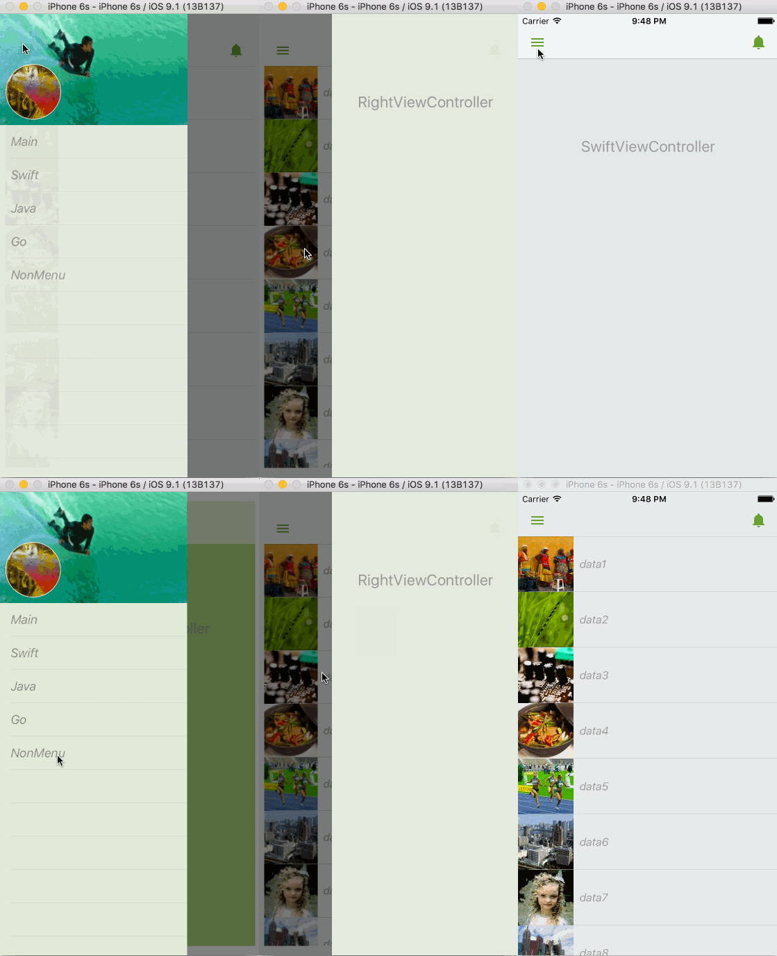
iOS Slide Menu View based on Google+, iQON, Feedly, Ameba iOS app. It is written in pure swift.
CocoaPods Carthage side menu drawer slide menu navigation menu
no preview
IFTTT · ★ 3.3K · ⟳ 2023-10 · MIT
Create scroll-driven onboarding and storytelling animations without hand-wiring every offset.
CocoaPods onboarding scroll story walkthrough keyframes

shoheiyokoyama · ★ 3.3K · ⟳ 2025-06 · MIT
Gemini is rich scroll based animation framework for iOS, written in Swift.
CocoaPods Carthage scroll collection view 3d animation carousel effects
andreamazz · ★ 3.3K · ⟳ 2020-11 · MIT
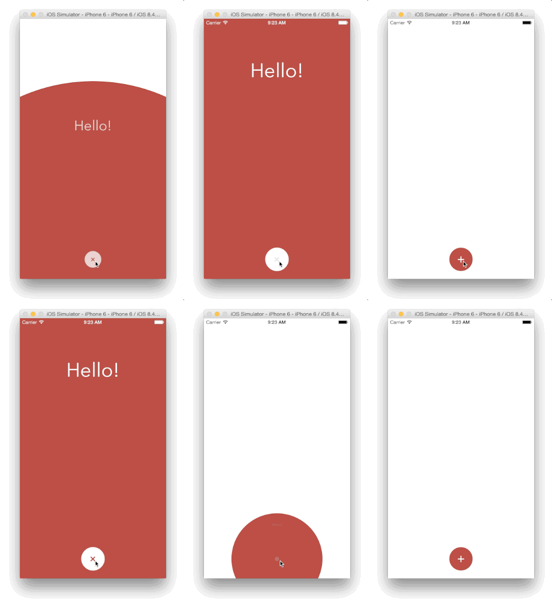
A custom modal transition that presents and dismiss a controller inside an expanding and shrinking bubble.
SPM CocoaPods Carthage Inactive since 2020 transition modal bubble circular present
.package(url: "https://github.com/andreamazz/BubbleTransition", from: "3.1.1")no preview
kaishin · ★ 3.2K · ⟳ 2025-08 ·
Animated GIF playback for UIImageView with frame caching and memory control.
SPM gif image uikit animated image uiimageview
.package(url: "https://github.com/kaishin/Gifu", from: "4.0.1")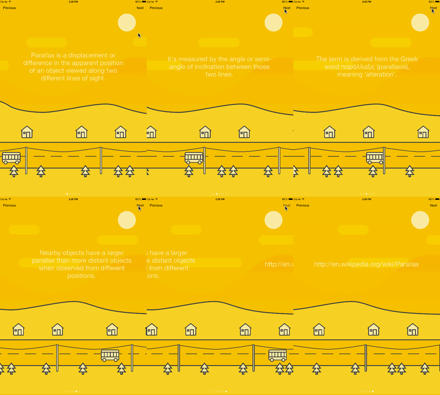
hyperoslo · ★ 3.1K · ⟳ 2020-06 · MIT
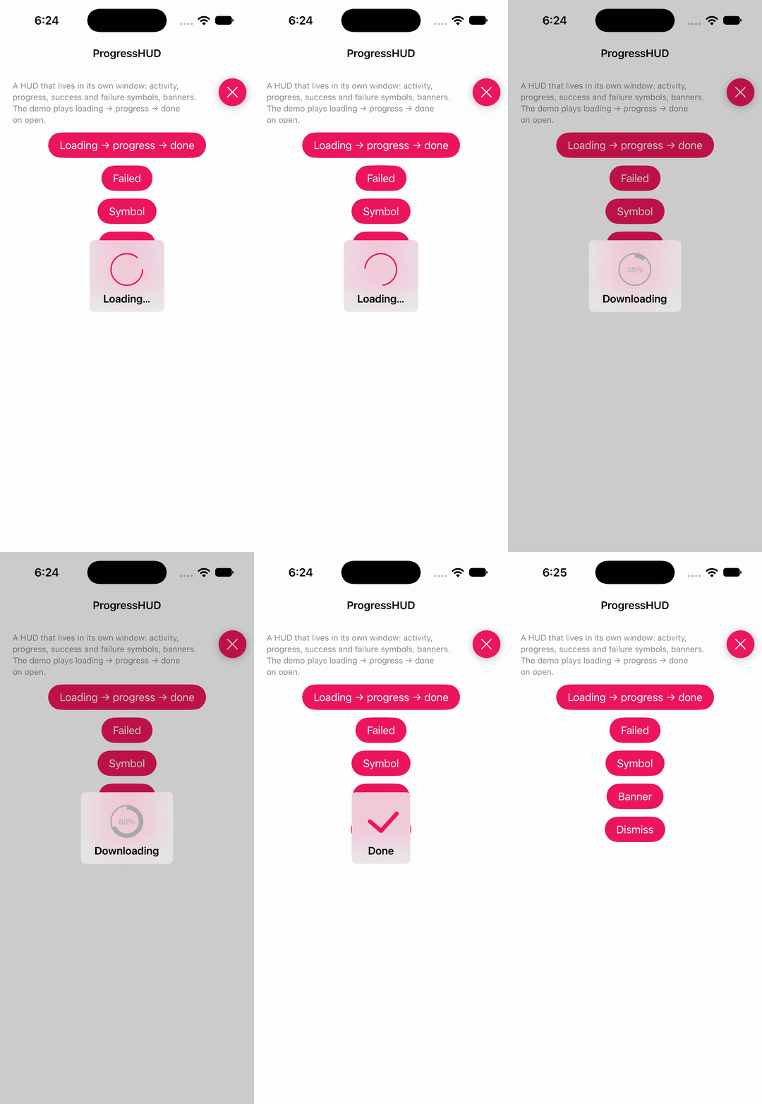
Looking for the easiest way of presenting something in your iOS app? Then you are in the right place. Presentation will help you make your tutorials, release notes and any kind of animated pages with the minimum amount of effort.
CocoaPods Carthage Inactive since 2020 onboarding slides pages walkthrough tutorial presentation
relatedcode · ★ 3.0K · ⟳ 2026-09 · MIT
Lightweight HUD with progress, activity-indicator and symbol animations plus banners.
▶ Live demo in the app SPM hud loading progress activity indicator banner spinner
.package(url: "https://github.com/relatedcode/ProgressHUD", from: "15.0.3")Usage
Static calls: animate, progress, succeed, failed, symbol, banner; colours and animation type are global settings.
ProgressHUD.colorAnimation = DemoSupport.accent     // tint of the animation and the progress ring
ProgressHUD.animationType = .circleStrokeSpin        // one of ~20 built-in animations

ProgressHUD.animate("Loading…", .circleStrokeSpin)           // text is optional; interaction stays enabled
after(1.2) { ProgressHUD.progress("Downloading", 0.35) }    // 0...1 on a ring
after(2.0) { ProgressHUD.progress("Downloading", 0.8) }
after(2.8) { ProgressHUD.succeed("Done", delay: 1.2) }       // checkmark, then hides itself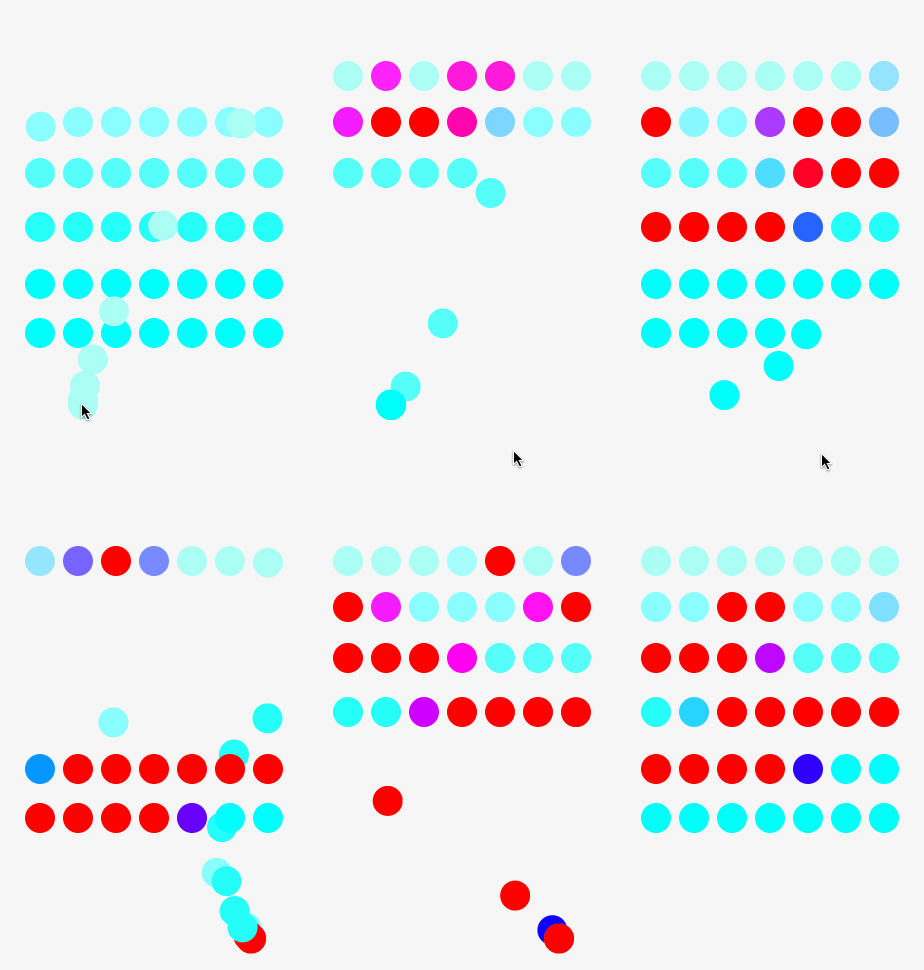
AugustRush · ★ 2.9K · ⟳ 2019-07 · MIT
A fantastic Physical animation library for swift(Not Just Spring !!!), it is base on UIDynamic and extension to it, friendly APIs make you use it or custom your own animation very easily!
SPM CocoaPods Carthage Inactive since 2019 physics uidynamics animation spring gravity snap
.package(url: "https://github.com/AugustRush/Stellar", from: "0.67")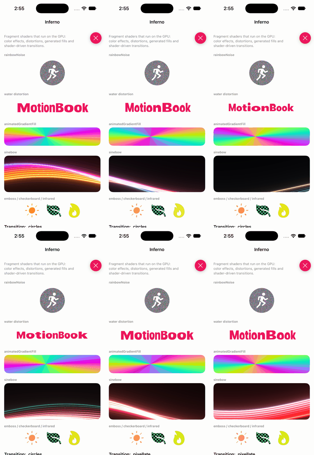
twostraws · ★ 2.9K · ⟳ 2026-05 · MIT
Metal shaders for SwiftUI.
▶ Live demo in the app SwiftUI SPM swiftui metal shaders effects gpu
.package(url: "https://github.com/twostraws/Inferno", from: "1.1.0")Usage
Metal shaders as SwiftUI modifiers: colour effects, distortions, generated fills and shader-driven transitions, driven by a TimelineView clock.
("circles", .circles()),
("pixellate", .pixellate()),
("genie", .genie()),

TimelineView(.animation) { timeline in
    let time = timeline.date.timeIntervalSince(start) // seconds since the view appeared: shaders take a Float

Image(systemName: "figure.run.circle.fill")
    .font(.system(size: 96))
    .rainbowNoise(time: time)

.distortionEffect(
    InfernoShaderLibrary.water(.float2(300, 80), .float(time), .float(3), .float(3), .float(10)),
    maxSampleOffset: CGSize(width: 12, height: 12)
)

.colorEffect(InfernoShaderLibrary.animatedGradientFill(.float2(320, 70), .float(time)))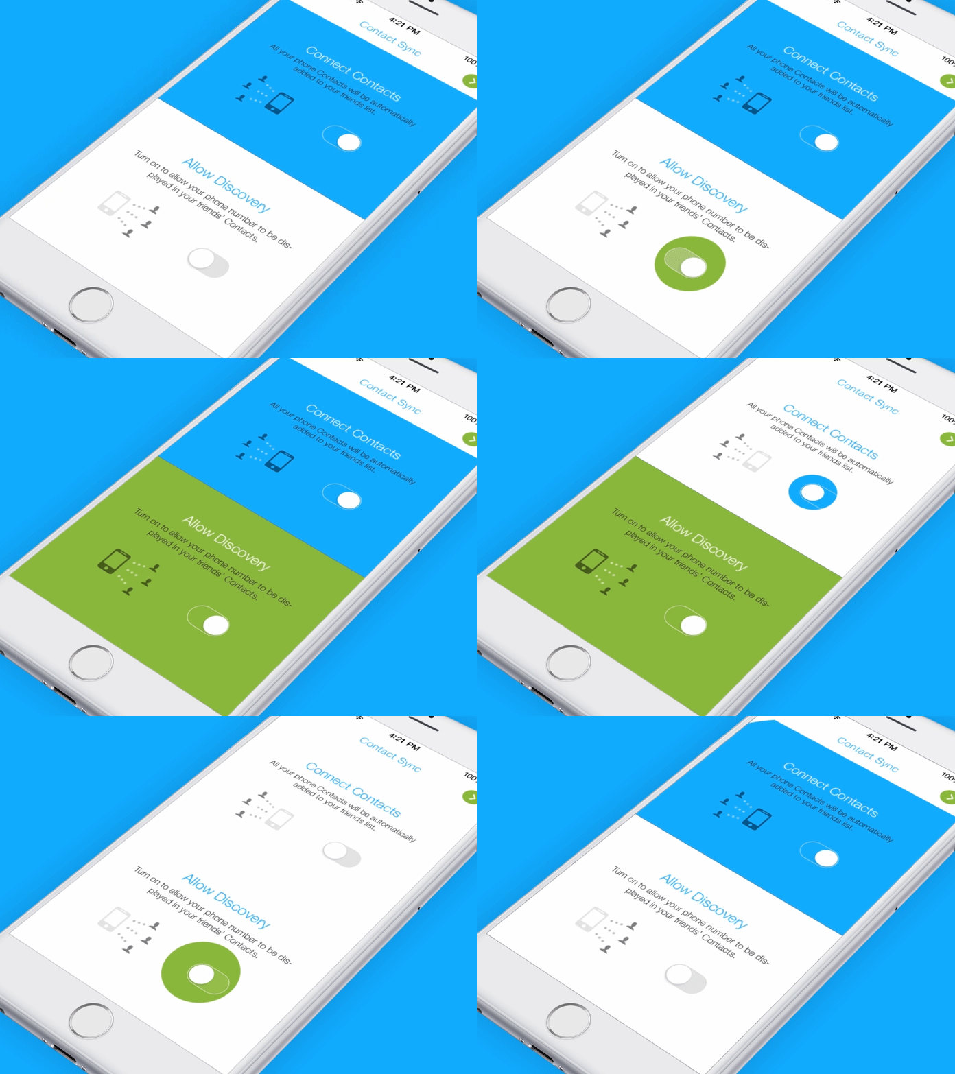
Ramotion · ★ 2.9K · ⟳ 2022-01 · MIT
RAMPaperSwitch is a Swift material design UI module which paints over the parent view when the switch is turned on.
SPM CocoaPods Carthage switch toggle material design fill uiswitch
.package(url: "https://github.com/Ramotion/paper-switch", from: "3.1.0")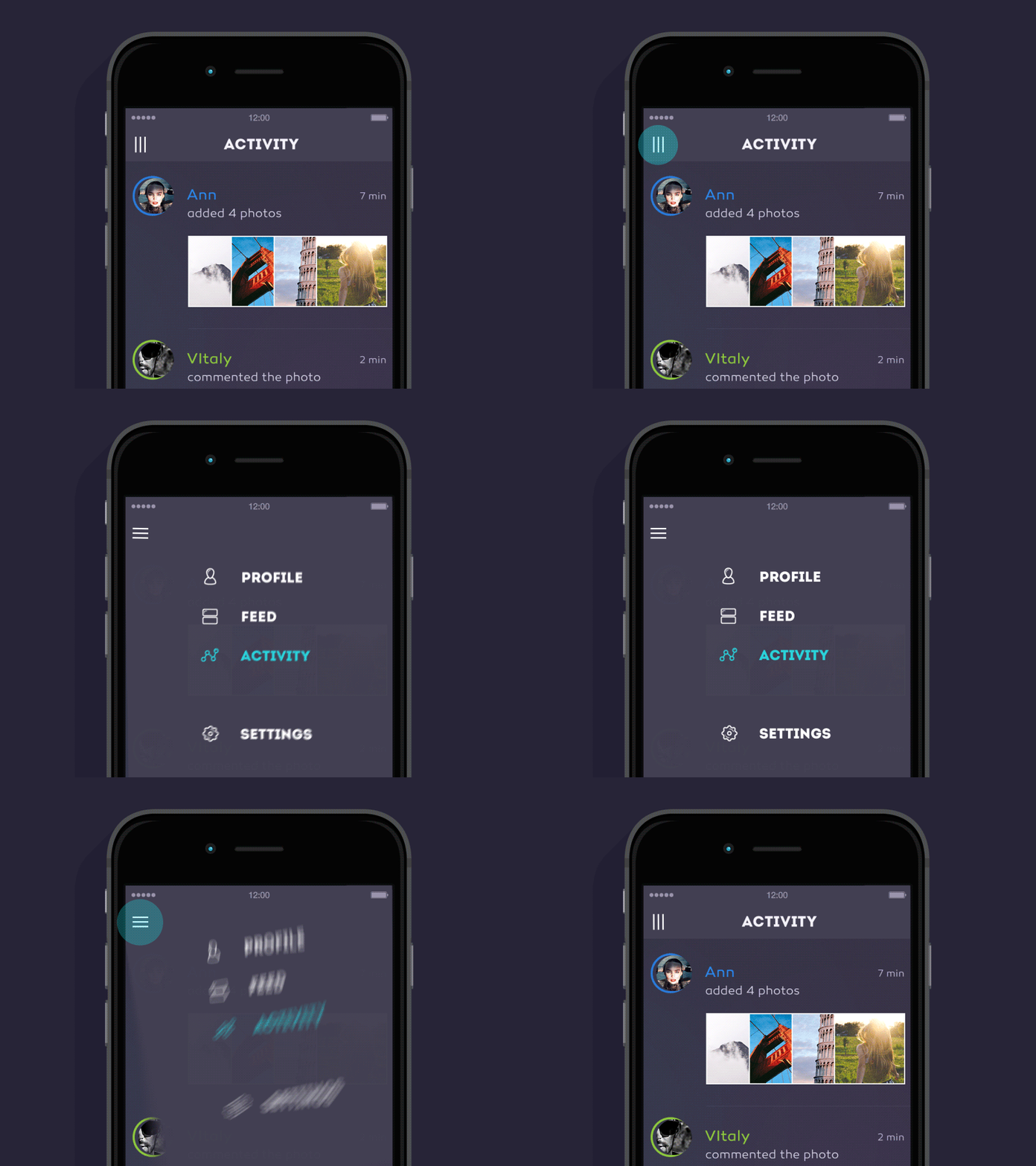
Yalantis · ★ 2.9K · ⟳ 2020-04 · MIT
Our Guillotine Menu Transitioning Animation implemented in Swift reminds a bit of a notorious killing machine.
CocoaPods Inactive since 2020 menu navigation transition rotation hamburger
ariok · ★ 2.7K · ⟳ 2021-02 · MIT
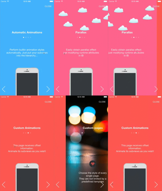
BWWalkthrough (BWWT) is a class that helps you create Walkthroughs for your iOS Apps. It differs from other similar classes in that there is no rigid template; BWWT is just a layer placed over your controllers that gives you complete freedom on the design of your views.
SPM CocoaPods Carthage onboarding walkthrough tutorial pages intro
.package(url: "https://github.com/ariok/BWWalkthrough", from: "4.0.2")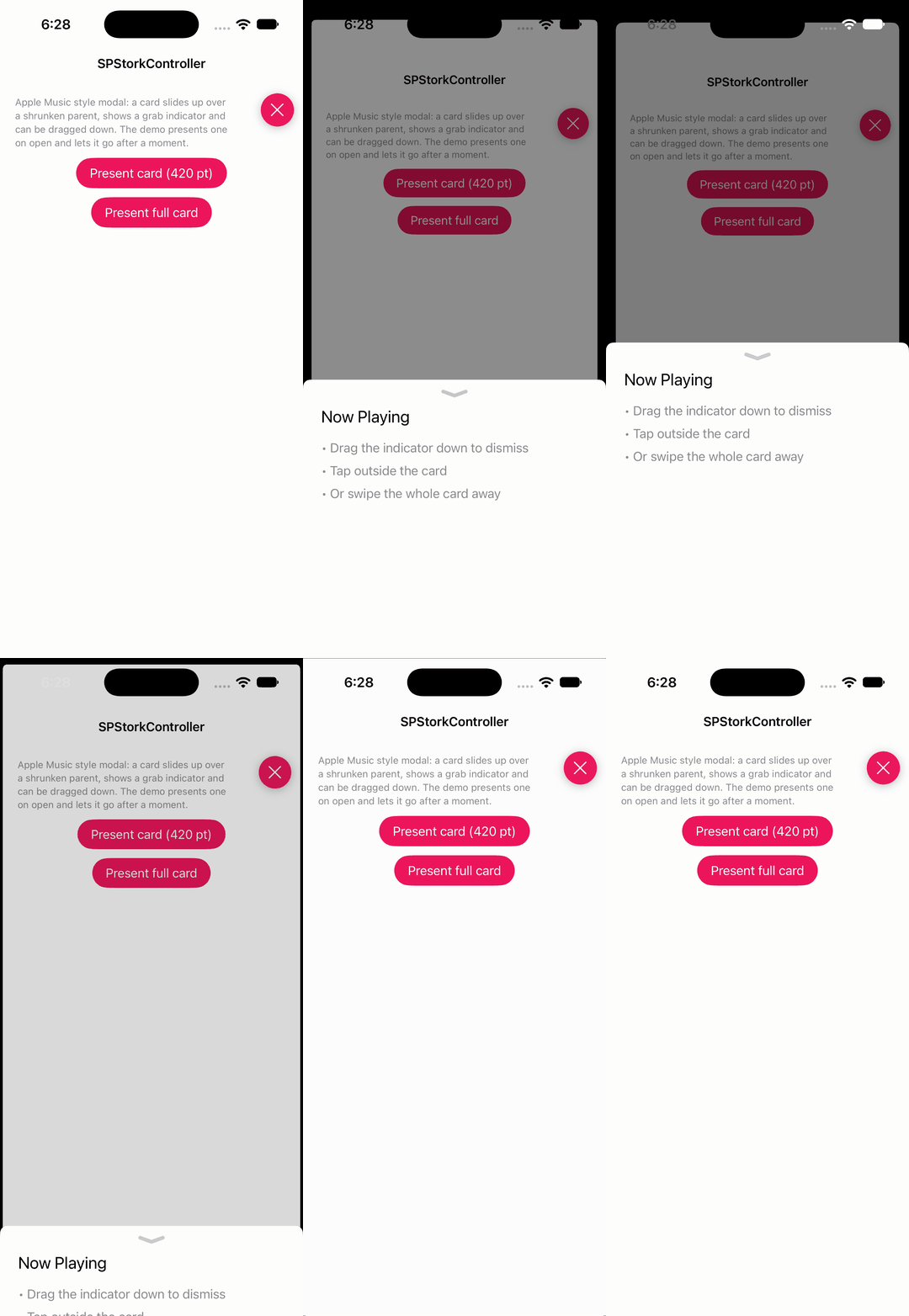
ivanvorobei · ★ 2.7K · ⟳ 2023-01 · MIT
Apple Music style modal presentation: a card that slides up and can be dragged down to dismiss.
▶ Live demo in the app SPM presentation sheet modal bottom sheet apple music card drag to dismiss
.package(url: "https://github.com/ivanvorobei/SPStorkController", from: "1.8.5")Usage
Set the controller's transitioningDelegate to an SPStorkTransitioningDelegate and present with .custom style.
transitionDelegate.customHeight = height          // nil = the default, almost full-height card
transitionDelegate.showIndicator = true            // grab indicator at the top
transitionDelegate.swipeToDismissEnabled = true
transitionDelegate.tapAroundToDismissEnabled = true
controller.transitioningDelegate = transitionDelegate   // keep the delegate alive: it is a weak reference
controller.modalPresentationStyle = .custom
controller.modalPresentationCapturesStatusBarAppearance = true
present(controller, animated: true)

Yalantis · ★ 2.7K · ⟳ 2020-04 · MIT
Animated side menu with customizable UI. Made in Yalantis.
CocoaPods Inactive since 2020 side menu drawer navigation menu animation
no preview
Touchwonders · ★ 2.6K · ⟳ 2020-11 · MIT
Interactive, interruptible view controller transitions built from reusable animation and interaction pieces.
SPM Inactive since 2020 transition interactive navigation interruptible view controller
.package(url: "https://github.com/Touchwonders/Transition", from: "1.3.0")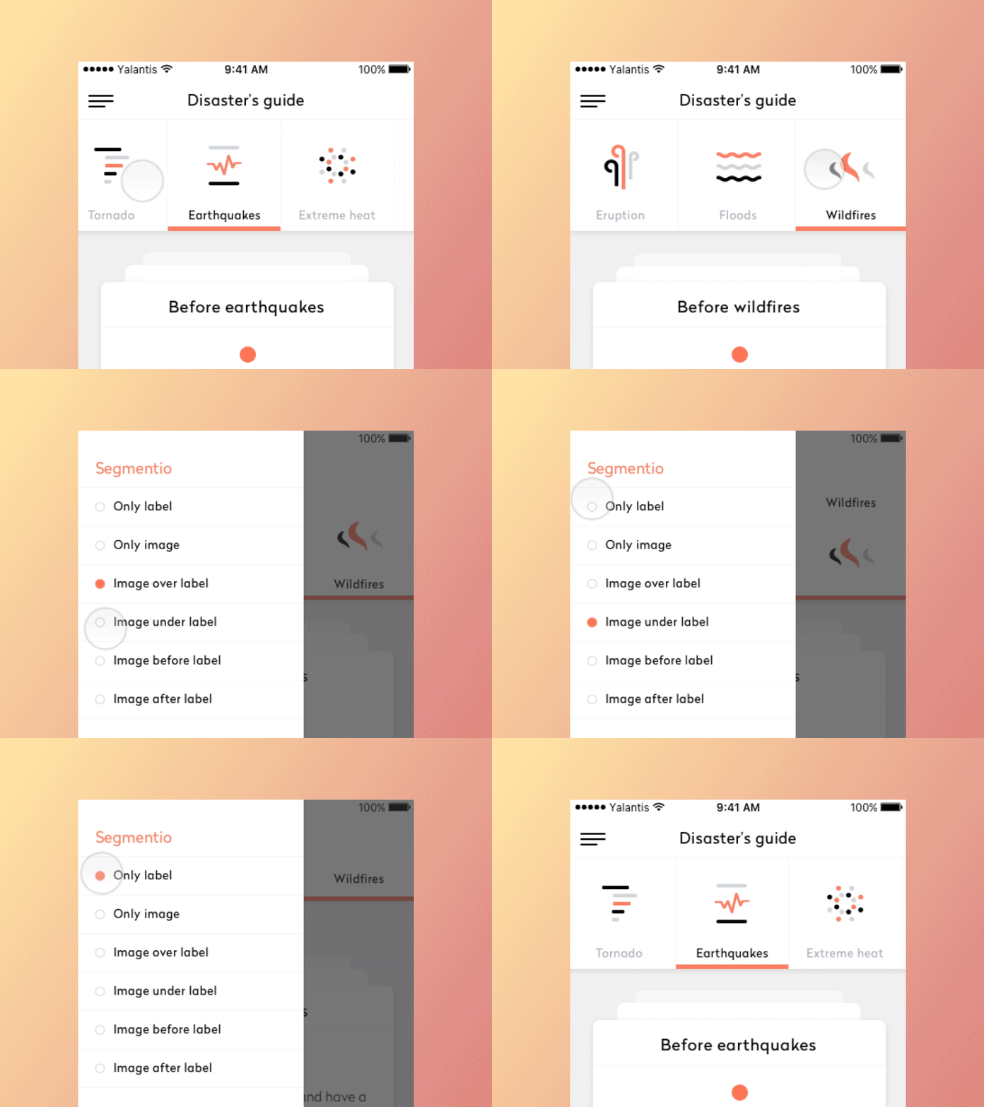
Yalantis · ★ 2.5K · ⟳ 2024-08 · MIT
Animated top/bottom segmented control written in Swift.
▶ Live demo in the app SPM CocoaPods Carthage segmented control tabs control indicator top bar
.package(url: "https://github.com/Yalantis/Segmentio", from: "3.0")Usage
Build items, states and options, then setup the control and observe valueDidChange.
let items = zip(titles, symbols).map { SegmentioItem(title: $0, image: UIImage(systemName: $1)) }
let states = SegmentioStates(
    defaultState: SegmentioState(backgroundColor: .clear, titleFont: .systemFont(ofSize: 12), titleTextColor: .secondaryLabel),
    selectedState: SegmentioState(backgroundColor: .clear, titleFont: .systemFont(ofSize: 12, weight: .semibold), titleTextColor: DemoSupport.accent),
    highlightedState: SegmentioState(backgroundColor: .systemGray5, titleFont: .systemFont(ofSize: 12), titleTextColor: .label)
)
let options = SegmentioOptions(
    backgroundColor: .systemBackground,
    segmentPosition: .fixed(maxVisibleItems: 5),
    scrollEnabled: false,
    indicatorOptions: SegmentioIndicatorOptions(type: .bottom, ratio: 1, height: 4, color: DemoSupport.accent),
    horizontalSeparatorOptions: SegmentioHorizontalSeparatorOptions(type: .bottom, height: 1, color: DemoSupport.hairline),
    verticalSeparatorOptions: SegmentioVerticalSeparatorOptions(ratio: 0.5, color: DemoSupport.hairline),
    imageContentMode: .center,
    labelTextAlignment: .center,
    labelTextNumberOfLines: 1,
    segmentStates: states,
    animationDuration: 0.3
)
segmentio.setup(content: items, style: .imageOverLabel, options: options)
segmentio.selectedSegmentioIndex = 0
segmentio.valueDidChange = { [weak self] _, index in
    guard let self else { return }
    detail.text = "Selected: \(titles[index])"
}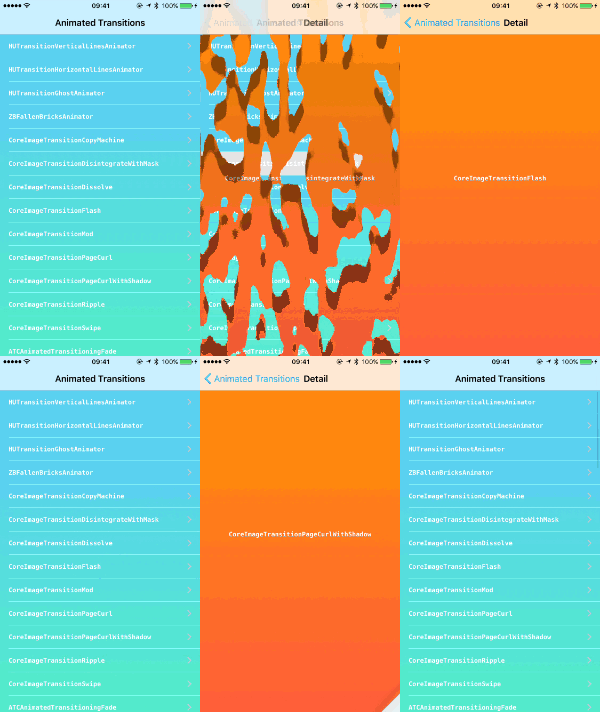
shu223 · ★ 2.5K · ⟳ 2024-04 ·
Collection of custom animated transitions for iOS using UIViewControllerAnimatedTransitioning protocol.
transition gallery view controller custom transition examples
simibac · ★ 2.5K · ⟳ 2026-01 · MIT
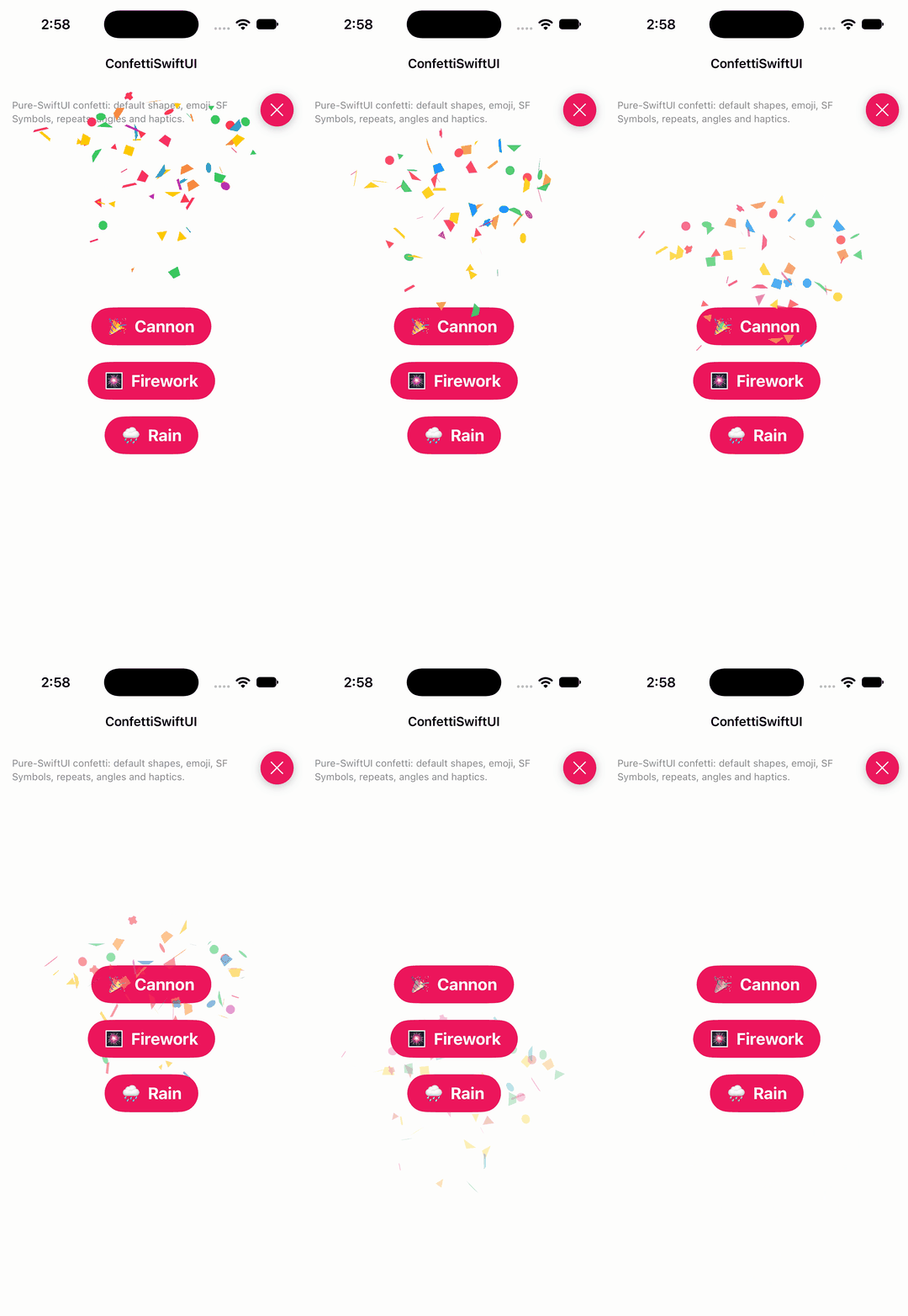
SwiftUI Package for Configurable Confetti Animation 🎉
▶ Live demo in the app SwiftUI SPM swiftui confetti particles celebration effects
.package(url: "https://github.com/simibac/ConfettiSwiftUI", from: "3.0.0")Usage
One modifier per cannon; bump the trigger to fire, pick shapes, emoji or SF Symbols, angles, radius and repeats.
Button { cannon += 1 } label: { Text("🎉  Cannon").font(.title2.bold()) }
    .confettiCannon(trigger: $cannon, num: 60, confettiSize: 12, rainHeight: 500, radius: 320)

Button { firework += 1 } label: { Text("🎆  Firework").font(.title2.bold()) }
    .confettiCannon(
        trigger: $firework,
        num: 50,
        confettis: [.text("❤️"), .text("💙"), .sfSymbol(symbolName: "star.fill")],
        colors: [.red, .blue, .yellow],
        confettiSize: 18,
        openingAngle: .degrees(0),
        closingAngle: .degrees(360),
        radius: 220,
        repetitions: 2,
        repetitionInterval: 0.7
    )
SebastianBoldt · ★ 2.5K · ⟳ 2025-11 · MIT
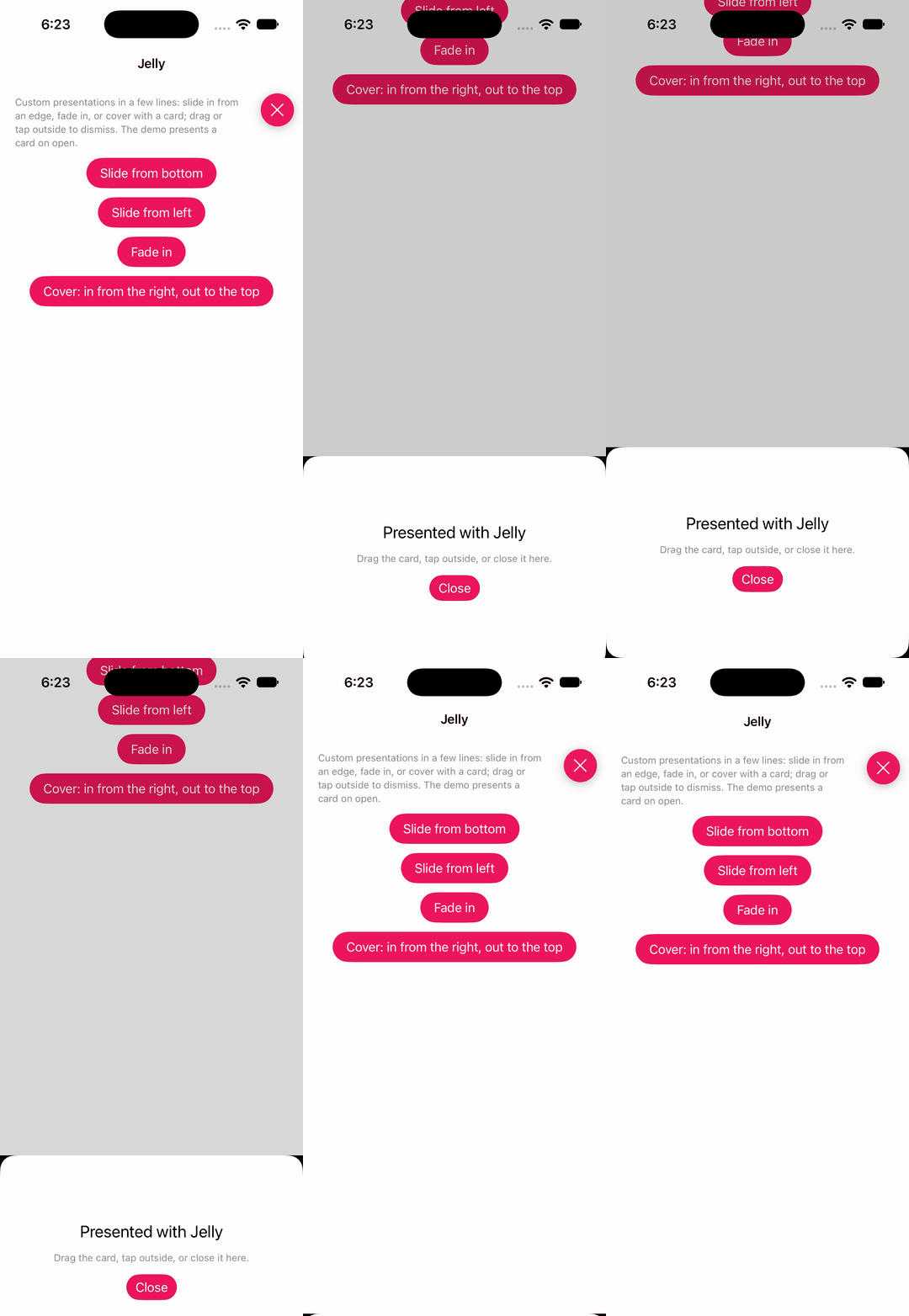
Animated view controller presentations (slide, fade, shift), interactive or not, in a few lines.
▶ Live demo in the app SPM presentation transition modal slide fade interactive
.package(url: "https://github.com/SebastianBoldt/Jelly", from: "2.3.0")Usage
Configure a presentation (slide, cover or fade), create an Animator, prepare the controller and present it.
let chrome = PresentationUIConfiguration(cornerRadius: 20, backgroundStyle: .dimmed(alpha: 0.45), isTapBackgroundToDismissEnabled: true)
let presentation = SlidePresentation(uiConfiguration: chrome, direction: .bottom, size: .custom(value: 280))
animator = Animator(presentation: presentation)      // keep a strong reference while presented
animator?.prepare(presentedViewController: card)
present(card, animated: true)
jtrivedi · ★ 2.4K · ⟳ 2026-03 · MIT
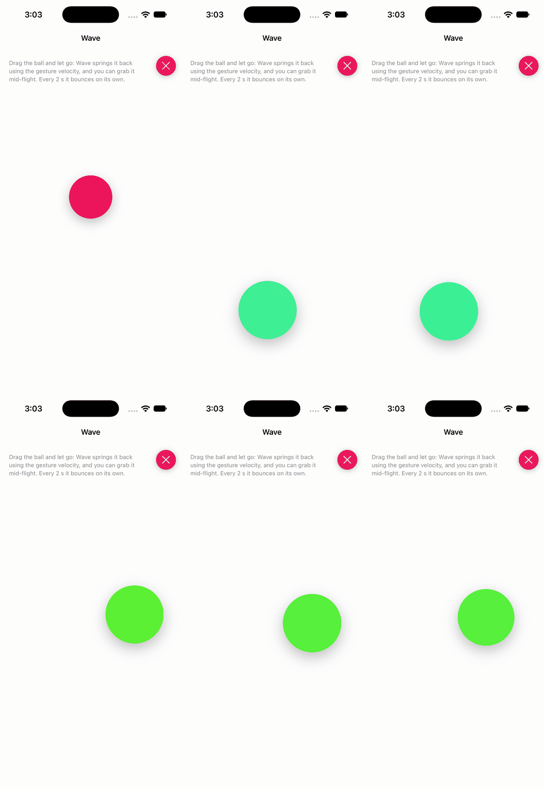
Wave is a spring-based animation engine for iOS and macOS that makes it easy to create fluid, interruptible animations that feel great.
▶ Live demo in the app SPM spring gesture engine animation engine interruptible uikit
.package(url: "https://github.com/jtrivedi/Wave", from: "0.3.3")Usage
Spring-animate any view's animator properties; pass the gesture velocity so a release continues the motion.
private let spring = Spring(dampingRatio: 0.55, response: 0.7)
private let interactive = Spring(dampingRatio: 1.0, response: 0.12)

@objc private func pan(_ gesture: UIPanGestureRecognizer) {
    switch gesture.state {
    case .began, .changed:
        let location = gesture.location(in: view)
        Wave.animate(withSpring: interactive) {
            ball.animator.center = location
            ball.animator.scale = CGPoint(x: 1.2, y: 1.2)
        }
    case .ended, .cancelled:
        let velocity = gesture.velocity(in: view)
        Wave.animate(withSpring: spring, gestureVelocity: velocity) {
            ball.animator.center = restCenter
            ball.animator.scale = CGPoint(x: 1, y: 1)
        }
    default:
        break
    }
}
andreamazz · ★ 2.3K · ⟳ 2020-06 · MIT
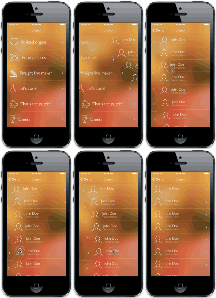
Custom transition between viewcontrollers holding tableviews. Each cell is animated to simulate a 'wave effect'.
CocoaPods Carthage Inactive since 2020 transition table view wave cells navigation
entotsu · ★ 2.3K · ⟳ 2026-11 · MIT
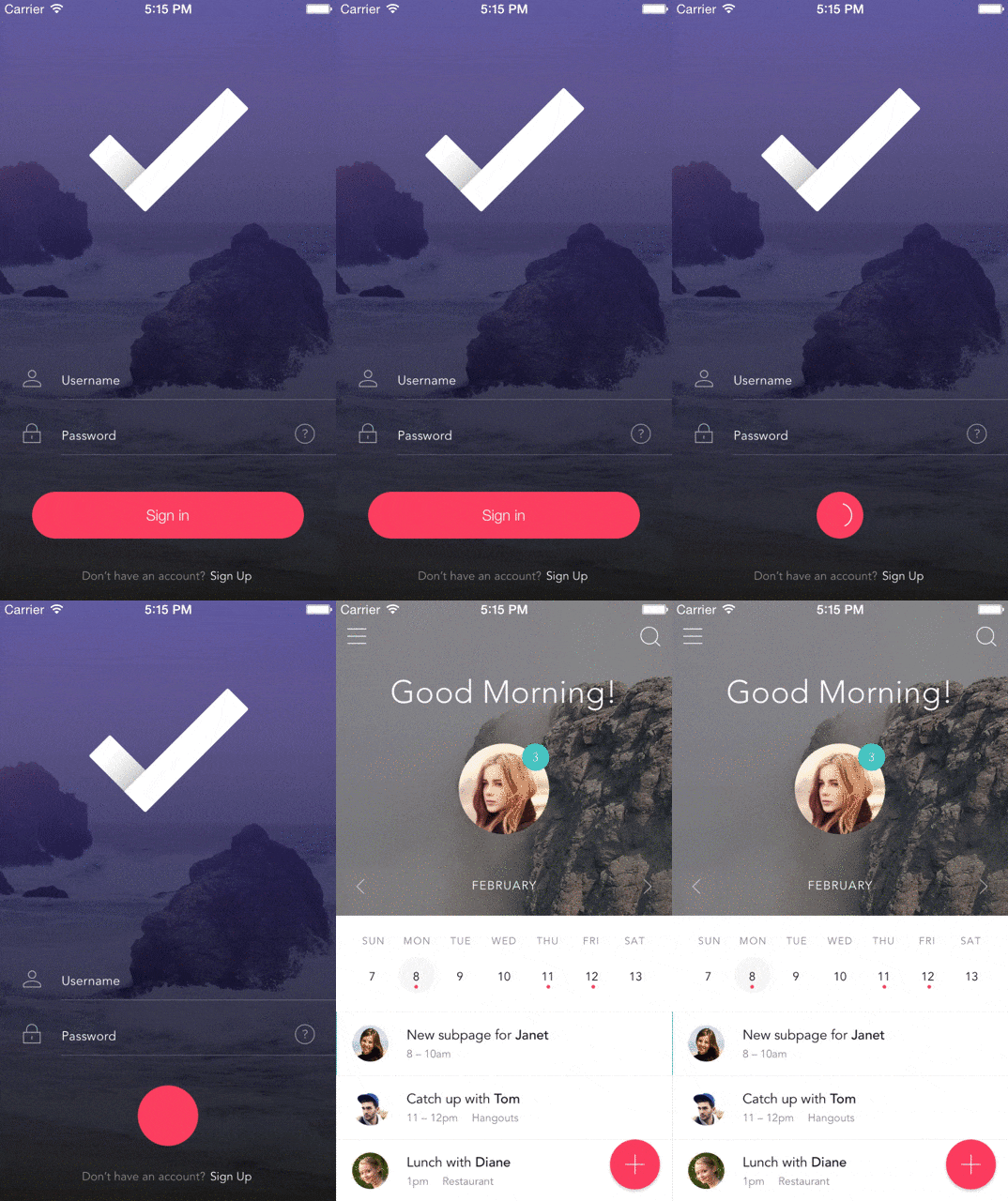
Animated UIButton of Loading Animation and Transition Animation.
CocoaPods button loading transition submit spinner
aheze · ★ 2.2K · ⟳ 2025-02 · MIT
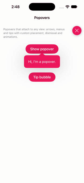
A library to present popovers. Simple, modern, and highly customizable. Not boring!
▶ Live demo in the app SwiftUI SPM swiftui popover menu tooltip popup notification
.package(url: "https://github.com/aheze/Popovers", from: "1.3.2")Usage
Popovers and menus attached to a view with placement attributes and Templates for containers and menu buttons.
Button("Show popover") { showPopover = true }
    .buttonStyle(DemoPrimaryButtonStyle())
    .popover(present: $showPopover, attributes: {
        $0.position = .absolute(originAnchor: .bottom, popoverAnchor: .top)
        $0.sourceFrameInset.bottom = -8
    }) {
        Templates.Container(arrowSide: .top(.centered), backgroundColor: DemoSwiftUIPalette.accent) {
            Text("Hi, I'm a popover.").foregroundColor(.white).padding(4)
        }
    }

Templates.Menu {
    Templates.MenuButton(title: "Copy", systemImage: "doc.on.doc") {}
    Templates.MenuButton(title: "Share", systemImage: "square.and.arrow.up") {}
    Templates.MenuButton(title: "Delete", systemImage: "trash") {}
} label: { fade in
    Text("Open menu").demoChip().opacity(fade ? 0.5 : 1)
}
keitaoouchi · ★ 2.2K · ⟳ 2026-10 · MIT
MarkdownView is a WKWebView based UI element, and internally use bootstrap, highlight.js, markdown-it.
▶ Live demo in the app SPM CocoaPods Carthage markdown web view text rendering wkwebview
.package(url: "https://github.com/keitaoouchi/MarkdownView", from: "2.1.1")Usage
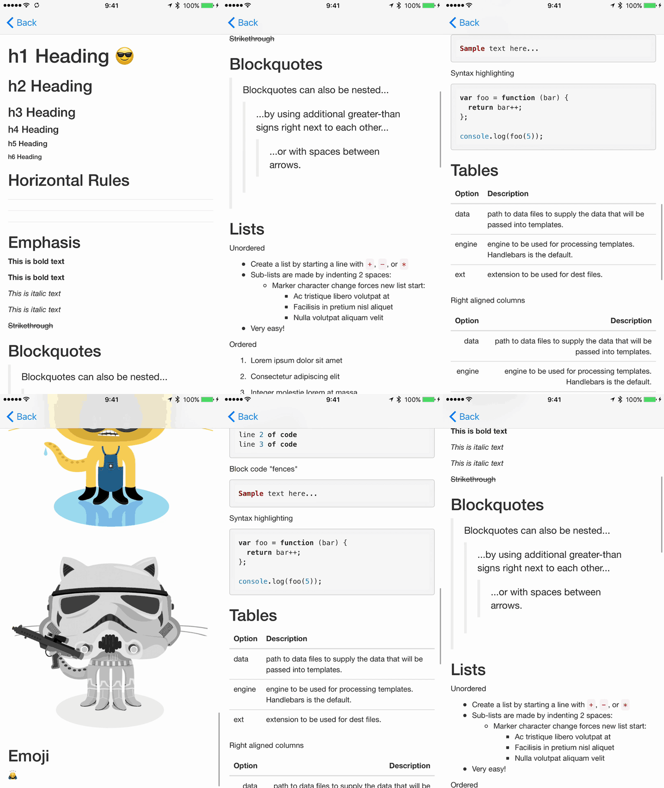
MarkdownView renders Markdown in a web view; onRendered reports the height and onTouchLink intercepts links.
private let markdownView = MarkdownView()

markdownView.isScrollEnabled = false

markdownView.onRendered = { [weak self] _ in self?.markdownView.invalidateIntrinsicContentSize() }
markdownView.onTouchLink = { _ in false }

markdownView.load(markdown: """
# MotionBook

A catalog of **112 open-source motion libraries** for iOS, with *live demos* for 64 of them.

## Why a demo app?

1. Seeing a transition beats reading about it.
2. Every library here builds against the current Xcode.
3. Fixes went back upstream as pull requests.

## Example

```swift
let banner = NotificationBanner(title: "MotionBook", style: .success)
banner.show()
```

| Category | Libraries | Live |
| --- | ---: | ---: |
| Transition | 18 | 9 |
| Menu | 11 | 5 |
| SwiftUI | 20 | 19 |

> Markdown rendered by [MarkdownView](https://github.com/keitaoouchi/MarkdownView).
""")
lkzhao · ★ 2.2K · ⟳ 2020-05 · MIT
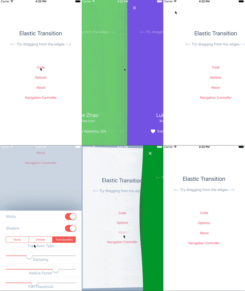
A UIKit custom transition that simulates an elastic drag. Written in Swift.
CocoaPods Inactive since 2020 transition elastic drag menu interactive
exyte · ★ 2.1K · ⟳ 2026-11 · MIT
The most powerful Grid container missed in SwiftUI
▶ Live demo in the app SwiftUI SPM swiftui grid layout spans collection
.package(url: "https://github.com/exyte/Grid", from: "1.5.0")Usage
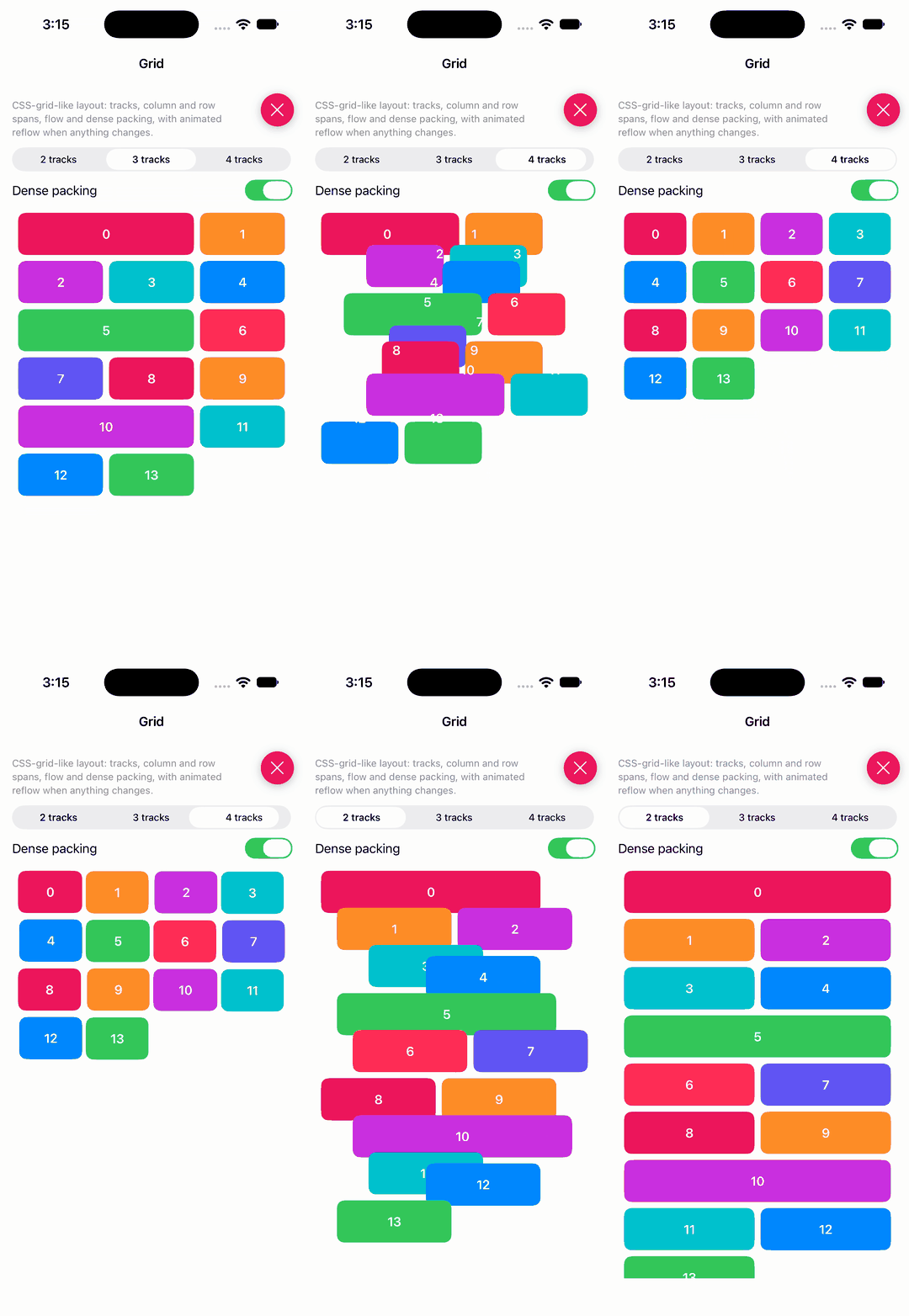
A CSS-style grid: tracks, column spans, flow, dense packing and animated reflow.
Grid(tracks: [GridTrack](repeating: .fr(1), count: trackCount), spacing: 8) {
    ForEach(0..<14, id: \.self) { index in
        RoundedRectangle(cornerRadius: 10)
            .fill(colors[index % colors.count])
            .overlay(Text("\(index)").foregroundColor(.white).bold())
            .frame(height: 56)
            .gridSpan(column: (index % 5 == 0 && wideSpans) ? 2 : 1)
    }
}
.gridContentMode(.scroll)
.gridFlow(.rows)
.gridPacking(dense ? .dense : .sparse)
.gridAnimation(.easeInOut(duration: 0.5))
Yalantis · ★ 2.1K · ⟳ 2018-06 · MIT
This project aims to provide a simple and customizable pull to refresh implementation.
▶ Live demo in the app CocoaPods Inactive since 2018 pull to refresh refresh table view scroll objective-c animation
Usage
Attach YALSunnyRefreshControl to a scroll view and call endRefreshing when the load finishes.
self.sunnyRefreshControl = [YALSunnyRefreshControl new];
[self.sunnyRefreshControl addTarget:self
                             action:@selector(sunnyControlDidStartAnimation)
                   forControlEvents:UIControlEventValueChanged];
[self.sunnyRefreshControl attachToScrollView:self.tableView];

[self.sunnyRefreshControl endRefreshing];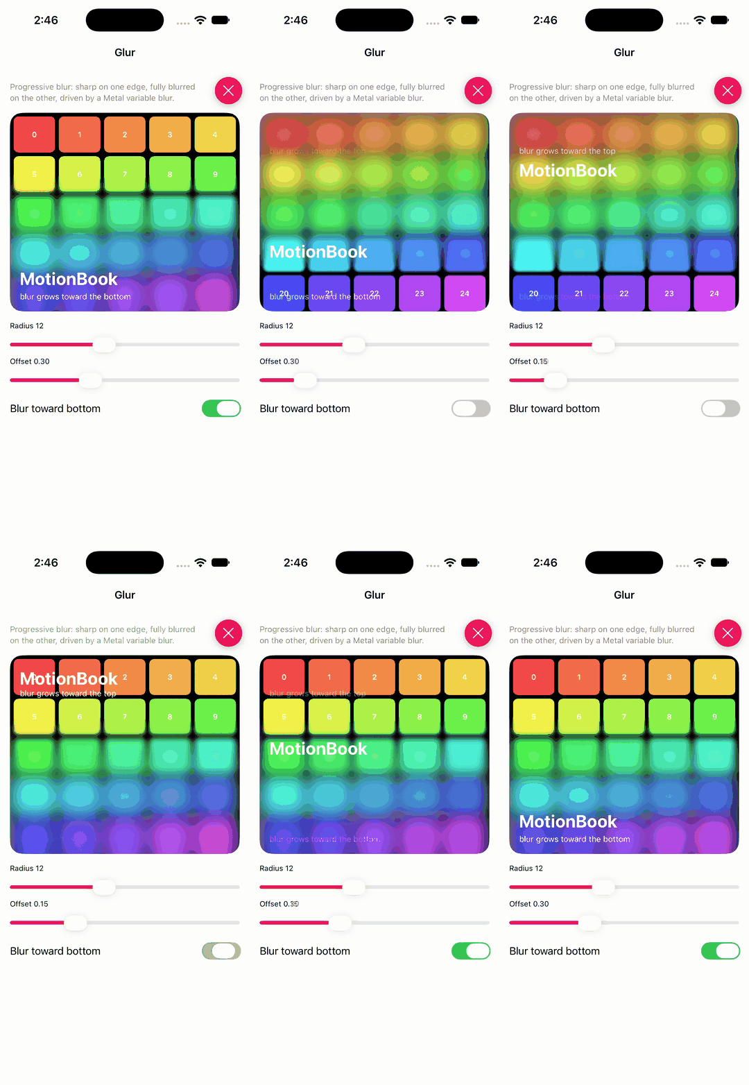
joogps · ★ 2.1K · ⟳ 2026-10 · MIT
A library for progressive blurs in SwiftUI.
▶ Live demo in the app SwiftUI SPM swiftui blur progressive variable blur effects
.package(url: "https://github.com/joogps/Glur", from: "2.1.2")Usage
Progressive blur over any view: radius, offset where the blur starts, interpolation and direction.
tiles.frame(height: 320, alignment: .top).clipped()
    .glur(radius: radius, offset: offset, interpolation: 0.4, direction: down ? .down : .up)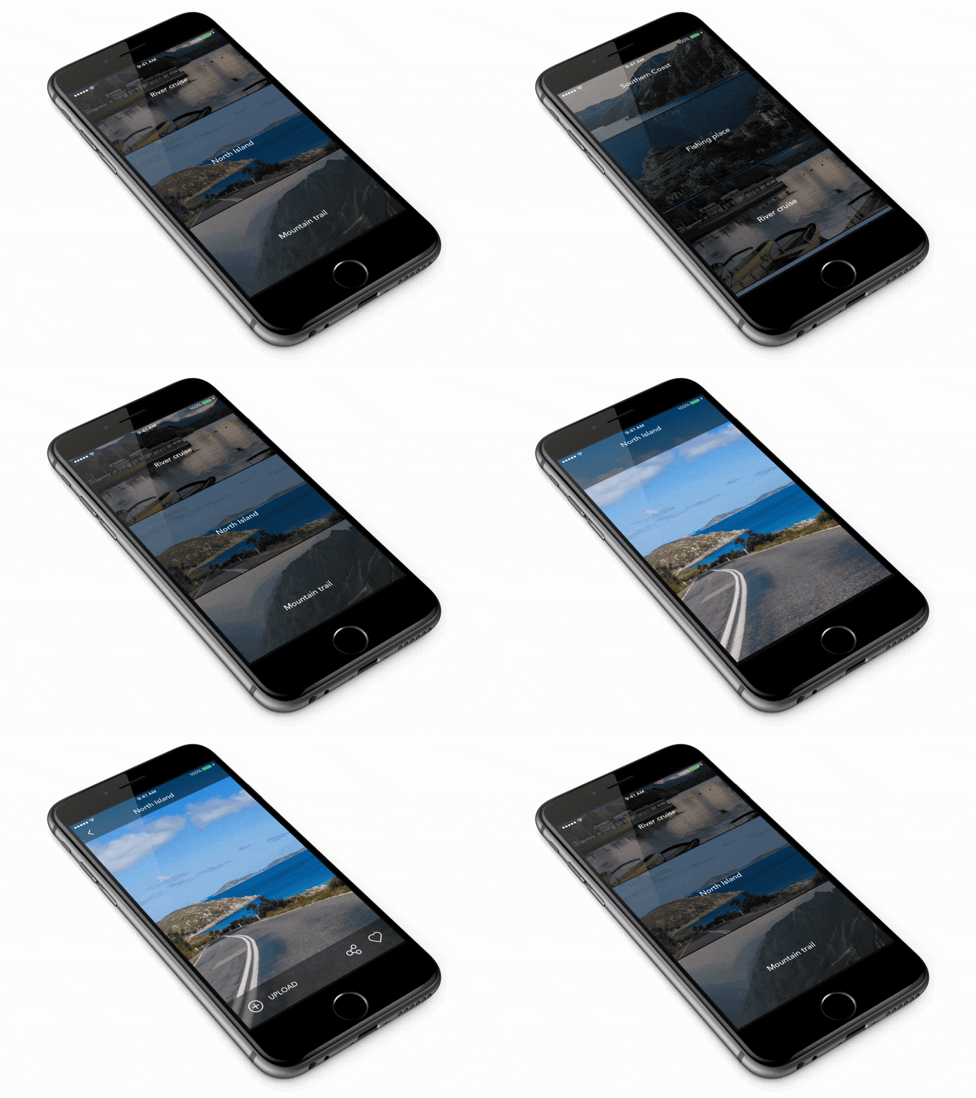
Ramotion · ★ 2.1K · ⟳ 2020-04 · MIT
PreviewTransition is a simple preview gallery controller
▶ Live demo in the app SPM CocoaPods Carthage Inactive since 2020 transition gallery preview table view parallax
.package(url: "https://github.com/Ramotion/preview-transition", from: "4.1.0")Usage
Subclass PTTableViewController; pushViewController animates the parallax preview transition.
let storyboard = UIStoryboard(name: "preview-transition", bundle: .module)
let detaleViewController: PTDemoDetailViewController = storyboard.instantiateViewController()
pushViewController(detaleViewController)
codestergit · ★ 2.0K · ⟳ 2020-03 · MIT
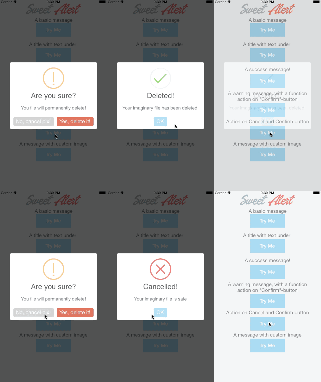
Beautiful Animated custom Alert View inspired from javascript library SweetAlert. Written in Swift this SweetAlertView can be used in Swift and Objective-C projects. SweetAlertView provides live intutive experience to user actions.It can be used in place of UIAlertView and UIAlertController
▶ Live demo in the app Inactive since 2020 alert dialog popup animated alert modal
Usage
SweetAlert().showAlert with a style; the closure tells you which button was tapped.
_ = SweetAlert().showAlert("Here's a message!")

_ = SweetAlert().showAlert("Good job!", subTitle: "You clicked the button!", style: AlertStyle.success)

@IBAction func warningAlert(_ sender: AnyObject) {
    _ = SweetAlert().showAlert("Are you sure?", subTitle: "You file will permanently delete!", style: AlertStyle.warning, buttonTitle:"Cancel", buttonColor:UIColor(demoRGB: 0xD0D0D0) , otherButtonTitle:  "Yes, delete it!", otherButtonColor: UIColor(demoRGB: 0xDD6B55)) { (isOtherButton) -> Void in
        if isOtherButton == true {

            print("Cancel Button  Pressed", terminator: "")
        }
        else {
            _ = SweetAlert().showAlert("Deleted!", subTitle: "Your imaginary file has been deleted!", style: AlertStyle.success)
        }
    }
Ramotion · ★ 2.0K · ⟳ 2022-06 · MIT
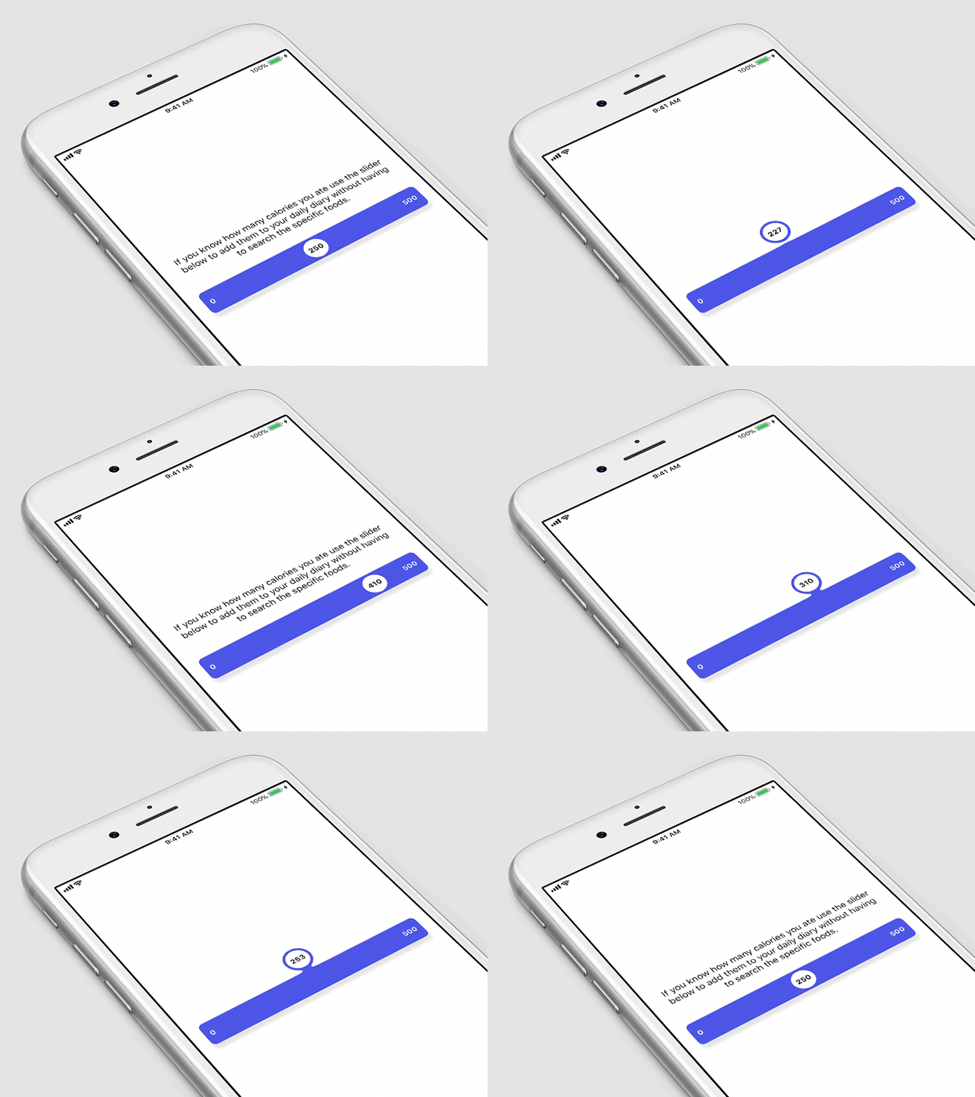
A slider widget with a popup bubble displaying the precise value selected.
SPM CocoaPods Carthage slider control input bubble uislider
.package(url: "https://github.com/Ramotion/fluid-slider", from: "1.1.0")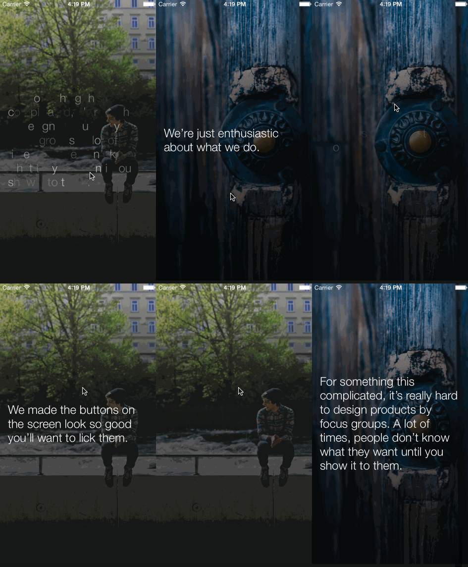
zipme · ★ 1.9K · ⟳ 2023-12 · MIT
A UILabel subclass that lets you animate text similar to Secret app.
▶ Live demo in the app SPM CocoaPods label text text animation fade secret app objective-c
.package(url: "https://github.com/zipme/RQShineLabel", from: "1.0.0")Usage
RQShineLabel shines its text in letter by letter; call shine, then fade it out.
self.shineLabel = ({
    RQShineLabel *label = [[RQShineLabel alloc] initWithFrame:CGRectMake(16, 16, 320 - 32, CGRectGetHeight(self.view.bounds) - 16)];
    label.numberOfLines = 0;
    label.text = [self.textArray objectAtIndex:self.textIndex];
    label.font = [UIFont fontWithName:@"HelveticaNeue-Light" size:24.0];
    label.backgroundColor = [UIColor clearColor];
    [label sizeToFit];
    label.center = self.view.center;
    label;
});
[self.view addSubview:self.shineLabel];

[self.shineLabel shine];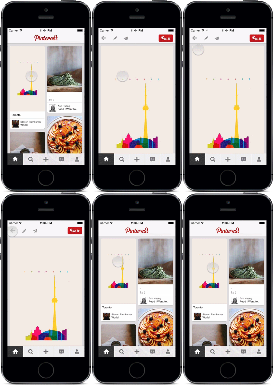
demonnico · ★ 1.9K · ⟳ 2020-06 · MIT
This is a Swift based demo project to show how to make the transition Pinterest liked.
Inactive since 2020 transition pinterest collection view zoom navigation
CezaryKopacz · ★ 1.8K · ⟳ 2019-10 · MIT
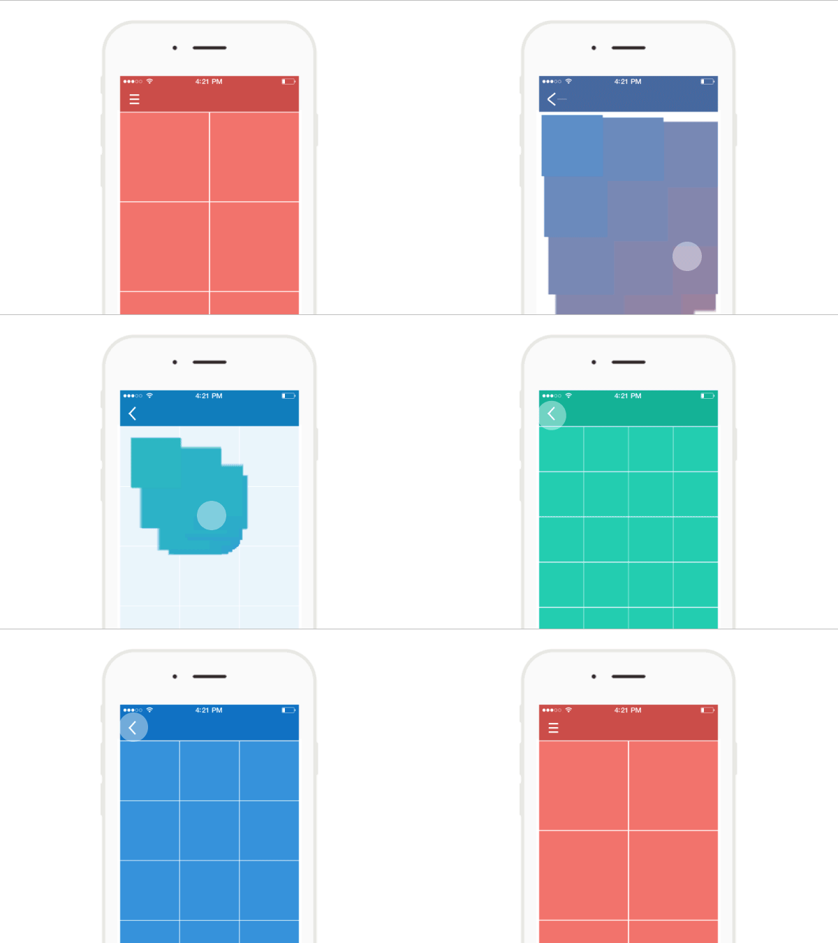
Cool wave like transition between two or more UICollectionView
CocoaPods Inactive since 2019 transition collection view wave navigation
sberrevoets · ★ 1.8K · ⟳ 2025-01 · MIT
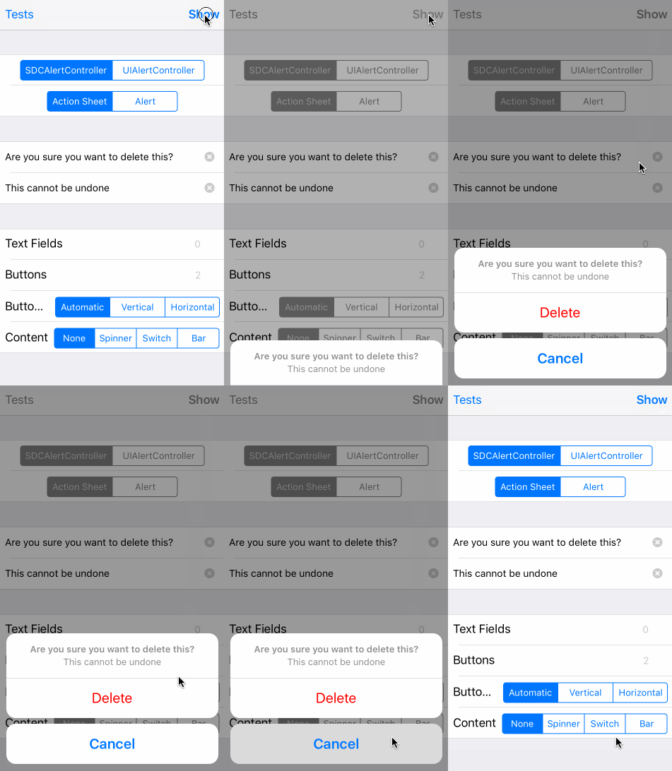
SDCAlertView started out as an alert that looked identical to UIAlertView, but had support for a custom content view. With the introduction of UIAlertController in iOS 8, the project was updated to the more modern API that UIAlertController brought.
▶ Live demo in the app SPM CocoaPods Carthage alert action sheet dialog uialertcontroller custom content
.package(url: "https://github.com/sberrevoets/SDCAlertView", from: "12.0.5")Usage
AlertController mirrors UIAlertController, accepts custom content views and a shouldDismissHandler.
let alert = AlertController(title: "SDCAlertView", message: "Looks like UIAlertController, behaves like your own view.", preferredStyle: .alert)
alert.addAction(AlertAction(title: "Cancel", style: .normal))
alert.addAction(AlertAction(title: "OK", style: .preferred))
alert.present()

let alert = AlertController(title: "Working", message: "Custom content view with a spinner…")
alert.contentView.addSubview(spinner)
NSLayoutConstraint.activate([
    spinner.centerXAnchor.constraint(equalTo: alert.contentView.centerXAnchor),
    spinner.topAnchor.constraint(equalTo: alert.contentView.topAnchor),
    spinner.bottomAnchor.constraint(equalTo: alert.contentView.bottomAnchor),
])
alert.addAction(AlertAction(title: "Stop", style: .preferred))
alert.present()

let alert = AlertController(title: "Dismissal rules", message: "Only the preferred action closes this alert.")
alert.addAction(AlertAction(title: "Doesn't dismiss", style: .normal))
alert.addAction(AlertAction(title: "Dismiss", style: .preferred))
alert.shouldDismissHandler = { $0?.title == "Dismiss" }
alert.present()
no preview
CosmicMind · ★ 1.8K · ⟳ 2020-01 · MIT
A Material-inspired motion engine for transitions, transforms, and interactive presentation work.
SPM Inactive since 2020 material transition layout animation engine material design
.package(url: "https://github.com/CosmicMind/Motion", from: "3.1.3")
liyong03 · ★ 1.8K · ⟳ 2020-12 · MIT
Asynchronized GIF image class and Image viewer supporting play/stop GIF images. It just use very less memory. Following GIF usually will cost almost 600MB memory if it is fully decoded (800x600x389x4 Bytes), but using YLGIFImage, it just use about 30MB memory.
CocoaPods Inactive since 2020 gif image image viewer animated image memory objective-c
gskbyte · ★ 1.7K · ⟳ 2024-08 · MIT
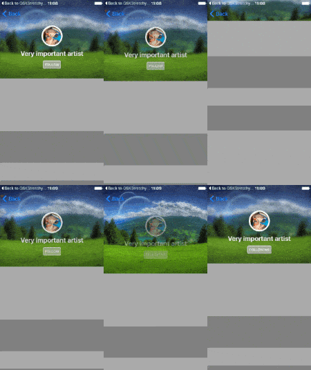
GSKStretchyHeaderView is an implementation of the stretchy header paradigm as seen on many apps, like Twitter, Spotify or airbnb.
CocoaPods Carthage stretchy header parallax header table view collection view scroll
markiv · ★ 1.7K · ⟳ 2024-08 · MIT
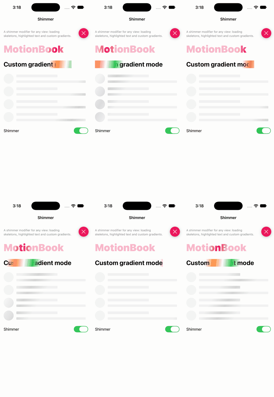
Shimmer is a super-light modifier that adds a shimmering effect to any SwiftUI View, for example, to show that an operation is in progress. It works well on light and dark modes, and across iOS, macOS, tvOS, watchOS and visionOS.
▶ Live demo in the app SwiftUI SPM swiftui shimmer loading skeleton placeholder
.package(url: "https://github.com/markiv/SwiftUI-Shimmer", from: "1.5.1")Usage
Add .shimmering to any view, optionally with a custom gradient, band size and mode; pairs well with .redacted.
Text("MotionBook")
    .font(.system(size: 44, weight: .black))
    .foregroundColor(DemoSwiftUIPalette.accent)
    .shimmering(active: active)
Text("Custom gradient mode")
    .font(.title.bold())
    .shimmering(active: active, gradient: Gradient(colors: [.clear, .orange, .white, .green, .clear]), bandSize: 0.5, mode: .overlay())

.redacted(reason: .placeholder)
.shimmering(active: active)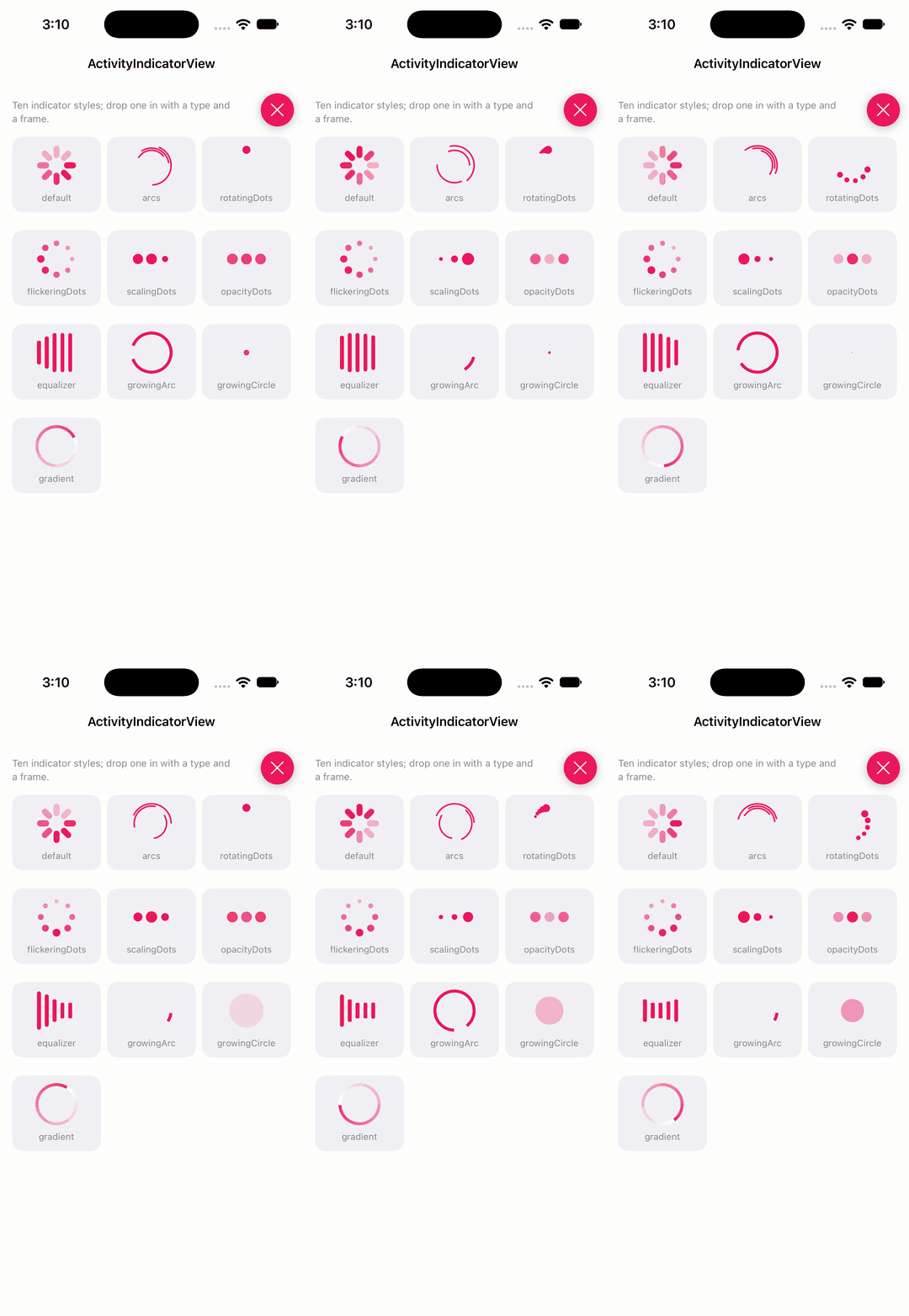
exyte · ★ 1.7K · ⟳ 2026-11 · MIT
A number of preset loading indicators created with SwiftUI
▶ Live demo in the app SwiftUI SPM swiftui loading indicator spinner activity indicator
.package(url: "https://github.com/exyte/ActivityIndicatorView", from: "2.0.2")Usage
Pick an indicator type and give the view a frame and colour.
("default", .default(count: 8)),
("arcs", .arcs(count: 3, lineWidth: 2)),
("rotatingDots", .rotatingDots(count: 5)),
("flickeringDots", .flickeringDots(count: 8)),
("scalingDots", .scalingDots(count: 3, inset: 2)),
("opacityDots", .opacityDots(count: 3, inset: 4)),
("equalizer", .equalizer(count: 5)),

ActivityIndicatorView(type: indicators[index].type)
    .frame(width: 52, height: 52)
    .foregroundColor(DemoSwiftUIPalette.accent)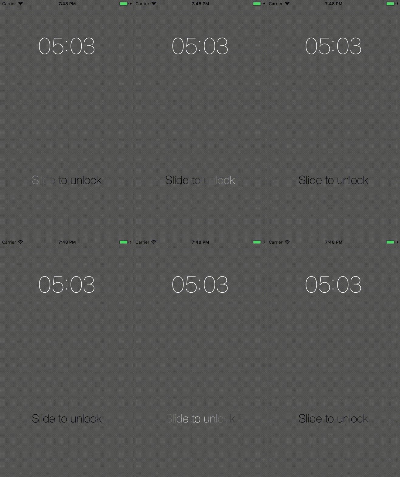
imjog · ★ 1.6K · ⟳ 2022-10 · MIT
Nice gradient animated label that enable an easy way to add a shimmering effect
CocoaPods Carthage label text gradient shimmer slide to unlock
twostraws · ★ 1.6K · ⟳ 2026-11 · MIT
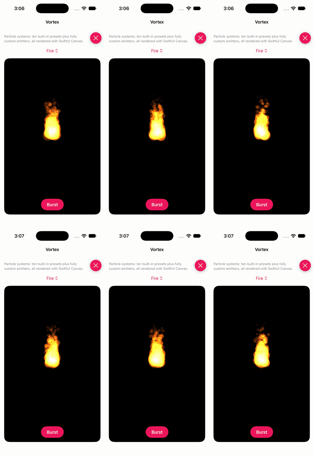
High-performance particle effects for SwiftUI.
▶ Live demo in the app SwiftUI SPM swiftui particles effects confetti snow fireworks
.package(url: "https://github.com/twostraws/Vortex", from: "1.0.5")Usage
VortexView renders a particle system (built-in presets or custom) from tagged particle views; the reader proxy bursts on demand.
VortexViewReader { proxy in
    ZStack(alignment: .bottom) {
        VortexView(presets[preset].system()) {
            Circle().fill(.white).blendMode(.plusLighter).frame(width: 32).tag("circle")
            Rectangle().fill(.white).frame(width: 16, height: 16).tag("square")
            Circle().fill(.white).blur(radius: 3).frame(width: 32).tag("sparkle")
        }

Button("Burst") { proxy.burst() }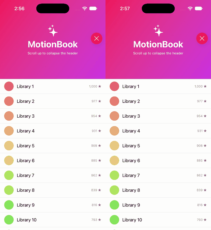
exyte · ★ 1.6K · ⟳ 2026-11 · MIT
A scroll view with a sticky header which shrinks as you scroll. Written with SwiftUI.
▶ Live demo in the app SwiftUI SPM swiftui header scroll sticky header collapsing header parallax
.package(url: "https://github.com/exyte/ScalingHeaderScrollView", from: "3.1.0")Usage
A scroll view with a header that collapses between minHeight and maxHeight; the closure receives the collapse progress.
ScalingHeaderScrollView(minHeight: 100, maxHeight: 300) { _, progress in

} content: {

}
.collapseProgress($progress)
.allowsHeaderCollapse()
.ignoresSafeArea(edges: .top)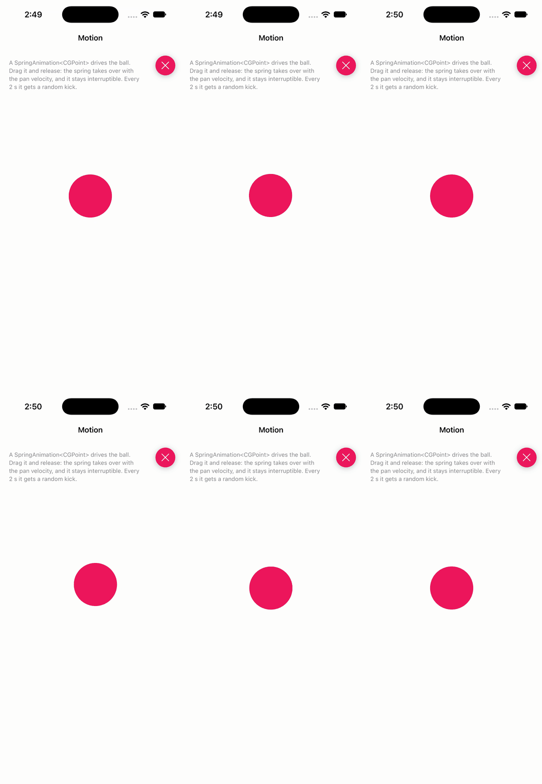
b3ll · ★ 1.5K · ⟳ 2024-10 · BSD-2-Clause
Animation engine for gesturally-driven user interfaces, animations, and interactions on iOS, macOS, and tvOS.
▶ Live demo in the app SPM spring gesture engine animation engine interruptible interactive
.package(url: "https://github.com/b3ll/Motion", from: "0.1.5")Usage
A SpringAnimation drives a value; update it while dragging, then hand over the velocity and start.
private let spring = SpringAnimation<CGPoint>()

spring.configure(response: 0.5, dampingRatio: 0.5)
spring.onValueChanged { [weak self] newValue in
    self?.ball.center = newValue
}

case .ended, .cancelled:
    spring.toValue = restCenter
    spring.velocity = gesture.velocity(in: view)
    spring.start()
TBXark · ★ 1.5K · ⟳ 2026-09 · MIT
A rubber animation pagecontrol
▶ Live demo in the app SPM CocoaPods Carthage page control pager indicator dots rubber
.package(url: "https://github.com/tbxark/TKRubberIndicator", from: "2.0.0")Usage
TKRubberPageControl with a page count; observe valueChange or the control event.
let page = TKRubberPageControl(frame: CGRect(x: 100, y: 100, width: 200, height: 100), count: 3)

page.center = view.center
page.valueChange = {(num) -> Void in
    print("Closure : Page is \(num)")
}
page.addTarget(self, action: #selector(TKRubberPageControlViewController.targetActionValueChange(_:)), for: UIControl.Event.valueChanged)
view.addSubview(page)

page.numberOfPage = 3

page.numberOfPage = sender.selectedSegmentIndex + 3
younatics · ★ 1.3K · ⟳ 2026-10 · MIT
✨The eligible dropdown menu, written in Swift 3, appears dropdown menu to display a view of related items when a user click on the dropdown menu. You can customize dropdown view whatever you like (e.g. UITableView, UICollectionView... etc)
▶ Live demo in the app SPM CocoaPods Carthage dropdown menu filter navigation dropdown menu
.package(url: "https://github.com/younatics/YNDropDownMenu", from: "4.1.0")Usage
YNDropDownMenu takes drop-down views and titles; set state images, label colours and fonts, open programmatically.
let view = YNDropDownMenu(frame: CGRect(x: 0, y: 64, width: UIScreen.main.bounds.size.width, height: 38), dropDownViews: _ZBdropDownViews, dropDownViewTitles: ["Apple", "Banana", "Kiwi", "Pear"])

view.setStatesImages(
    normalImages: Array(repeating: UIImage(named: "arrow_nor", in: .module, compatibleWith: nil), count: menuCount),
    selectedImages: Array(repeating: UIImage(named: "arrow_sel", in: .module, compatibleWith: nil), count: menuCount),
    disabledImages: Array(repeating: UIImage(named: "arrow_dim", in: .module, compatibleWith: nil), count: menuCount)
)
view.setLabelColorWhen(normal: UIColor.black, selected: FFA409, disabled: UIColor.gray)
view.setLabelFontWhen(normal: UIFont.systemFont(ofSize: 12), selected: UIFont.boldSystemFont(ofSize: 12), disabled: UIFont.systemFont(ofSize: 12))

view.backgroundBlurEnabled = true

view.alwaysSelected(at: 0)

self.view.addSubview(view)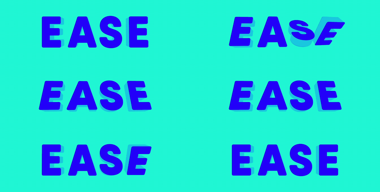
roberthein · ★ 1.3K · ⟳ 2020-07 · MIT
Ease is a event driven animation system that combines the observer pattern with custom spring animations as observers.
SPM CocoaPods Inactive since 2020 easing spring observer scroll gyroscope animation
.package(url: "https://github.com/roberthein/Ease", from: "3.2.0")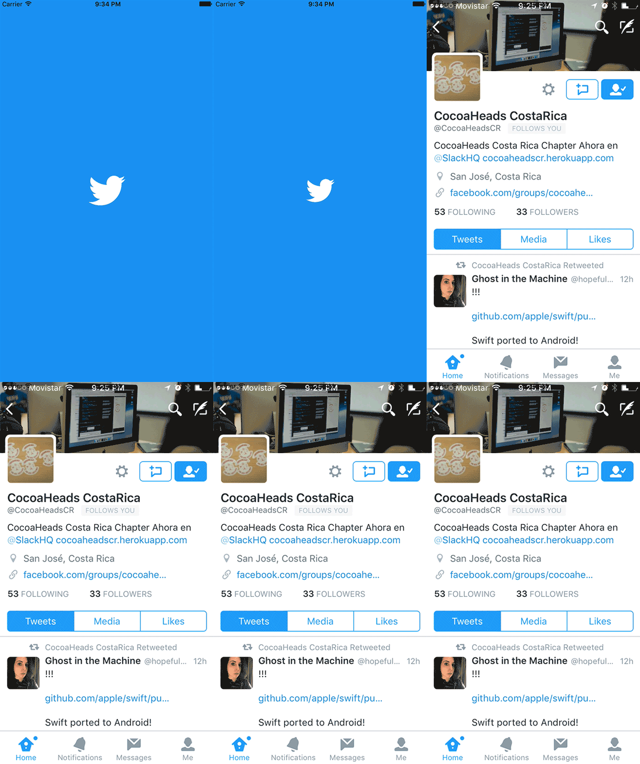
PiXeL16 · ★ 1.2K · ⟳ 2025-03 · MIT
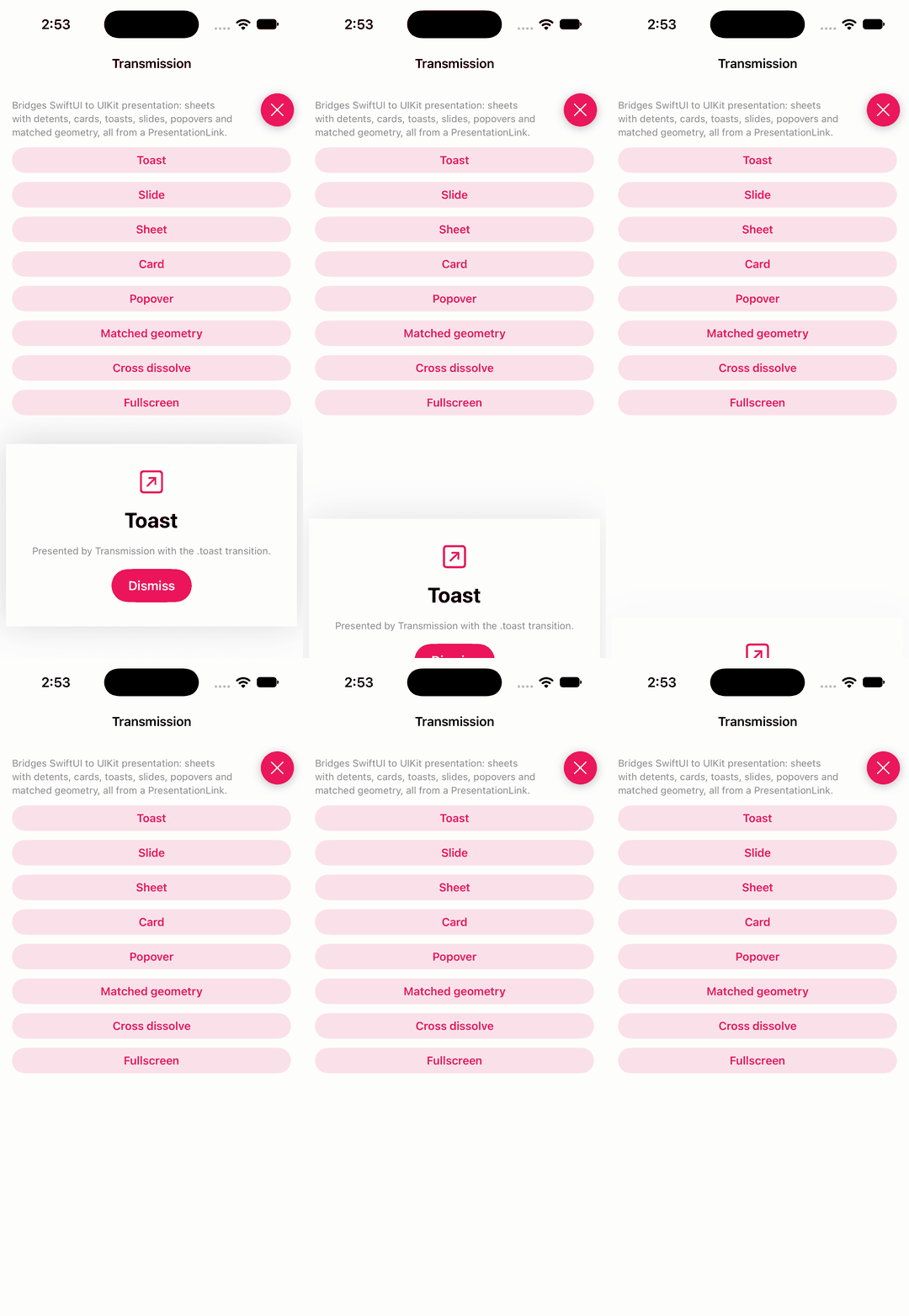
A Splash view that animates and reveals its content, inspired by Twitter splash
▶ Live demo in the app SPM CocoaPods Carthage splash launch screen reveal twitter logo
.package(url: "https://github.com/PiXeL16/RevealingSplashView", from: "0.9.1")Usage
Create a splash with an icon, pick an animationType and duration, add it over the view and start.
let splash = RevealingSplashView(iconImage: icon, iconInitialSize: CGSize(width: 90, height: 90), backgroundColor: DemoSupport.accent)
splash.useCustomIconColor = true
splash.iconColor = .white
splash.animationType = types[picker.selectedSegmentIndex]
splash.duration = 4.0
splash.frame = view.bounds
splash.autoresizingMask = [.flexibleWidth, .flexibleHeight]
view.addSubview(splash)
splash.startAnimation()
nathantannar4 · ★ 1.2K · ⟳ 2026-11 · BSD-2-Clause
Bridges UIKit presentation APIs to a SwiftUI API so you can use presentation controllers, interactive transitions and more.
▶ Live demo in the app SwiftUI SPM swiftui presentation transition modal uikit bridge sheet
.package(url: "https://github.com/nathantannar4/Transmission", from: "3.1.0")Usage
PresentationLink presents SwiftUI content with UIKit transitions; the destination dismisses through the presentation coordinator.
PresentationLink(transition: .toast, isPresented: $showToast) {
    TransmissionDestination(title: "Toast")
} label: {
    Text("Toast").frame(maxWidth: .infinity).demoChip()
}

@Environment(\.presentationCoordinator) private var coordinator

Button("Dismiss") { coordinator.dismiss() }.buttonStyle(DemoPrimaryButtonStyle())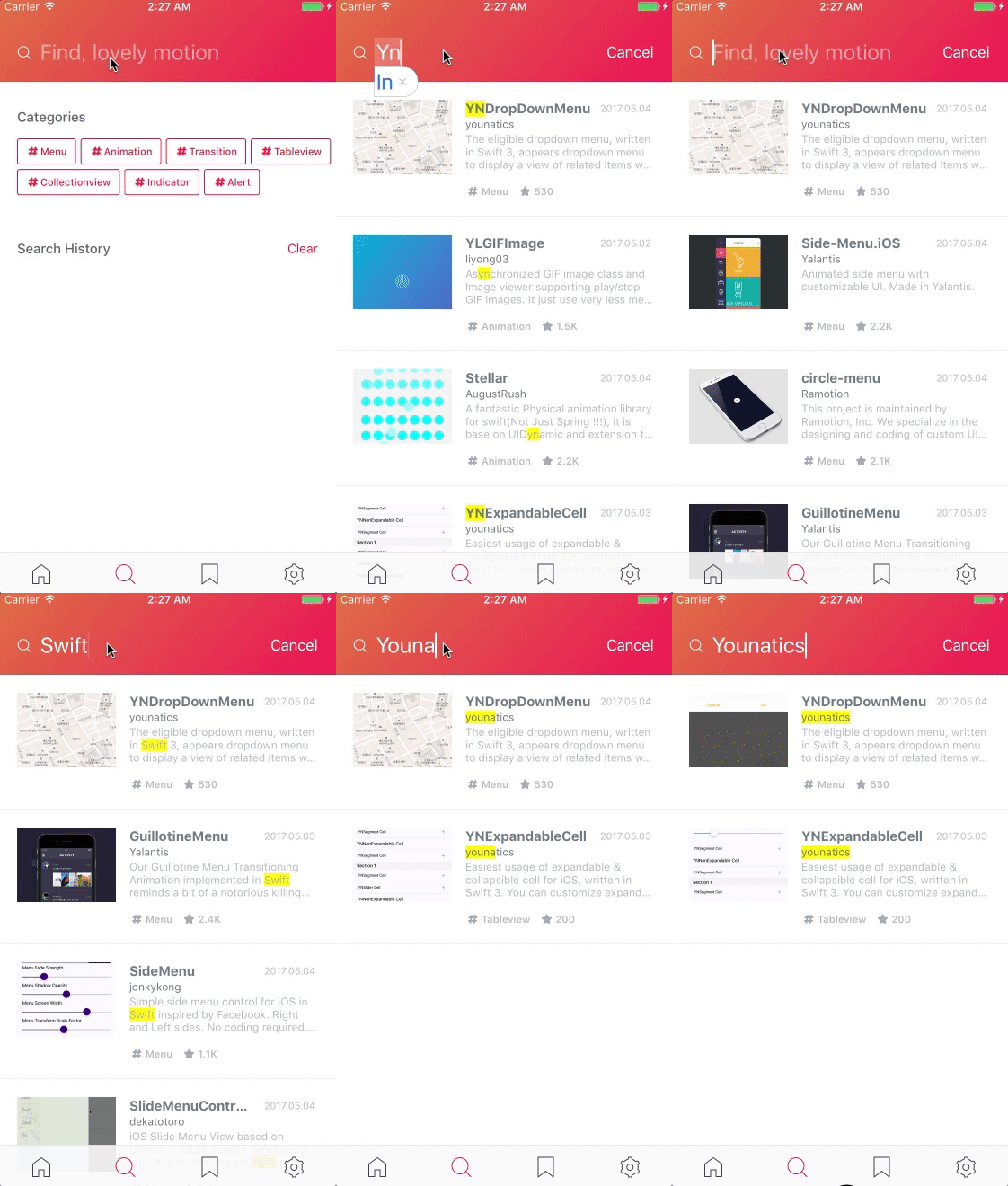
younatics · ★ 1.2K · ⟳ 2026-10 · MIT
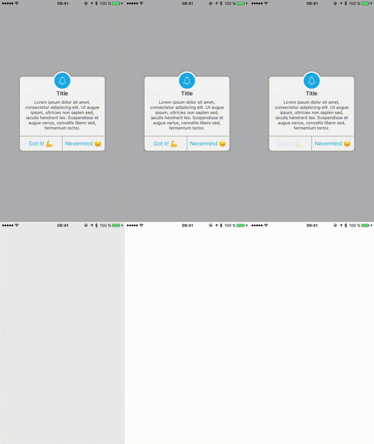
✨Awesome search view, written in Swift 3, appears search view like Pinterest Search view. You can fully customize this library. You can also use this library with Realm!
▶ Live demo in the app SPM CocoaPods Carthage search search bar pinterest suggestions history
.package(url: "https://github.com/younatics/YNSearch", from: "3.1.0")Usage
Subclass YNSearchViewController: set categories and history, init data, and implement the list delegate.
YNSearch.shared.setCategories(value: categories)
YNSearch.shared.setSearchHistories(value: ["Menu", "Transition", "Hero"])
ynSearchinit()
delegate = self
let database = libraries.map { name, category, stars -> LibraryEntry in
    let entry = LibraryEntry(key: name)
    entry.category = category
    entry.stars = stars
    return entry
}
initData(database: database)
setYNCategoryButtonType(type: .colorful)
ynSearchView.ynSearchMainView.redrawSearchHistoryButtons()

func ynSearchListView(_ ynSearchListView: UITableView, cellForRowAt indexPath: IndexPath) -> UITableViewCell {
    let cell = ynSearchView.ynSearchListView.dequeueReusableCell(withIdentifier: YNSearchListViewCell.ID) as! YNSearchListViewCell
    if let entry = ynSearchView.ynSearchListView.searchResultDatabase[indexPath.row] as? LibraryEntry {
        cell.searchLabel.text = "\(entry.key ?? "")  ·  \(entry.category)  ·  \(entry.stars) ★"
    }
    return cell
}

func ynSearchListView(_ ynSearchListView: UITableView, didSelectRowAt indexPath: IndexPath) {
    guard let entry = ynSearchView.ynSearchListView.searchResultDatabase[indexPath.row] as? LibraryEntry, let key = entry.key else { return }
    ynSearchView.ynSearchListView.ynSearchListViewDelegate?.ynSearchListViewClicked(key: key)
    ynSearchView.ynSearchListView.ynSearch.appendSearchHistories(value: key)
}
candostdagdeviren · ★ 1.1K · ⟳ 2026-08 · MIT
CDAlertView is highly customizable alert popup written in Swift 3. Usage is similar to UIAlertController.
CocoaPods Carthage alert popup dialog uialertcontroller warning
maustinstar · ★ 1.1K · ⟳ 2024-07 · MIT
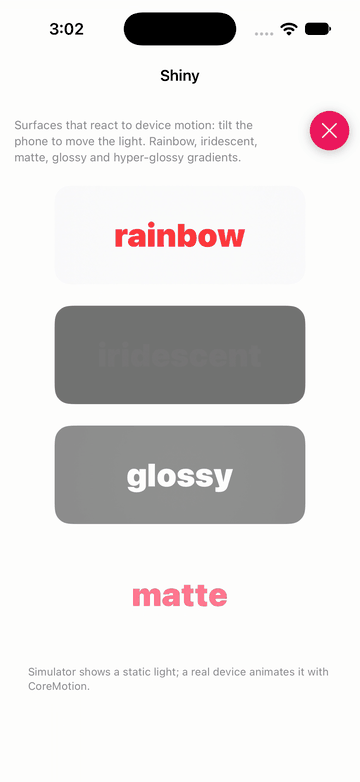
Shiny uses your gyroscope to simulate lighting and motion effects on colors. Works on almost every SwiftUI View.
▶ Live demo in the app SwiftUI SPM swiftui gyroscope shine lighting motion holographic
.package(url: "https://github.com/maustinstar/shiny", from: "0.0.1")Usage
Apply .shiny with a surface gradient; the highlight follows device motion.
Text(title)
    .font(.system(size: 36, weight: .black))
    .shiny(surface)
    .frame(width: 280, height: 110)
    .background(RoundedRectangle(cornerRadius: 18).shiny(background))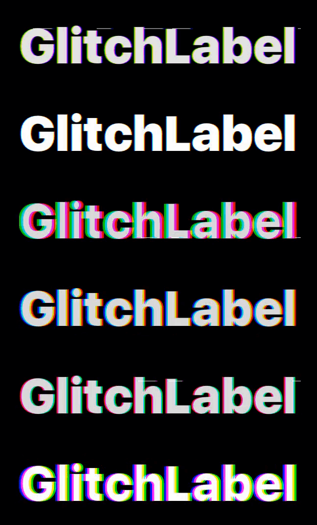
kciter · ★ 1.0K · ⟳ 2022-12 · MIT
G..lit...c...hing UILa..bel fo..r iO...S
SPM CocoaPods Carthage label text glitch text animation uilabel
.package(url: "https://github.com/kciter/GlitchLabel", from: "2.1.0")
gmertk · ★ 978 · ⟳ 2017-05 · MIT
A UINavigationBar extension to show loading effects above navigation bar's background.
CocoaPods Carthage Inactive since 2017 navigation bar loading indicator activity busy

cocoatoucher · ★ 963 · ⟳ 2022-06 · MIT
A smooth, nice looking and IBDesignable flat design switch for iOS. Can be used instead of UISwitch. Inspired by Creativedash's Dribbble post
SPM CocoaPods switch checkbox checkmark toggle flat design uiswitch
.package(url: "https://github.com/cocoatoucher/AIFlatSwitch", from: "1.0.8")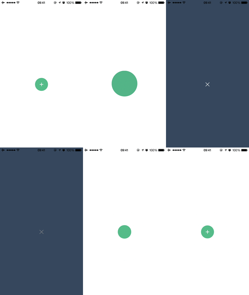
jonathantribouharet · ★ 947 · ⟳ 2019-01 · MIT
An iOS transition for controllers based on material design.
▶ Live demo in the app SPM CocoaPods Inactive since 2019 transition material design circular reveal present button
.package(url: "https://github.com/johnvuko/JTMaterialTransition", from: "2.0.3")Usage
Create the transition with the button to animate from, set it as transitioningDelegate with a .custom presentation.
self.transition = JTMaterialTransition(animatedView: self.presentControllerButton!)

		 let controller = JTMaterialTransitionSecondViewController()

        controller.modalPresentationStyle = .custom
        controller.transitioningDelegate = self.transition

        self.present(controller, animated: true, completion: nil)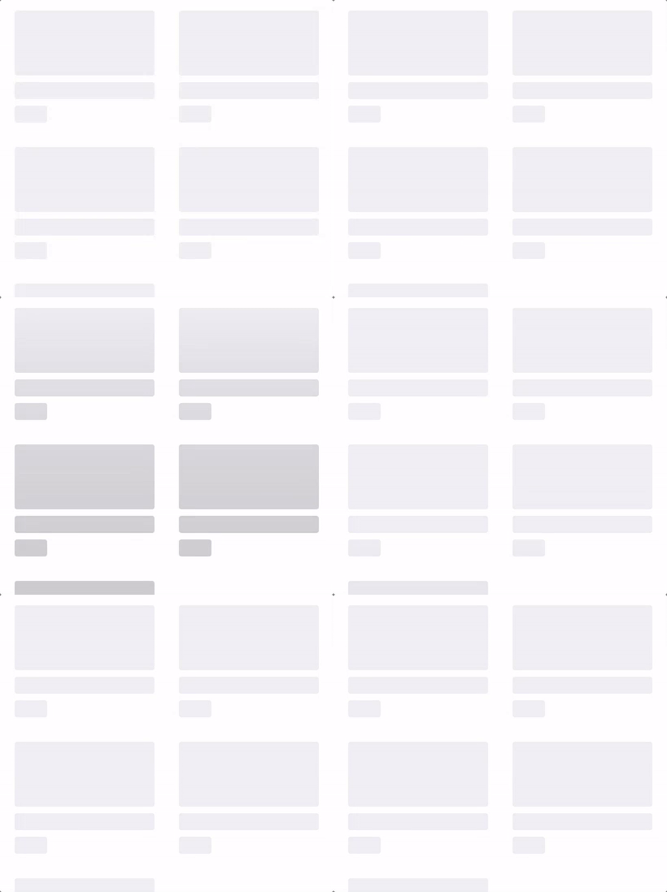
Interactive-Studio · ★ 947 · ⟳ 2022-07 · MIT
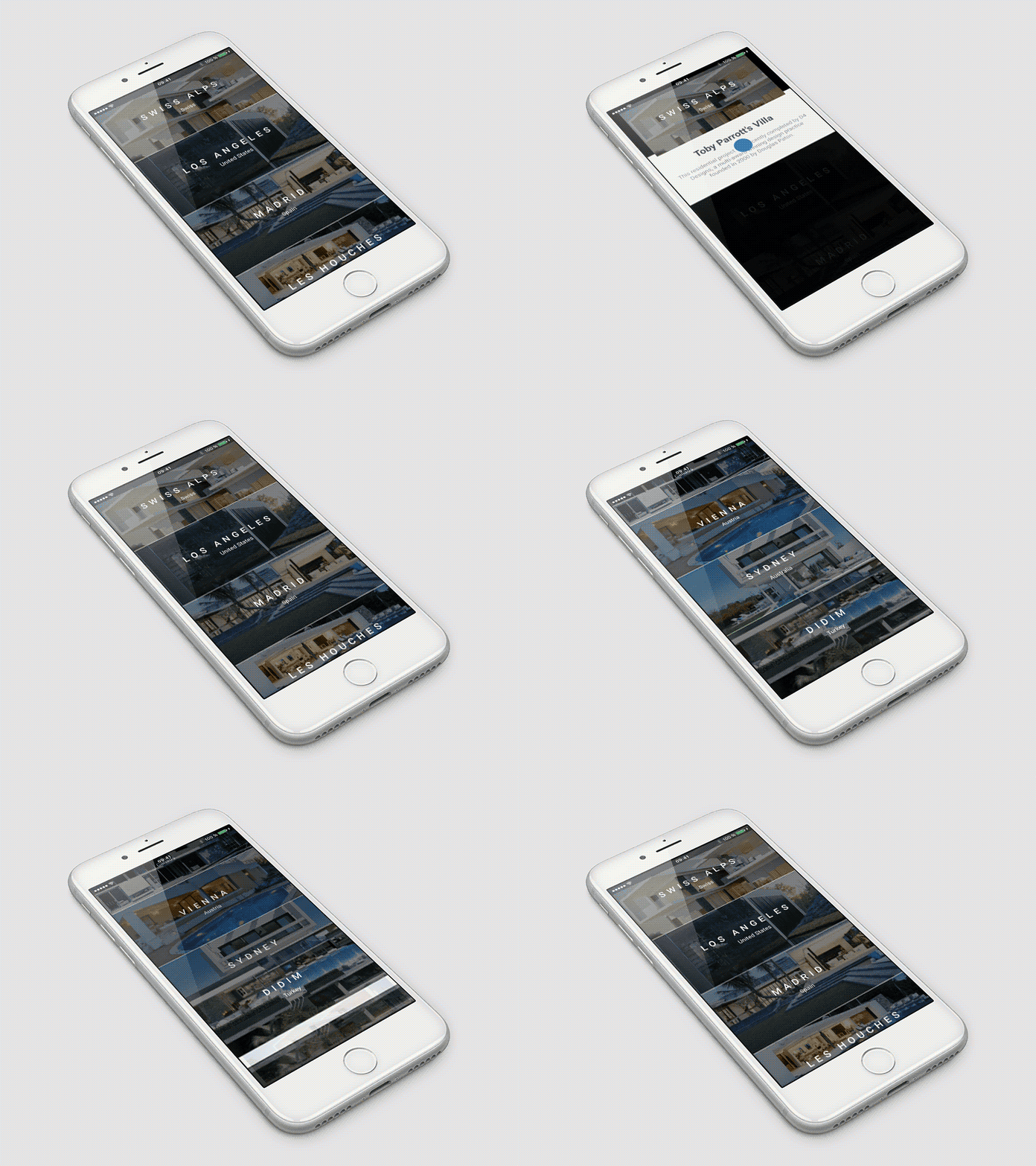
Windless makes it easy to implement invisible layout loading view.
SPM CocoaPods Carthage skeleton loading placeholder shimmer layout
.package(url: "https://github.com/ParkGwangBeom/Windless", from: "0.1.5")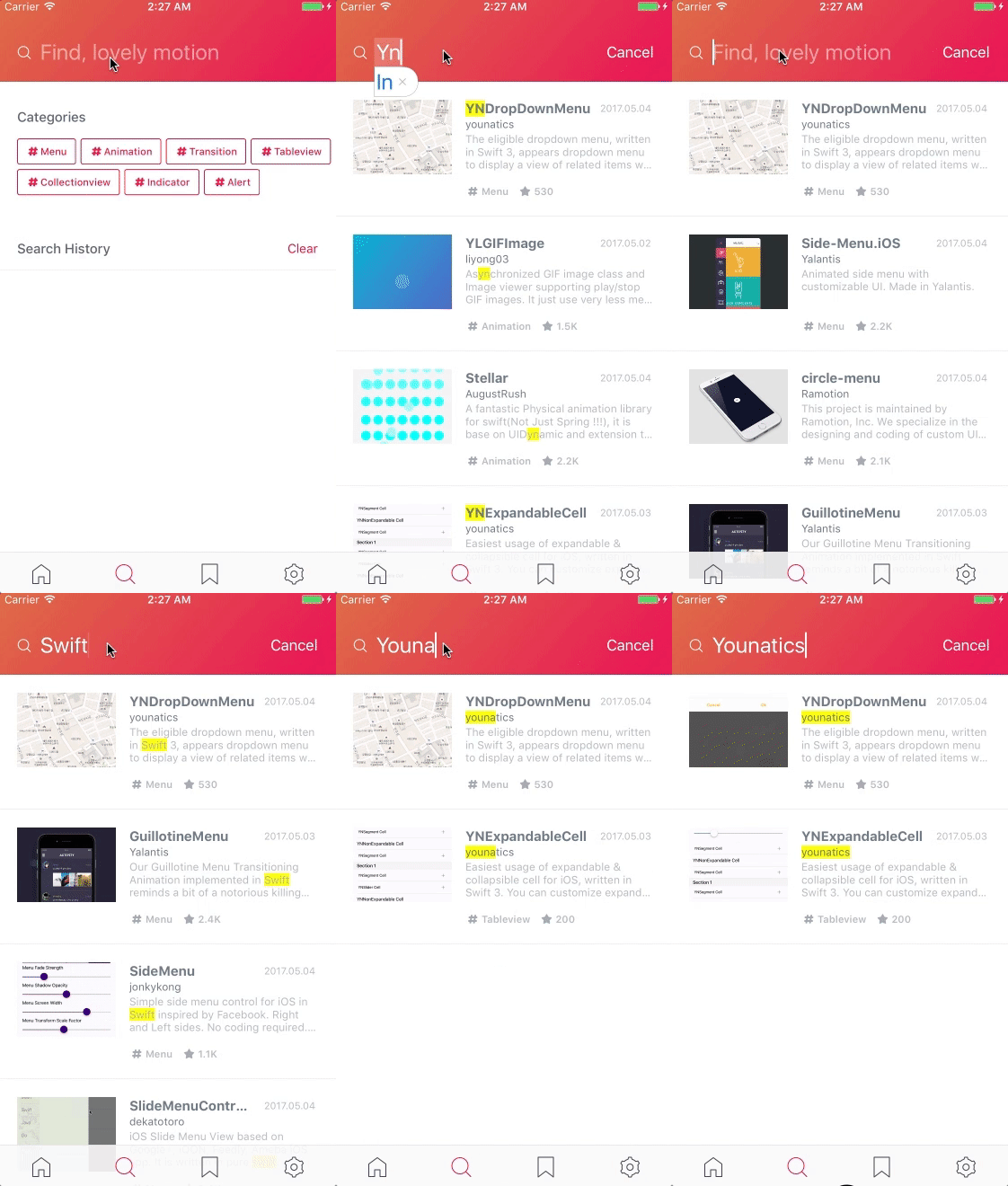
younatics · ★ 922 · ⟳ 2026-10 · MIT
🖍Highlight whatever you want! Highlighter will magically find UI objects such as UILabel, UITextView, UITexTfield, UIButton in your UITableViewCell or other Class.
▶ Live demo in the app SPM CocoaPods Carthage highlight search text uilabel uitextview
.package(url: "https://github.com/younatics/Highlighter", from: "2.1.1")Usage
Call highlight(text:normal:highlight:) on any Highlightable view; a non-matching query resets it (2.1.1).
for view in highlightables {
    let normal: [NSAttributedString.Key: Any] = [.foregroundColor: view is UIButton ? DemoSupport.title : UIColor.label]
    (view as? Highlightable)?.highlight(text: query, normal: normal, highlight: highlight)
}
Ramotion · ★ 889 · ⟳ 2020-04 · MIT
ElongationPreview is an elegant push-pop style view controller
SPM CocoaPods Carthage Inactive since 2020 preview table view expand push detail
.package(url: "https://github.com/Ramotion/elongation-preview", from: "1.1.1")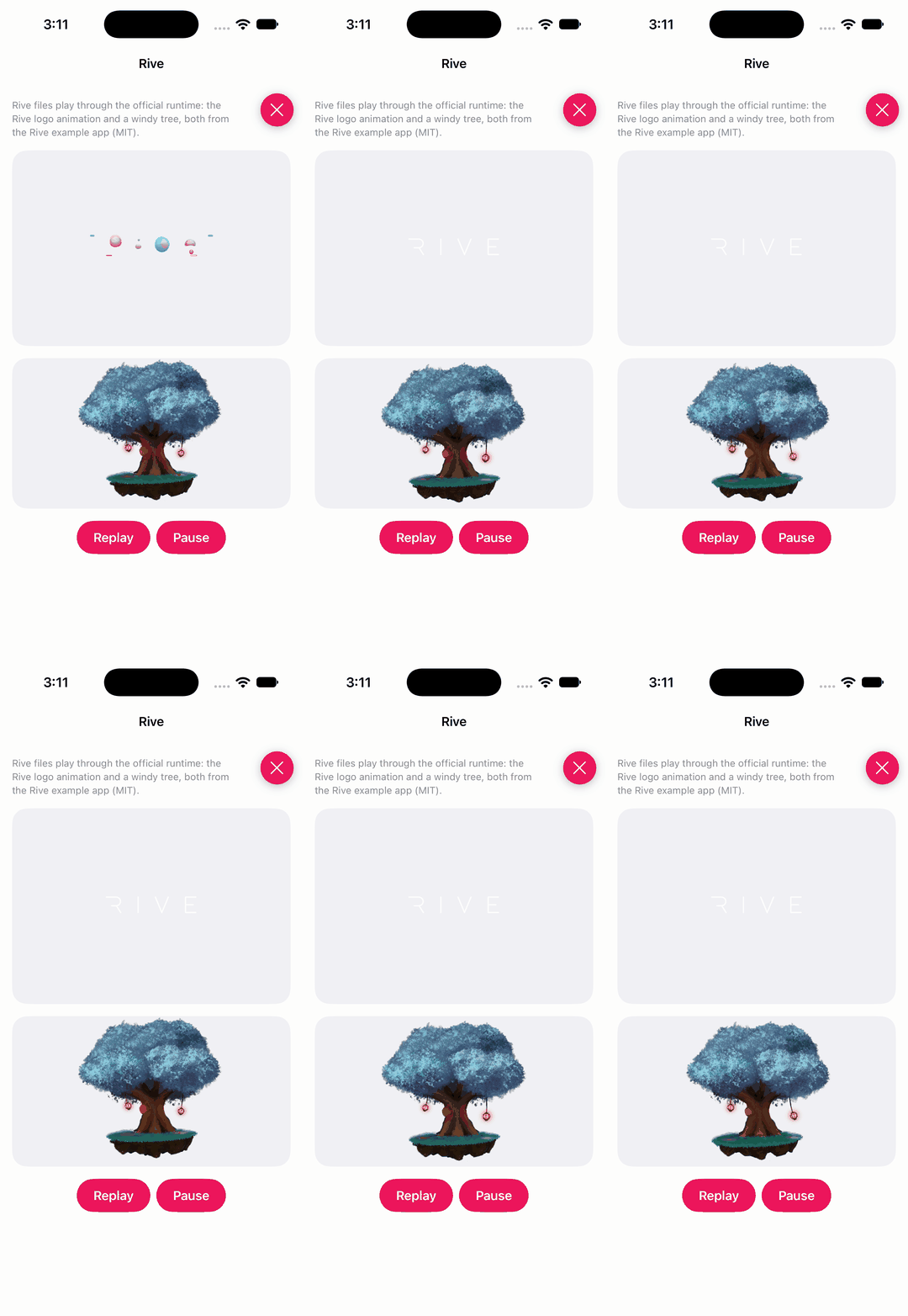
rive-app · ★ 861 · ⟳ 2026-11 · MIT
iOS runtime for Rive
▶ Live demo in the app SPM rive runtime vector animation state machine interactive
.package(url: "https://github.com/rive-app/rive-ios", from: "6.30.1")Usage
RiveViewModel loads a .riv file; its view plays the animation and the model controls playback.
@StateObject private var logo = RiveViewModel(fileName: "rive_animation_logo", in: .module)
@StateObject private var tree = RiveViewModel(fileName: "windy_tree", in: .module)

logo.view()
    .frame(height: 260)

Button("Replay") {
    logo.reset()
    logo.play()
    tree.reset()
    tree.play()
}
maustinstar · ★ 855 · ⟳ 2024-08 · MIT
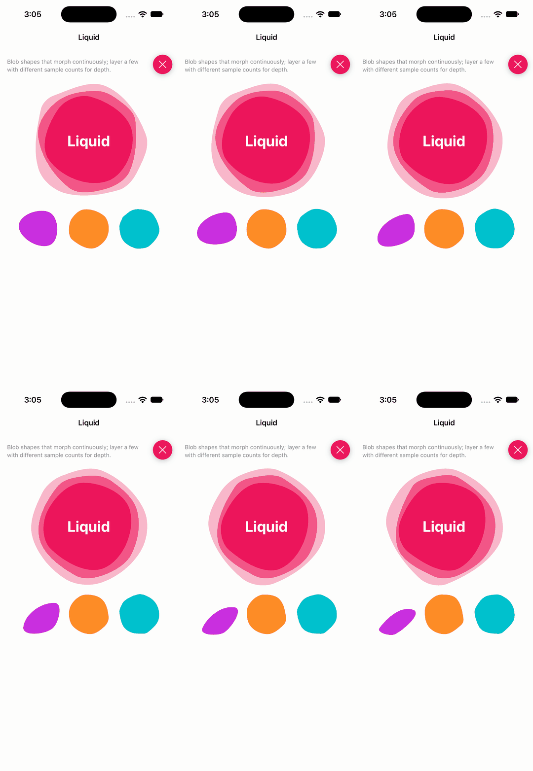
Create a playful backsplash in SwiftUI.
▶ Live demo in the app SwiftUI SPM swiftui blob backsplash shapes animation background
.package(url: "https://github.com/maustinstar/liquid", from: "0.0.2")Usage
Liquid() is a morphing blob view; samples and period control the shape and speed.
Liquid()
    .frame(width: 260, height: 260)
    .foregroundColor(DemoSwiftUIPalette.accent)
    .opacity(0.3)

Liquid(samples: 5)
    .frame(width: 200, height: 200)
    .foregroundColor(DemoSwiftUIPalette.accent)

Liquid(samples: 3, period: 3).frame(width: 90, height: 90).foregroundColor(.purple)
Liquid(samples: 8, period: 8).frame(width: 90, height: 90).foregroundColor(.orange)
Liquid(samples: 12, period: 4).frame(width: 90, height: 90).foregroundColor(.teal)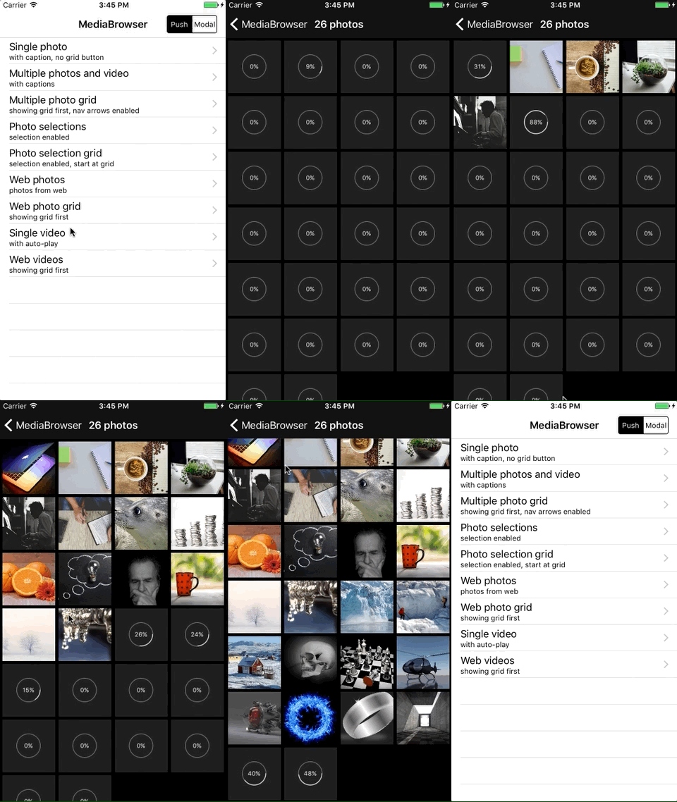
younatics · ★ 647 · ⟳ 2026-10 · MIT
🏞 MediaBrowser can display one or more images or videos by providing either UIImage objects, PHAsset objects, or URLs to library assets, web images/videos or local files. MediaBrowser handles the downloading and caching of photos from the web seamlessly. Photos can be zoomed and panned, and optional (customisable) captions can be displayed. This can also be used to allow the user to select one or more photos using either the grid or main image view.
▶ Live demo in the app SPM CocoaPods Carthage photo browser gallery image viewer video media zoom
.package(url: "https://github.com/younatics/MediaBrowser", from: "3.1.0")Usage
MediaBrowser(delegate:) with Media items; configure the browser and push it, then serve media from the delegate.
mediaItems = images.enumerated().map { Media(image: $1, caption: "Sample image \($0 + 1) of 6") }

let browser = MediaBrowser(delegate: self)
browser.displayActionButton = true
browser.displayMediaNavigationArrows = true
browser.enableGrid = true
browser.zoomPhotosToFill = true
browser.autoPlayOnAppear = false
browser.setCurrentIndex(at: index)
navigationController?.pushViewController(browser, animated: true)

func numberOfMedia(in mediaBrowser: MediaBrowser) -> Int { mediaItems.count }

func media(for mediaBrowser: MediaBrowser, at index: Int) -> Media {
    mediaItems[min(index, mediaItems.count - 1)]
}

func thumbnail(for mediaBrowser: MediaBrowser, at index: Int) -> Media {
    mediaItems[min(index, mediaItems.count - 1)]
}
stuffrabbit · ★ 637 · ⟳ 2019-10 · MIT
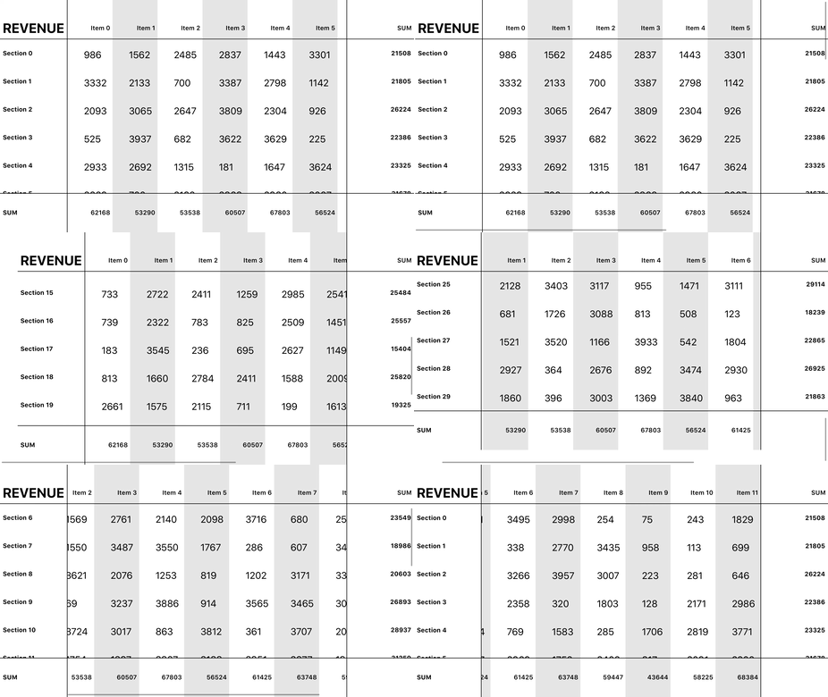
Spreadsheet CollectionViewLayout in Swift. Fully customizable.
SPM CocoaPods Inactive since 2019 spreadsheet table grid collection view layout
.package(url: "https://github.com/stuffrabbit/SwiftSpreadsheet", from: "1.2.1")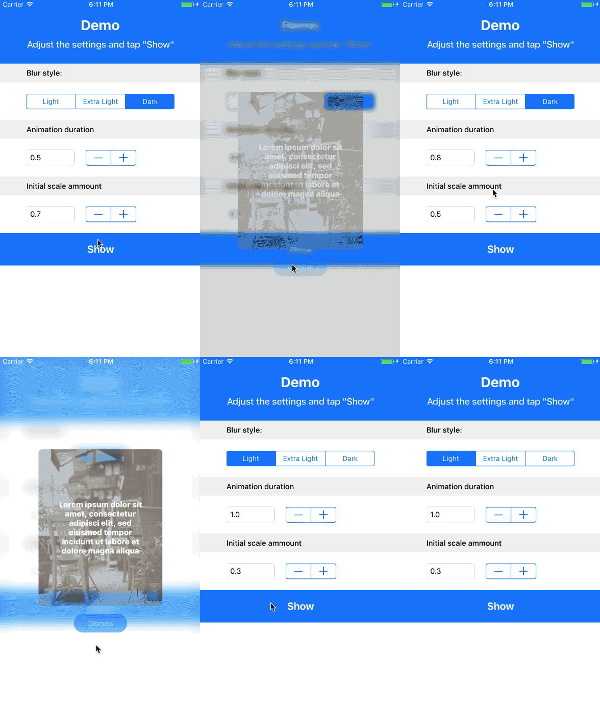
MarioIannotta · ★ 598 · ⟳ 2026-10 · MIT
MIBlurPopup lets you create amazing popups with a blurred background
▶ Live demo in the app SPM CocoaPods popup blur alert modal segue
.package(url: "https://github.com/MarioIannotta/MIBlurPopup", from: "1.0.0")Usage
The presented controller adopts MIBlurPopupDelegate to supply the popup view, blur style, scale and duration.
extension PopupViewController: MIBlurPopupDelegate {

    var popupView: UIView {
        return popupContentContainerView ?? UIView()
    }
    var blurEffectStyle: UIBlurEffect.Style? {
        return customBlurEffectStyle
    }
    var initialScaleAmmount: CGFloat {
        return customInitialScaleAmmount
    }
    var animationDuration: TimeInterval {
        return customAnimationDuration
    }

}
entotsu · ★ 572 · ⟳ 2019-03 · MIT
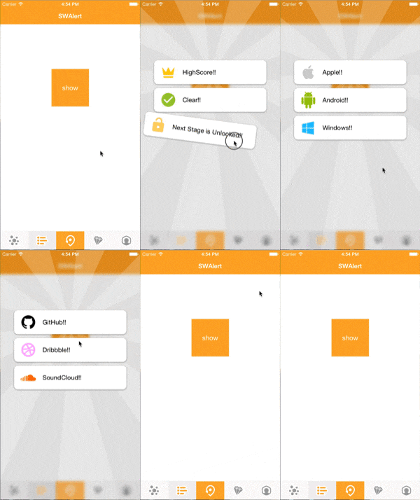
Animated alert library like Swarm app.
CocoaPods Carthage Inactive since 2019 alert popup animation swarm app spring
MillmanY · ★ 564 · ⟳ 2021-10 · MIT
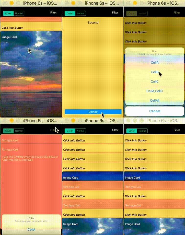
Custom CollectionView like Wallet App
CocoaPods card wallet collection view stack passbook
no preview
exyte · ★ 562 · ⟳ 2026-11 · MIT
A tabbar with a number of preset animations written in pure SwiftUI
SwiftUI SPM swiftui tabbar animation tab bar menu
.package(url: "https://github.com/exyte/AnimatedTabBar", from: "1.0.1")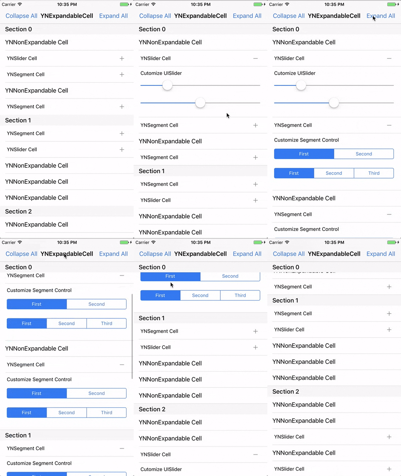
younatics · ★ 451 · ⟳ 2026-10 · MIT
✨Easiest usage of expandable & collapsible cell for iOS, written in Swift 3. You can customize expandable UITableViewCell whatever you like. YNExpandableCell is made because insertRows and deleteRows is hard to use. You can just inheirt YNTableViewDelegate and add one more method func tableView(_ tableView: YNTableView, expandCellAt indexPath) -> UITableViewCell?
▶ Live demo in the app SPM CocoaPods Carthage table view expandable collapsible cell accordion
.package(url: "https://github.com/younatics/YNExpandableCell", from: "2.1.0")Usage
YNTableView with YNTableViewDelegate: return the expanded cell and height per index path.
@IBOutlet var ynTableView: YNTableView!

func tableView(_ tableView: YNTableView, expandCellWithHeightAt indexPath: IndexPath) -> YNTableViewCell? {
    let ynSliderCell = YNTableViewCell()
    ynSliderCell.cell = tableView.dequeueReusableCell(withIdentifier: YNSliderCell.ID) as! YNSliderCell
    ynSliderCell.height = 142

    let ynSegmentCell = YNTableViewCell()
    ynSegmentCell.cell = tableView.dequeueReusableCell(withIdentifier: YNSegmentCell.ID) as! YNSegmentCell
    ynSegmentCell.height = 160

    if indexPath.section == 0 && indexPath.row == 1 {
        return ynSliderCell
    } else if indexPath.section == 0 && indexPath.row == 2 {
        return ynSegmentCell
    } else if indexPath.section == 0 && indexPath.row == 4 {
        return ynSegmentCell
    } else if indexPath.section == 1 && indexPath.row == 0 {
        return ynSegmentCell
    } else if indexPath.section == 1 && indexPath.row == 1 {
        return ynSliderCell
    } else if indexPath.section == 2 && indexPath.row == 2 {
        return ynSliderCell
    } else if indexPath.section == 2 && indexPath.row == 4 {
        return ynSliderCell
    }
    return nil
}
jegumhon · ★ 446 · ⟳ 2019-01 · MIT
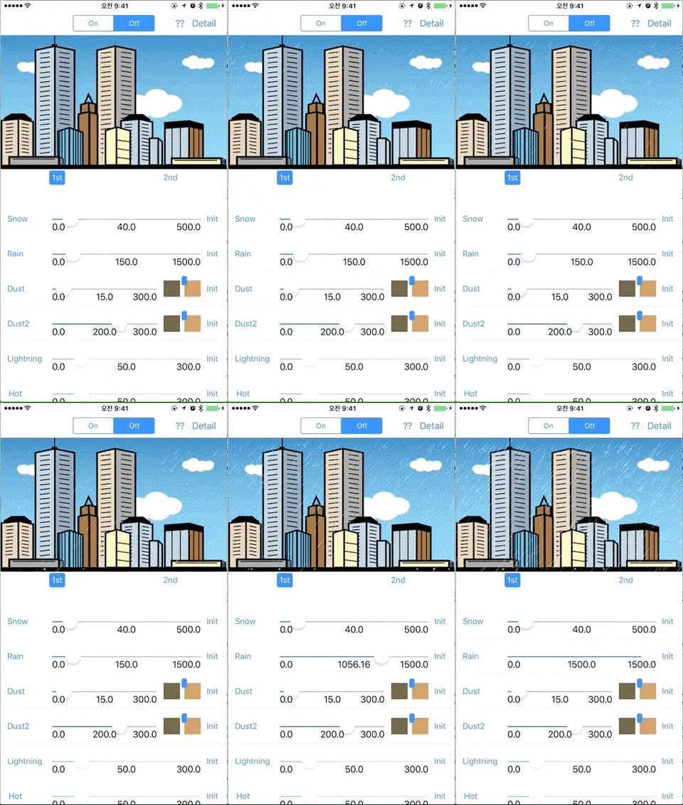
Show the weather effects onto view written in Swift3
CocoaPods Carthage Inactive since 2019 weather effects rain snow shader particles
Cindori · ★ 444 · ⟳ 2024-03 · MIT
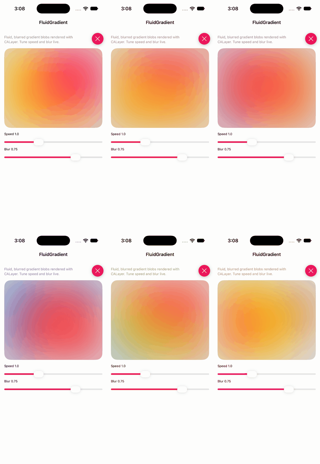
A fluid, animated gradient implemented with CoreAnimation and SwiftUI.
▶ Live demo in the app SwiftUI SPM swiftui gradient background mesh animation
.package(url: "https://github.com/Cindori/FluidGradient", from: "1.0.0")Usage
FluidGradient animates blurred colour blobs; tune blobs, highlights, speed and blur.
FluidGradient(
    blobs: [DemoSwiftUIPalette.accent, .purple, .blue],
    highlights: [.yellow, .orange, .pink],
    speed: speed,
    blur: blur
)
jasudev · ★ 433 · ⟳ 2024-02 · MIT
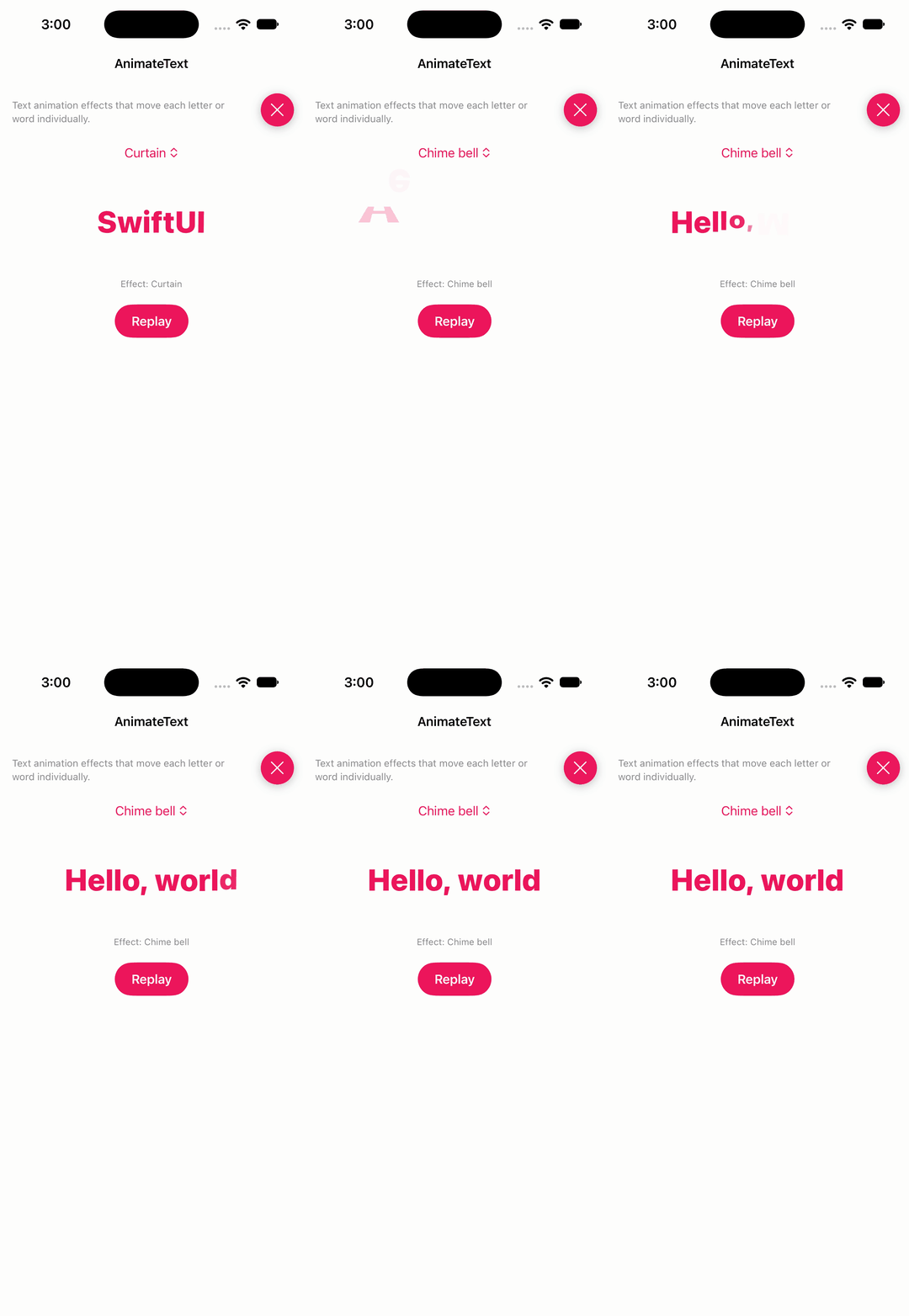
This library for animating text. Developed with SwiftUI. This library supports iOS/macOS.
▶ Live demo in the app SwiftUI SPM swiftui text animation text animation typing typography
.package(url: "https://github.com/jasudev/AnimateText", from: "0.5.0")Usage
AnimateText<Effect> animates a bound string letter by letter; reset the text to replay.
case 0: AnimateText<ATCurtainEffect>($text)
case 1: AnimateText<ATChimeBellEffect>($text)
case 2: AnimateText<ATDropEffect>($text)

private func replay() {
    text = ""
    DispatchQueue.main.asyncAfter(deadline: .now() + 0.05) {
        text = phrases[Int.random(in: 0..<phrases.count)]
    }
}
AshRobinson · ★ 416 · ⟳ 2016-10 · MIT
An Android Wear style confirmation view for iOS
Inactive since 2016 alert confirmation android wear checkmark overlay
paulrolfe · ★ 365 · ⟳ 2019-06 · MIT
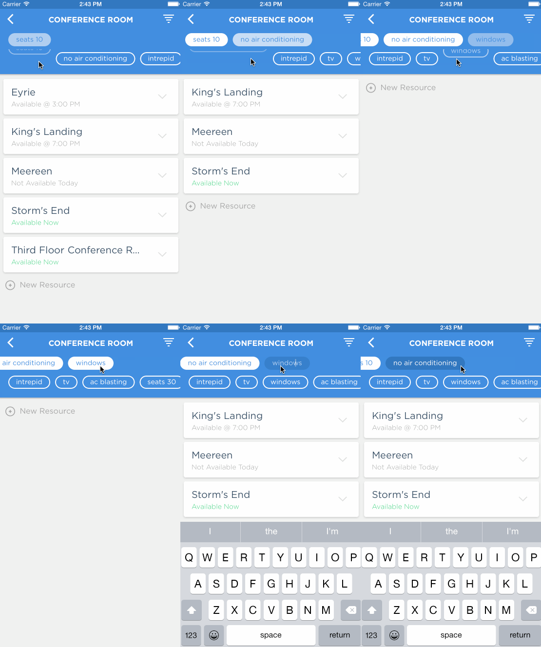
This pod provides a view controller for choosing and creating tags in the style of wordpress or tumblr. This tag picker was originally used in the Intrepid Pursuits app, Slate.
CocoaPods Inactive since 2019 tags tag picker input chips text field
KyoheiG3 · ★ 270 · ⟳ 2020-09 · MIT
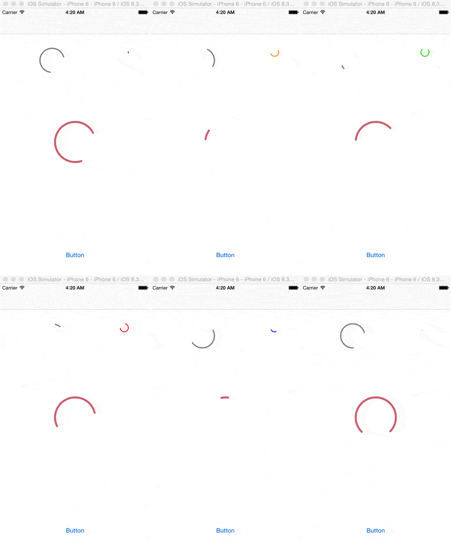
SpringIndicator is indicator and PullToRefresh. Inspired by Material design components.
SPM CocoaPods Carthage Inactive since 2020 indicator pull to refresh spinner loading material design
.package(url: "https://github.com/KyoheiG3/SpringIndicator", from: "4.0.0")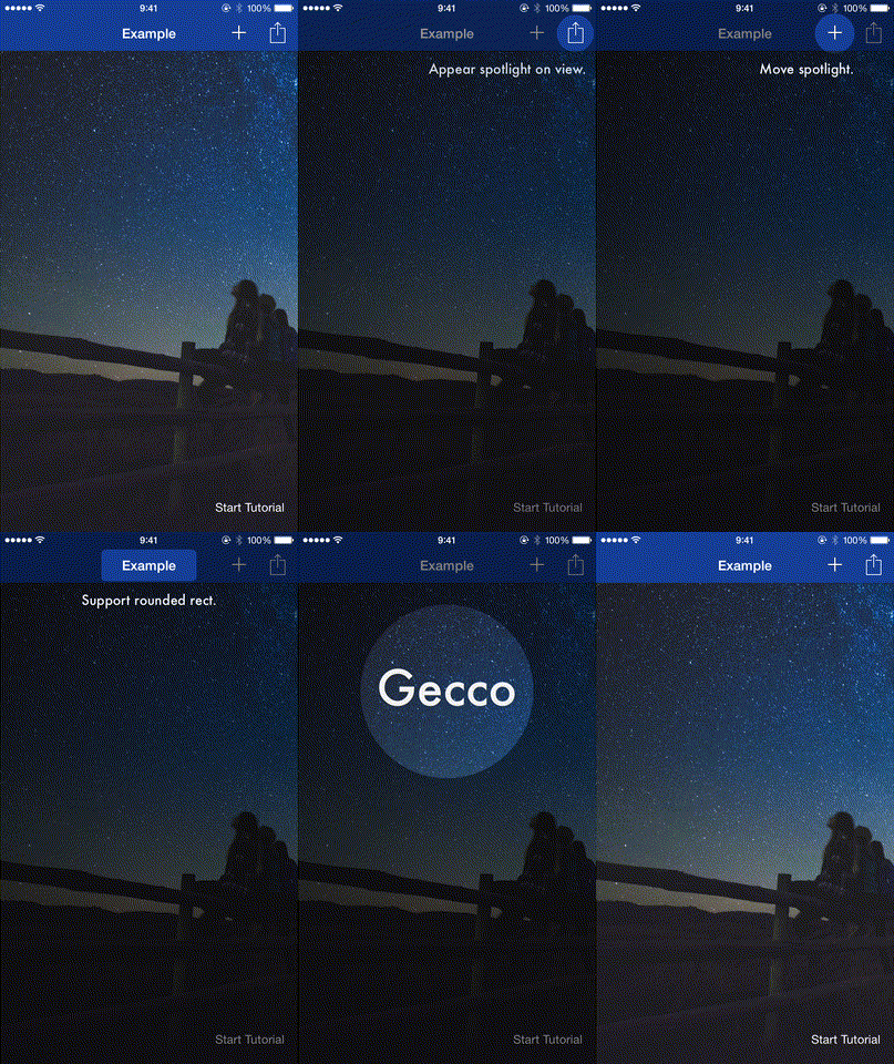
yukiasai · ★ 19 · ⟳ 2020-09 · MIT
Simply highlight items for your tutorial walkthrough, written in Swift. Gecco means Moonlight in Japanese.
CocoaPods Carthage Inactive since 2020 tutorial walkthrough spotlight highlight onboarding coach mark